HOME | DD
 hyoori —
Mirage - Type Modification
hyoori —
Mirage - Type Modification
Published: 2013-07-16 14:26:58 +0000 UTC; Views: 9116; Favourites: 279; Downloads: 129
Redirect to original
Description
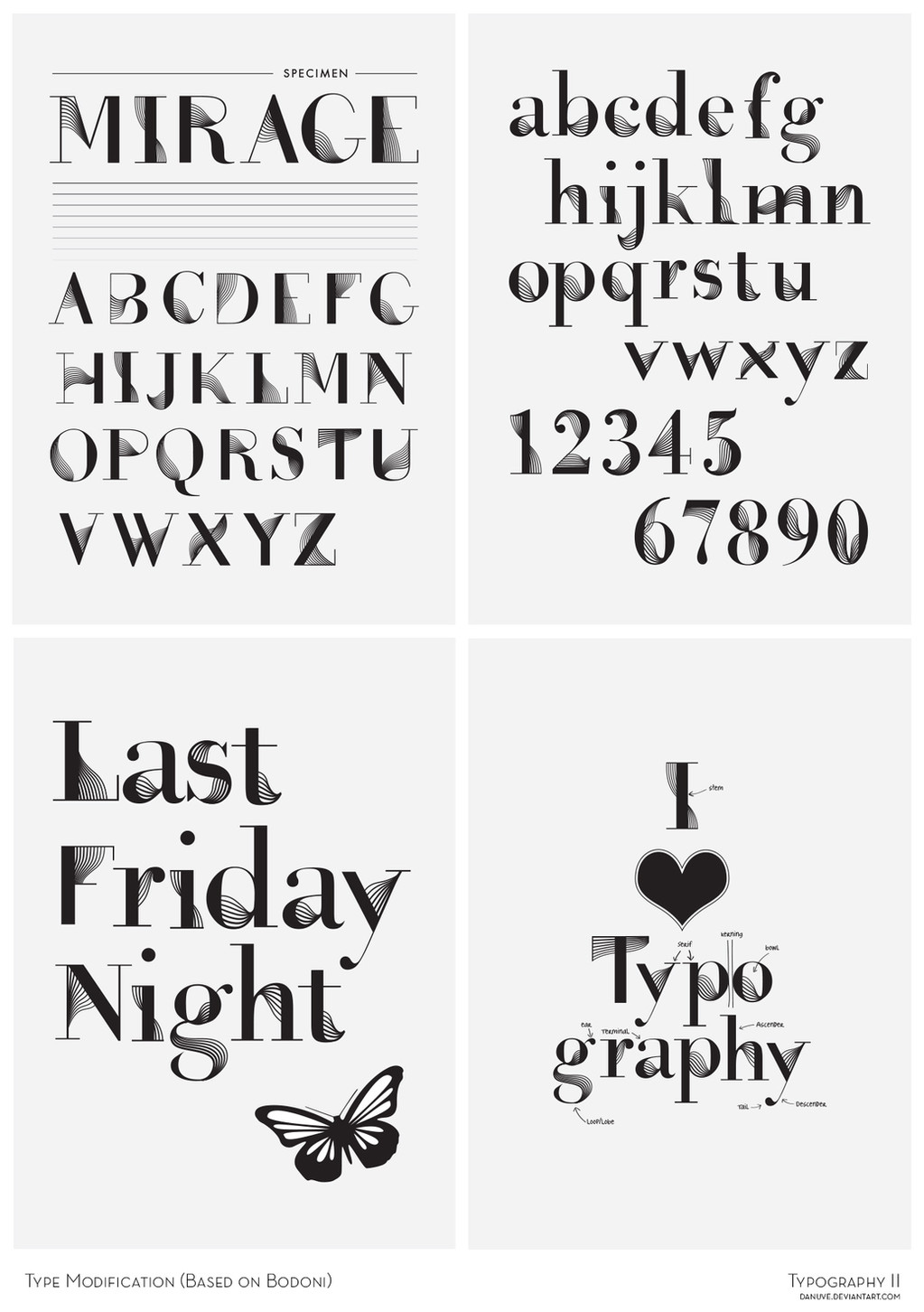
Done as final examination submission for "Typography III" class at DKV BINUS.Was asked to modify a typeface into a new typeface of our own.
These sets of lines could somehow create a mirage for cylindrical people
")
 Adobe Illustrator Modified from BODONI Inspired by Armin Van Buuren's Mirage album See more on my Behance page: www.behance.net/gallery/Mirage...
 Poster series:
--
I hope it can be a good reference for you guys, dkv binus students. Ganbatte minna!
Don't forget to upload your own related artwork and comment here with ur deviation link.
--
[Added]
A DD
 I feel very honoured and thankful
 Thank you very much ^pica-ae for featuring

May Llamas always be with you! XD
Related content


Comments: 19


Ah, I did a Typography sector of my course, too. ^^ You're...better at it, than what I am...

👍: 0 ⏩: 1

You're too kind
👍: 0 ⏩: 1

Oooh... that is one nice font modification. It reminds me of stuff from 1920.
👍: 0 ⏩: 1
That is it! My lecturer's insight was also the same as yours
👍: 0 ⏩: 0


thanks for your critique! will you explain a bit more about it? or does it just not fitting right?
👍: 0 ⏩: 1

of course you can, I've just notice those 'new'lines - I don't know- shouldn't be in that place? but seriously, this is veery very nice concept I really like it
👍: 0 ⏩: 0


Great work, I don't know much about typography but these are awesome
👍: 0 ⏩: 0


