HOME | DD
 IanMacDougall — Spacer -Concept-
#2dcharacters #armor #artdigital #bandit #bandolier #bankrobber #bayonet #bayonette #beautiful #belts #blonde #boots #breakdown #cash #color #design #digital #glowing #harness #heist #holsters #illustration #kneehighboots #leather #lineart #money #pirate #powerarmor #progress #renegade #robbery #sassy #scifi #sexy #shemagh #shotgun #shots #smg #spacegirl #stepbystep #swashbuckler #weapon #woman #duffelbag #ridingboots #keffiyeh #shmagh #2dconcept #boobplate #patreon #artistsontumblr #artistsondeviantart #artistsoninstagram #artistsofinstagram #ianmac #ianmacstudios #ianmacdougall #digitalpainting #photoshop #photoshoppainting
Published: 2017-12-15 11:44:20 +0000 UTC; Views: 5573; Favourites: 78; Downloads: 0
Redirect to original
Description
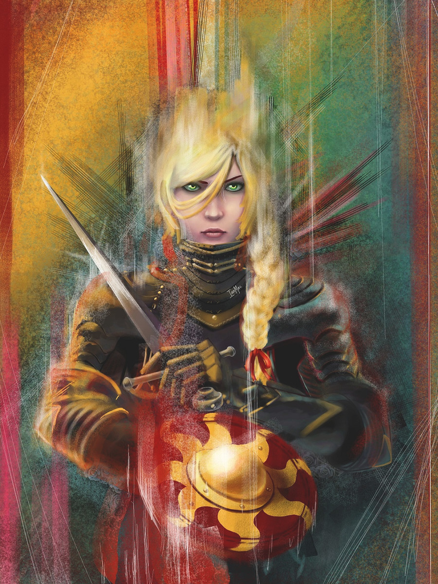
My attempt at dipping my toes into sci-fi costume/armor design, and playing with alternate methods of establishing tones and colors.This is the final version with the color overlays fully fleshed-out.
Like my art? Support me on Patreon for early releases, full-size HD images, and soon-to-be tutorials!
www.patreon.com/ianmacstudios
Related content


Comments: 15

 (Smile)")

This is a really cool character design, I really like the combination of old-world and new world elements with the leather and cloth over top of the lit up power armour. It has a very Firefly-esque aesthetic. I like the arms and the armour covering them. Adding detail to sci-fi armour can be a fine line between creating a believable looking suit and just adding visual noise and I think you've done it well here.
Looking at your WIP shots of this, did you do all the shading on this in greyscale and overlay colour over the top? If so, then it's worked a lot better than I thought a method like that would work! I'd be very curious to see what your colour layer looks like, is it flat colour all of the same transparency or is it darker in places and lighter in others? What sort of blending are you using? Genuinely curious because it's come out very well for you and it's quite different from how I'd approach something like this.
I like your bold highlights on the right side of the picture, getting more comfortable with really going hard on highlights is something I know I need to work on. My only suggestion on that regard though is to consider making sure that your shadows in the area are just as bold. Considering the shotgun and the cash in the bag there, while the highlights are great, I think perhaps the shadows could be a little darker on the shadowed faces. In the greyscale version, the tones are all right there, but I think adding that extra layer of bright light without a corresponding layer of dark shadow upset the balance a little there.
The kit you've given her here seems practical and realistic and I think the scarves are great for a subtle feminine touch. It's a cool little PDW weapon you've given her here too, in the style of a P90 or a Type-97B. One thing to consider with designing a weapon for a pose like this though, is how the weapon would be aimed. To me, this looks like two handed weapon due to the long stock on it, but I don't see anywhere for her to put her front hand, especially if she's gonna be thrusting with a bayonet. This could be a vertical grip like on a Type-97B or just a rounded section to hold flat like on a Micro Tavor . I'm a massive airsoft nerd, so I apologise if I'm being nit-picky here, but just a suggestion to think about for firearm design.
But yeah, great work with this, the overall image is fantastic and she looks like a great character, the sorta noble thief, robin-hood swashbuckler type. She's got a badass design and I'm really impressed with how you managed to do the shading. I'd be very curious to learn more about how your shading/colouring style works.
")
👍: 0 ⏩: 1

Thank you! Glad it seems to have worked out overall!
And yes, that's basically what I did to color it. I basically took a different base color for the shadows, highlights, and base respectively, and put them on layers set to overlay or multiply. More desaturated and yellow-shifted colors for the highlight regions, and more saturated blue-shifted for the shadows. Then I did an overpaint to touch up bits of areas that didn't quite look good.
This was the first time I tried this method, but I found that meeting things halfway by using multiple colors looked much better than my initial impulse to get lazy and just do a wash with a single color/shade.
A good 80% of the work is upfront [grayscale stage], but I particularly like how the method allows you to focus on tones and the color hues in separate steps. Makes things a bit more manageable for someone who's trying to get used to working in color.
Here's what those color layer/s look like without the grayscale layer:
[ imgur.com/a/gxBbP ]
Good eye. The rimlight was a last minute addition, and I'm almost surprised I didn't notice the issues with the shadows before.
As for the SMG, the original sketch was something not unlike a P90 optical sight group + foregrip and a cheek-plate mounted onto a minimal stock that would probably look at home on a Kel-Tec Sub-2000. Unfortunately, it seems I also forgot to add the foregrip in. >.>
( And yeah, the bayonet's pretty useless. I just stuck it on because it looked cool. ;D )
Thanks again for the fantastic input
👍: 0 ⏩: 1
You're very welcome! Sorry for the late reply, things have been a bit hectic here.
Thanks for the screenshot, it's really interesting to see how other people do these sorta thing. I tend to use "hard light" for highlights, although more recently I've been using overlay a lot more. Multiply is great though. The truly grand thing with digital art is that if you do what you were planning and it isn't quite right you can just add another layer.
Yeah, I can see the advantage in compartmentalising things down into multiple steps. I did a few speedpaints a long time ago in greyscale and I think it's a good idea just to help learn about lighting without the added confusion of colour.
Haha yeap, at the end of the day, the rule-of-cool is what matters most! I always enjoy looking at other peoples' weapon designs. It's fun trying to spot what they've used as inspiration.
👍: 0 ⏩: 0


Thanks! The arms were one of my favorite parts to draw.
👍: 0 ⏩: 0

Her progression from design from lineart to completion was fun to watch! ovo
I like how she confident she looks, and the way you added the highlights to her armor o7o)
👍: 0 ⏩: 1
Thanks! I think I might've gone a bit overboard on the tendrils of LED lights, but they're just so fun to draw! ( ˊ̱˂˃ˋ̱ )
👍: 0 ⏩: 0