HOME | DD
 Idgit — Kitchenware of doom
Published: 2005-08-07 03:37:15 +0000 UTC; Views: 110; Favourites: 0; Downloads: 1
Redirect to original
Description
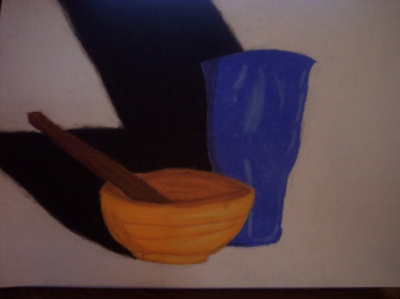
Another summer project. Yeah... no BG, except for the shadow. Just so y'all know, I didn't do BGs on any of my summer projects, which kind of frustrated my teacher >_>;; Just, I never thought, while doing them, to do the BGs first and, by the times I got the stuff in the foreground done, I was so tired of the piece o_O;; I may go back and add BGs to a couple, to boost my grade. The others... must either be still on my camera, or I have yet to take pics of them... I forget.Oh, and the bowl is really grey, but I didn't have any chalk pastels in varying shades of grey, so it turned out to be orange, since orange and blue are complementary
")
Art (c) ~Idgit
Related content


Comments: 10

Ahhh...blue and orange...complementary, my dear Watson. x3
The colours are sexy. D: Great pic Idg.^^
👍: 0 ⏩: 1

Why, I do say, jolly good show, Kimbs!
👍: 0 ⏩: 1
Oh, jolly good. I love being a snobby pom with a crappy English accent! x3
👍: 0 ⏩: 1
Indeed! Chipchip cheerio and all that!
👍: 0 ⏩: 0

Shadows could use some variation.. Good work, though. Chalk pastels are tricky.
👍: 0 ⏩: 1
Yeah, I could maybe go and put some white in there or something, or maybe some blue & orange, though I wish I had different shades of grey in 'em. T_T
Thanks!
👍: 0 ⏩: 0

I love the angle of the shadow on this.
And using the orange with the blue made them really stand out.
")
👍: 0 ⏩: 1
Thanks!! x3
Now I just gotta try and think of what so do for a bg =/
👍: 0 ⏩: 0