HOME | DD
 isibis7 — Fury of Colors
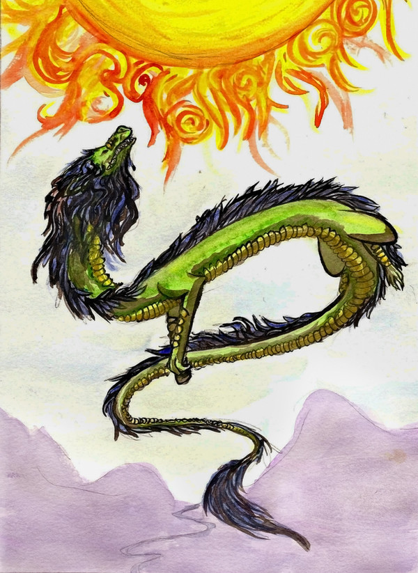
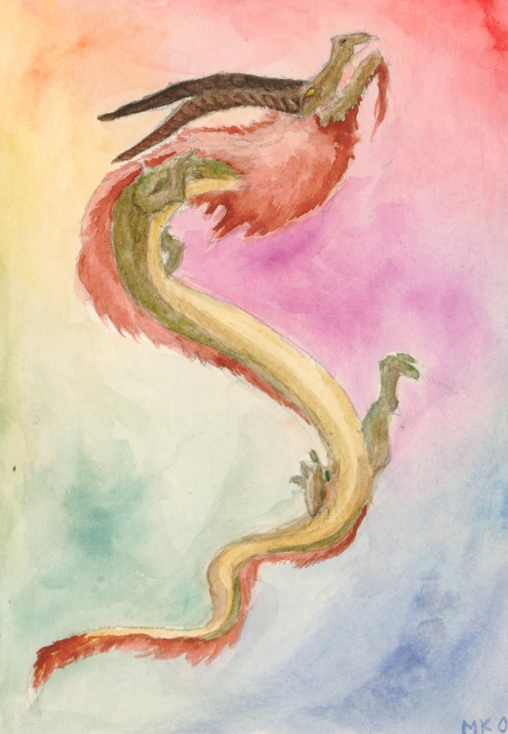
Published: 2009-11-05 00:56:15 +0000 UTC; Views: 885; Favourites: 22; Downloads: 18
Redirect to original
Description
This one is from this summer, but I just had no time or willpower to upload it, until recently I found a high quality scaner at my school and here are the fruits of my efforts to make it work in a productive manner.Feedback:
I want to know how well the background looks compared to the subject and if they clash too much or not.
Also is there a way to make the dragon look more realistic?
Thanks.
Related content


Comments: 43

I think thise piece of artwork is AWESOME. I think the background is really cool with all of the colors and how it resembles a rainbow a bit. A way to make it more realistic is possibly going over the body when it's dried with a colored pencil and try to creat scales. Otherwise, it's very good and I love the fur on it's chin and neck ^^ Nice work!
👍: 0 ⏩: 0

I actually like the background. You've got all sorts of swirly colours in there that can work with mythical beasties. As for the dragon, I love the long flowing lines, makes him look graceful  (Smile)")
👍: 0 ⏩: 1

Why thank you! That was very useful ^^
👍: 0 ⏩: 0

i think its great but, maybe try an opposite color scheme for the background, like if your going to make the dragon with light colors, do the background with dark colors, anyway bravo 

👍: 0 ⏩: 1

Ooooh!! He's very cool!!
I like the background the way it is. Here's what I think: Have you ever worked with charcoal?? If you were to use some charcoal to define the edges of the dragon from the BG and soften the marks towards the body of the dragon for shading and depth, you will get a more realistic effect for the beast and separation from him(her??) and the BG.
Charcoal and watercolor work together beautifully. Just something to invade your mind!!
Good work and good luck!!

👍: 0 ⏩: 1
Thank you! I have worked in charcoal but wouldnt try it on this one for the sole reason that its very small and i dont have a thin enough charcoal piece. Though i will definitely try that at some point.
👍: 0 ⏩: 1
You're welcome!! How small is it?? It's hard to believe you have something so small that you could not even use vine charcoal on it...
Hey, it's up to you though ")
")

👍: 0 ⏩: 1
umm... i wanna say 4 by 8 inches.... something around there
👍: 0 ⏩: 1
Oh wow, that is tiny... O.O
👍: 0 ⏩: 0

Holy crackers that's good. I love the colors so much! That is great!
👍: 0 ⏩: 1
Thank you! And thank you for the fav too.
👍: 0 ⏩: 1

I really like this piece! The motion of the dragon is very fluid and natural, and the colors go well together.
But to address the issue of the detail, I would suggest looking at other dragon interpretations to see exactly what makes them so complex and ornate.
Here are some of my favorites --> [link] [link] [link] [link]
I think all it would take to spice this piece up is the addition of another media, such as ink or colored pencils.
Also, by adding more dark values, you could also get more depth and a feel of more detail.
The legs could also use a bit more definition.
But this is really a great piece! 
👍: 0 ⏩: 1

Nice piece! But it looks unfinished: I think it has much more potential.
The BG is pretty nice, it's ok with watercolours to be blend and muted. To make the dragon look more realistic, there are a few things you can try:
- defining the outlines
- adding structure
- adding details and details and details
- combining different techniques and methods
The outlines are pretty important for the motif to sepparate it from the BG. You can try adding structure in Photoshop, playing arround digitally often produces interesting results! The details are important to bring in life and dimension to the piece and to make the dragon realistic and believable. (Just a thought  (Wink)")
Also, from my own experience, you can try combining the different properties of other techniques like colored pencils or watercolor pencils or colored ink.
That was a hell of a long comment... I hope it helps a bit!

👍: 0 ⏩: 1
Thank you, your input was really useful. I definitely should try these, if not on this piece then a future one. ^^
👍: 0 ⏩: 1

Loved that pic... how the dragon stands... the colours... Congrats!
👍: 0 ⏩: 1

:gimmiefeedback: The background colours around the chest seem to blend...
👍: 0 ⏩: 1

My opinion, I think the picture looks nice just the way it is. I love how the background colors blend in with each other and how they're not too bright, or too dark. If you like the dragon how it is, then it needs no changes.
Lets just say I have a small thing for dragons. In fact, I have two dragon pics. up now. Come and check out.
👍: 0 ⏩: 1
haha....Thank. I appreciate the favorite too.
👍: 0 ⏩: 0

For making the dragon look more realistic: details. I'd like to see some more texture in his scales and hair, and the limbs better defined from the body. Darker darks and brighter highlights would really make him pop out of his background too. Someone's already mentioned a fine brush or markers, which would work, but I personally use colored pencils or ink in my work. That said, I generally like the pose; he fills the space with that S shape nicely.
👍: 0 ⏩: 1

nice job. love the coloration. the background doesnt clash at all with the dragon, in fact, they set each other off nicely.
im not a user of watercolors, so i cant give you much advice on how to make it more realistic in that media. a general rule of thumb though realistic pictures dont use lines to define form. they use contrasting areas of color and tone. this is a royal bitch to learn, and im still figuring it out myself.
👍: 0 ⏩: 1

The colours are perferct, They look great
In my opinion, to make the dragon look more realistic, after you let it dry you could go over some of the details like the the horns, edge of the fur, and legs, with a very tiny brush using a much darker colour.
Hope it helps
👍: 0 ⏩: 1
Oh yes it does, and though i may not have the heart to do anything to this one, i'll definitely apply this in my next ones.
👍: 0 ⏩: 1

the colors do clash, it just macks the image pop.
👍: 0 ⏩: 0

The background doesn't clash in my opinion, because you've got a whole rainbow of colours, but in muted tones. Apparently, if you use salt with wet watercolours, it gives a cool effect! For realism in the dragon, you want a fairly good outline. The way we see them in real life is contrast between the background and foreground. Take a look around you, and see if you can see a dark outline around most objects. Sometimes, if there is a really bright highlight on something, the outline will be lost. If you go darker in the shadows, it will bring out the light in the brighter areas.
👍: 0 ⏩: 1

I think it looks great. The background is very nice; not too high-contrast, but enough to make the dragon stand out.
Unfortunately, I don't know anything about watercolors, so I can't help you much with that. Just about the only thing I can say is that if you want to increase realism, you might try to work in more details. I don't know how to do that with watercolor though.
👍: 0 ⏩: 1

I have no criticism towards this piece, as I think it is perfect the way it is in it's colorful minimalism.
I have a question though: Why would anyone even want the dragon to be more realistic when it is already plenty fantastic?
All in all, lovely watercolors, and good work
👍: 0 ⏩: 1
Haha... Thank you. And to answer your question, I've almost wanted to make fictional creatures look more real enough to make them almost look like they are part of this world. To me that is the highest accomplishment of a fantasy artist. ^^
👍: 0 ⏩: 0

hey kate. It looks great and the background at the top doesn't make the dragon stand out as much as it does at the bottom.As for making it more realistic i would try adding scales or feathers for skin. Hope this helped. Also great to see your back on the DA I missed you.
👍: 0 ⏩: 1
Thanks, thats a good idea. And yea no time at all around here though i try.
👍: 0 ⏩: 0