HOME | DD
 Islingt0ner — Indigo
by-nc-sa
Islingt0ner — Indigo
by-nc-sa
Published: 2011-05-17 03:18:54 +0000 UTC; Views: 30827; Favourites: 251; Downloads: 4344
Redirect to original
Description
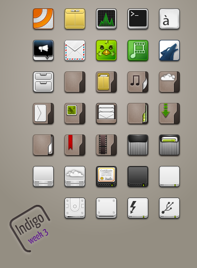
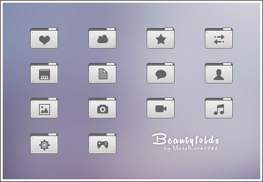
Week 1:: Not much to write home about...>Folders, some apps at 48x48px.
Week 2 :: Spent a great deal of time cleaning svgs, refactoring into managable bits. got anal retentive about curves and alignments.
Week 3 :: Spent this week making some, what-do-you-callem, pancakes... wait no, icons. also made logo for project.
Related content


Comments: 45

👍: 0 ⏩: 0


There are few icons missed - for home, templates, desktop and publicshare. After that this icon set can be easy merged with Faenza/Faience icons, so you don't need to draw ALL icons.
I hope, it will be released one day
 (Smile)")
👍: 0 ⏩: 1
And i think, this is great icon set
👍: 0 ⏩: 0


The best freaking icon theme i ever seen on deviant art and its not even finished
I really hope the author hasn't abandoned this cuz its freaking awesome man.
")
👍: 0 ⏩: 0


Just beautiful, I'm just so lazy to convert all of them to .ico somehow XD makes me wanna install some linux, too bad I always uninstall them after some days.
👍: 0 ⏩: 0

Thanks for the awesome icons
Use it here in this Vs preview --> [link]


👍: 0 ⏩: 0


Will you keep the project to make a full icon set? Please, do it, cause I love it. Very good work.
👍: 0 ⏩: 0

WOW I love it, brown colours that still remain very modern. But are you still working on them?
👍: 0 ⏩: 0


keep this work dude, it's a great iconpack, congrats.
👍: 0 ⏩: 0


 (Wink)")
👍: 0 ⏩: 1

other sizes are definitely in the plan

👍: 0 ⏩: 0


could be a while, feel free to checkout the git repo though
👍: 0 ⏩: 1

can you send me link to this repo ?
👍: 0 ⏩: 1


look very good. Just a couple of sugetions.
1. Try using a linear gradient instead of a radial in the folders. If it looks better cool, otherwise keep the radial.
2. Straighten the music note. Just looks wierd tilted like that. Your other icons are so squared that the tilt looks funny.
8. On the chat icon, (with the microphone) and the wolf icon (idk what app thats for) either flip the gradient, (light to dark not dark to light) or do something entirely differerent for the gradient color (silver?) The glossy does't match your set very well. More Applesque and less unix looking. Over all, nice icon set!
Four stars! * * * * °
👍: 0 ⏩: 1
Awesome feedback! I will try these things, thanks so much!
👍: 0 ⏩: 1
No prob! Keep up the great work!
👍: 0 ⏩: 0

Great icons, I see a lot of potential. I hope you release more.
👍: 0 ⏩: 1
thanks! Planning on releasing more
👍: 0 ⏩: 0


Awesome! I'm currently using it (:
whisper: Opera icon please!
Thank you!
👍: 0 ⏩: 0

Very nice... Could possibly be looking at my next icon theme once it's more complete.
Keep it up mate. Great work!
Cheers,
PL
👍: 0 ⏩: 0

")
