HOME | DD
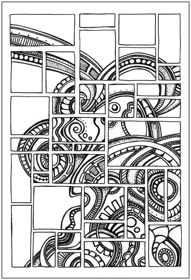
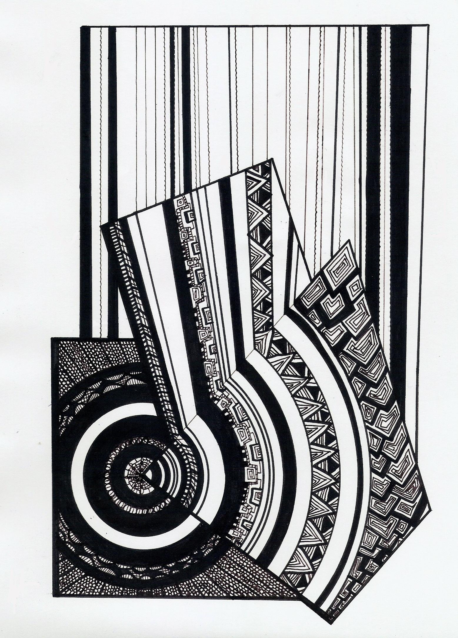
 Itsuo — Fragmentations
Published: 2005-10-11 04:56:35 +0000 UTC; Views: 3708; Favourites: 81; Downloads: 170
Redirect to original
Description
Something that I had thought about doing this summer but hadn't gotten around to till this week. I thought maybe I should fill in all the squares, but I think I like some of the empty space.Related content


Comments: 57


I love this work. The pattern almost feels connected between blocks as I look through the piece, but it is just perfectly dissimilar that it sits on the brink of being consistent.
There is a great mix of block sizes that adds a lot to the piece.
Great stuff!
👍: 0 ⏩: 1

Thank you very much, I appreciate the comments
👍: 0 ⏩: 0


Go for it, I always get inspired from all the great work here!
👍: 0 ⏩: 0


This is fantastic! i love the flucuation in design within each little square. Very unique and ...no doubt time consuming.
👍: 0 ⏩: 1


It happens once in a blue moon!
👍: 0 ⏩: 1

very cool... i'm still trying to figure out how i missed these pieces... this is wonderful!
👍: 0 ⏩: 1

Dude, I love your style! I'm getting inspired just checking out your gallery.
👍: 0 ⏩: 1
Thanks
Thats what I love about DA, all the exposure to so much different styles. I know it has had a definite impact on my own art.
👍: 0 ⏩: 0
I--blank--I [2005-12-19 11:08:44 +0000 UTC]
this is the best I've seen from you yet. The structure is amazing. I'd definately leave the spaces blank.
I love how it flows between the tiles/squares. At first you think it's just a picture which has been broken up, but looking closely it's so much more than that. Every square is unique but they all fit together perfectly.
👍: 0 ⏩: 0


I like the empty space too. This is fantastic... I love the idea, and you've done it so well. It's very clean and somehow "free"... even the boxes look free, its hard to explain. Maybe because you didn't use a ruler ")
👍: 0 ⏩: 0

geeeezus. so many comments mine shall never recieve attention!
this is an awsome piece of work. no wonder. makes me feel *insanely JEALOUS at the fact i hadnt thought of this before you  (Smile)")
the line work is incredible. was there any draft? im so gona fav this ")
")
👍: 0 ⏩: 1
Thanks for the comments and the Fav!
I don't generally do drafts, although I did put some faint guide lines in pencil for the boxes. The designs in the middle I did free hand once the boxes where inked in.
👍: 0 ⏩: 1

I really like this. I couldn't exactly tell you why, or anything. But smoething about it just says, hey I like this.
👍: 0 ⏩: 1

woah. i'm mesmerized. and believe me, that's no small feat.
the separation makes it look so...brick-ish.
i love.
👍: 0 ⏩: 1
Thanks!
I was going for the brickish, tile mosaic look
👍: 0 ⏩: 1

Love it. If it were on a cavnas and 4 feet high, I'd buy it!
👍: 0 ⏩: 1
Thank you.
I have never thought about doing anything bigger, biggest Ive ever worked on is 9" * 12".
👍: 0 ⏩: 0


I really love this one, the fragmentation was an excellent idea, although it doesn't have a meaning to me it makes all the sense in the world (hope you see what I mean), for me one of your best 
👍: 0 ⏩: 1
Hmm...well to be honest, Im not %100 percent sure what you mean, but that is the thing I love about abstract. It has different meaning to different people depending on their own personal experiences, views, or whatever
👍: 0 ⏩: 1
exactly  (Wink)")
👍: 0 ⏩: 0


wow. seriously. this is by far the cheif of your arts. you combined like everything you've bee working on and made this MASTERPEICE. it looks AWESOME. the layout is amazing. congrats!
👍: 0 ⏩: 1
Thank you!
I don't know about masterpiece (I think you are only allowed one of those in a lifetime
Thanks again
👍: 0 ⏩: 0

I think this is your best work that I've seen. You should leave it as is. By doing this you are playing asymmetry against symmetry. The patterning is much like your other works, which tend to be symmetrical, but by leaving the design as it is, you have a form that is symmetrical in its basic design, off centered leaving a single strip coming up and off the page at the top left, which balances out the mass in the bottom right. This allows for a very intriguing work. Thumbs up. Good job man.
👍: 0 ⏩: 1
Thank you for your comments. Its funny when you talk about asymmetry vs symmetry, because I generally tend to draw by instinct and do not generally consider the basic elements of art. THis drawing I did stop and plan a little of what I was going to do and then let instinct take over. Maybe its time for me to look a little deeper into what I am doing, it could prove interesting
👍: 0 ⏩: 0
I think this is your best work that I've seen. You should leave it as is. By doing this you are playing asemitry against semitry. The pattening is much like your other works, which tend to be semitrical, but by leaving the design as it is, you have a form that is semitrical in its basic design, off centered leaving a single strip coming up and off the page at the top left, which balances out the mass in the bottom right. This allows for a very intriging work. Thumbs up, Good job man.
👍: 0 ⏩: 0

This one is really cool.
I like it the way it is.
👍: 0 ⏩: 1

| Next =>