HOME | DD
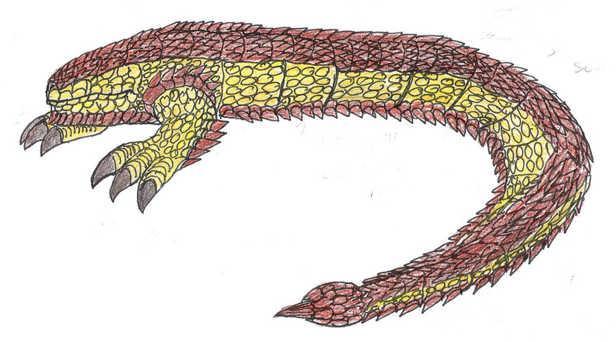
 JacobSpencerKaiju79 — Gezion-Colored Study
Published: 2010-03-26 00:51:25 +0000 UTC; Views: 563; Favourites: 14; Downloads: 7
Redirect to original
Description
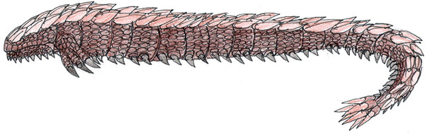
This is the second colored drawing of one of my kaiju. This happens to be one of my popular ones called Gezion, a reptilian worm. this is also the second attempt at coloring this guy, the previous one is right here [link]Colors:
Armor plates/spikes: Brown with orange highlights
Main body: Tan with yellow hightlights
Claws: Black with brown hightlights
So, what do you guys think?
Related content


Comments: 19

looks good .
does he rear up like mothra larva or like a snake or is he a crawler ?
👍: 0 ⏩: 1

He crawls, mostly. He can kind of leap forward however.
👍: 0 ⏩: 0

MM likes him a Gezion. For some reason, its one of my faves of your series.
👍: 0 ⏩: 1
And what's wrong with the rest of my monster cast?
I guess he's just so unique, even if he's a semi-minor kaiju.
Thanks
👍: 0 ⏩: 0

Very impressive design, I especially like the color scheme. He certainly has improved over the years.
P.S. May I draw him?
👍: 0 ⏩: 1
If you want. Thanks either way.
👍: 0 ⏩: 0

U should color your deviations more often... they look a lot better that way

👍: 0 ⏩: 1

I have to say, I like this new color scheme a lot better. The yellow/brown combo looks more interesting. Good job on it!
👍: 0 ⏩: 1
Actually, it's suppose to be tan, but it comes off as looking like yellow.
👍: 0 ⏩: 0

While the color on both of them is just fine, I'd try working some shading and value differences in there so its a bit more 3 dimensional.
-RenDragonClaw
👍: 0 ⏩: 1
I hate shading, but I could work it out.
👍: 0 ⏩: 1
....o_0...shading is one of those things that are pretty necessary dude. My old art teacher harped me for the longest time about it.
-RenDragonClaw
👍: 0 ⏩: 1
I know shading is a important thing for art. I just saying it's not my favorite thing.
Do you think I could get away just darkening the areas?
👍: 0 ⏩: 1
You can try it out and see if it makes a bit of difference.
-RenDragonClaw
👍: 0 ⏩: 1
