HOME | DD
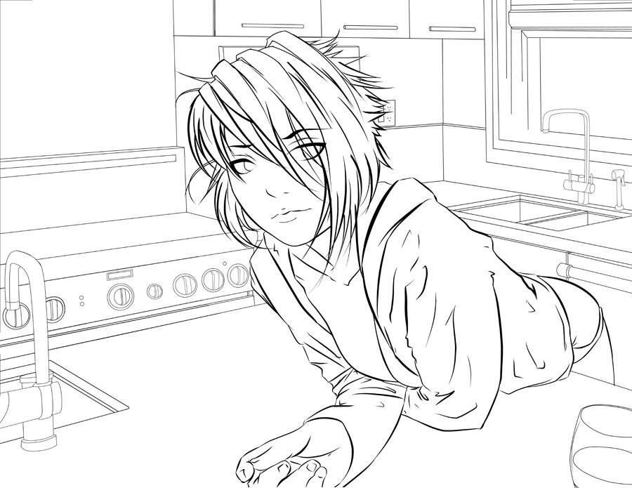
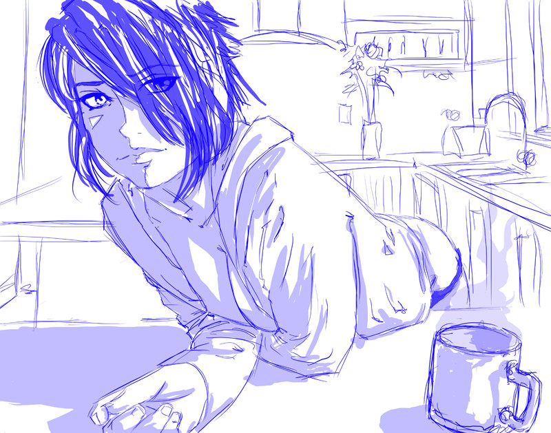
 jadeedge — Morning Sunshine -LINEART-
by-nc-nd
jadeedge — Morning Sunshine -LINEART-
by-nc-nd
Published: 2008-03-26 18:29:29 +0000 UTC; Views: 13942; Favourites: 384; Downloads: 0
Redirect to original
Description
I did most of this at Anime Boston in a vain attempt to finish it while i was there. (Quite a few people were asking for the finished version.)I should have the colored version up in a day or two.
I changed the perspective of the BG to match the girl more. it's still a bit off... i'll just have to rely on color to fix it :d
any crits before i color?
EDIT: Fixed the BG again and added a couple more tweaks...
 to and .
PLEASE DO NOT COLOR!
I encourage people to color my fanart, but when it comes to originals, i'd rather not see other people's interpretations.
Related content


Comments: 59


I want to color T_T
/cries
Is wonderful cant wait to see it finished
")
👍: 0 ⏩: 0

It's awesome! I colored it for a friend, and then I read the "DO NOT COLOR" thing after. XD Sorry...I didn't upload it to DA though. So you're cool.
")
👍: 0 ⏩: 0

You used manga studio? YES!!! im going to be buying that at AX next month!!!! I love your line art. I want to have my line art as clean as yours. I cant wait till I get that software.
👍: 0 ⏩: 0

I love how whenever I type out a giant critique for your pictures, my computer gets all fuckered over and I never bother to retype them again. << With my luck, you've colored this already.
Some things about the perspective seem off...it begins with her head looking like it's just too large. Even for the perspective, unless you cropped out more of the background, it's just too prominent. With her breasts, unless they were absolutely gigantic (in which case, her arms couldn't be as close together as they are,) then you would actually see at least some areola, no matter how far down her arm was pushing them. Her head seems a little narrow; I think she needs a higher volume of hair on her left (our right) side, to give the skull its fullness. And the crease between her hipbone and leg would be farther down; her butt is too narrow for that pose there.
I hope that helped.
👍: 0 ⏩: 0


what did youy do to learn how to use photoshop i need some help heheh
👍: 0 ⏩: 0


wow your lineart looks soo amazing everytime! I cant wait to see the finished version!
👍: 0 ⏩: 0

 (Smile)")

lineart is amazing. Everything's smooth and crisp.
((someone may have mentioned this before but I'm not gonna look through the other comments x_x so my apologies if said so before))
Something seems 'off' with the right side of her face. Maybe where the eye and the eyebrow is positioned idk I can't place my finger on it.
Other than that, as I've said before it looks gorgeous and such. Lovely work as always =]
👍: 0 ⏩: 0

Perfect this time! like she's really in there, it fits! good job
👍: 0 ⏩: 0

lucky you got into anime boston?!
i went and we didnt go in because we didnt pre register like idiots....then we got mugged
how was it?
and i really like the lineart. can i color it when im done with some other projects?
👍: 0 ⏩: 1

eww... muggings suck. it was pretty much a 10+hour wait for regular registration. so, be glad you didn't have to collapse from dehydration.
thanks for the interest, but please dont color this one. i dont mind my fanart being colored, but sometimes id rather have my originals be the only ones floating around.
👍: 0 ⏩: 1
okk no problem
uugh a ten hour wait?
the line i was in was 2 and a half and then we had to go into the regular line...
next time im camping out or something cuz i want in lol
👍: 0 ⏩: 1
best advice: go early. get there at 7am-ish. cause no one wants to get up that early.
")
👍: 0 ⏩: 1
ill be 18 by then so ima camp out lol
screw getting mugged ima keep my money in my bra and camp out.
bwahahhaa no one try and stop me!!
i will also register early
XD
👍: 0 ⏩: 0


I love the perspective of the girl. =] Especially her hand. It works really well with the background. haha, She looks so tired. Yea um.. haha Sorry I don't have anything super-constructive to say.
👍: 0 ⏩: 0

It looks great ^^
But the face looks like a guy =\
No offense. I love your work.
👍: 0 ⏩: 0

So how did you manage to change the perspective?
Have you redone all the lineart ? I'm curious ..
Graet job.
👍: 0 ⏩: 1

You probably don't want to hear this, but I think the perspective of the stuff in the background looks seriously weird now. The knobs on the oven look huge, and that countertop looks higher than the one she's leaning on, and it looks like there's almost no space between the two. On the other hand, the sink behind her looks too small. And the round objects (taps and the water jug) still look distorted.
👍: 0 ⏩: 1

Quick question; when you've finished it, would you mind if someone colored it using the finished one as a guide to color in the lineart?
👍: 0 ⏩: 1
i'd rather people not color my original work, unless i give the "ok". there are some pieces i'd like to keep to myself 
👍: 0 ⏩: 1

In a word...Sexy. Not even sexy. Smexy!
Keep up the nice work, man. I'm looking forward to the one with the Girl with the umbrella.
👍: 0 ⏩: 0

wow, pretty! I like how the lineart differs in thickness and how the background is in grey.
👍: 0 ⏩: 0

How in the world did you do the background and the fixtures and all that?
It looks too perfect for hand, almost as if it were done in some AutoCad program.
👍: 0 ⏩: 1
it was done with Manga Studio EX3's perspective rulers.
👍: 0 ⏩: 1
Ah yes, I've heard of Manga Studio.
Though how does the program compare to a program like Photoshop?
👍: 0 ⏩: 1
fairly similar... but takes a while to get the hang of it.
👍: 0 ⏩: 1
sweet job~ a great thing to wake up to
really dig the linework and the BG is tops
my only crit is the same as my last crit i gave you
she looks HUGE in her surroundings
👍: 0 ⏩: 1
i agree. this is what happens when i do the BG after the focal point. *sigh*
i may have to shrink her down even further, but i'm worried i will lose the perspective element. (which is the main theme.)
oh well... i'll try resizing again. i'll see if that works.

👍: 0 ⏩: 1
haha your lucky you made the BG so well, so all it needs is a resizing and not a re-drawing~
but you nailed it anyway~
👍: 0 ⏩: 0


I love it
just one comment, plz!
you can just erase that right eye under the hair
👍: 0 ⏩: 1
i did have it erased in the beginning. but it made the character seem unbalanced. so i decided to keep it, for the time being.
👍: 0 ⏩: 1
oh, kay ^^
don't worry, its just my opinion
👍: 0 ⏩: 0


her chest doesn't look so right
and her face seems a little too big
👍: 0 ⏩: 0


How did you do the background? It looiks almost rendered.
👍: 0 ⏩: 1
| Next =>