HOME | DD
 jake — bland v2

Published: 2003-07-22 14:10:04 +0000 UTC; Views: 1460; Favourites: 5; Downloads: 599
Redirect to original
Description
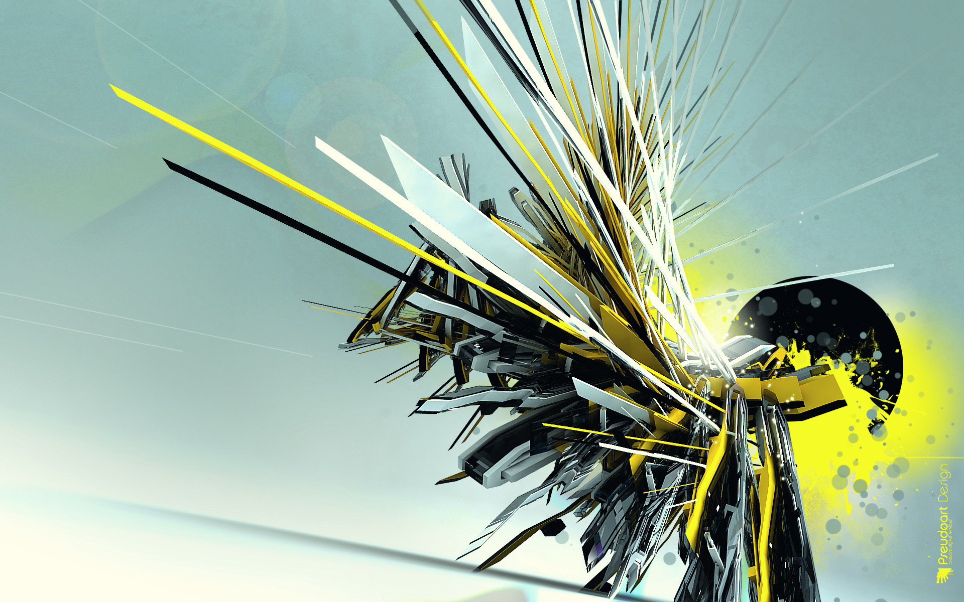
Another version of Bland. Actually, this one was done from scracht, but since they are so similar, I elected to call this one Bland as well. It turned out not quite as good as the first one, but still good enough, I think.Related content


Comments: 12


i really like it! the red line~ and how it looks techy :3
👍: 0 ⏩: 0

wow - very tasty. I can't look at it for long though. I had Bland v1.0 as my desktop for weeks, and the direction of this one is opposite...feels all wrong LOL. Great pic though. clean and smooth.
👍: 0 ⏩: 0

 (Smile)")

i like the monochrome parts, i'm a sucker for clean things like this.
👍: 0 ⏩: 0

nice piece, i like the element of random placement and ideas, it turned out very cool in my opinion, nice work and i'll have to check out v1... and maybe everything else you've done
👍: 0 ⏩: 0

Looks very pure, I think I would have prefered it without the three rectangles down to the left, or if they all had the same color, blue preferably.
👍: 0 ⏩: 0

Actually a second look yearns a few different things...
The abstract part is just a bit on the strong side, color wise, though it looks excellent compared to before!
I just took this into photoshop and lowered the brightness and raised the contrast and what a difference! It needs a little more contrast going on to pickup all those subtle details... plus it's a bit bright for a desktop background as the icons/text can become difficult to read.
It's turning into more of an illustration then a desktop background becuse their isn't a great place to throw your icons like the orginal - so I'd think about that.
Overall it's another overwhelming and if you make a Bland V3, you can bet your talented ass I'll likely love it and make it my desktop background as I have with these two.
I think you've really opened the can of beans to a new genere of art, and I hope the trend follows on
Infact you've inspired me so much I am going to learn howto skin for StyleXP so I can create a theme to match a gorgeous, clean desktop like this.
Have a great day as always!
👍: 0 ⏩: 0
I have a few things to say again...
It is sharper, the lines are more well defined - Big Plus
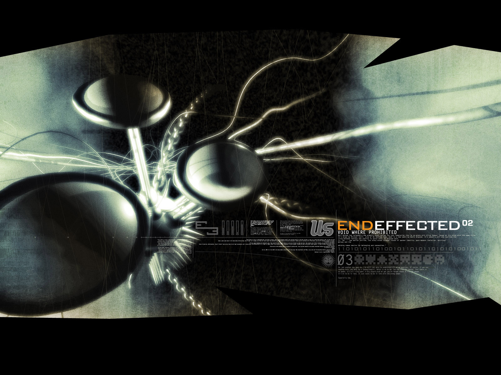
The abstract rendering has been implemented flawlessly, it has a feeling of vector to it along with a well defined color scheme that adds to the peice - Huge Plus
It needs more well defined panels, as the current ones just flow into the layout just a bit too much but it's definitely not a problem - Neutral
I noticed the red changed! Big difference... flows much more seemlessly - Big Plus
It has some pixelation among some areas, I am not sure if it was intended but I really dislike that - Minus
The 3D render is even sweeter now, I love the new industral feel it gives meanwhile retaining that high tech futurstic presence in the image - Big Plus
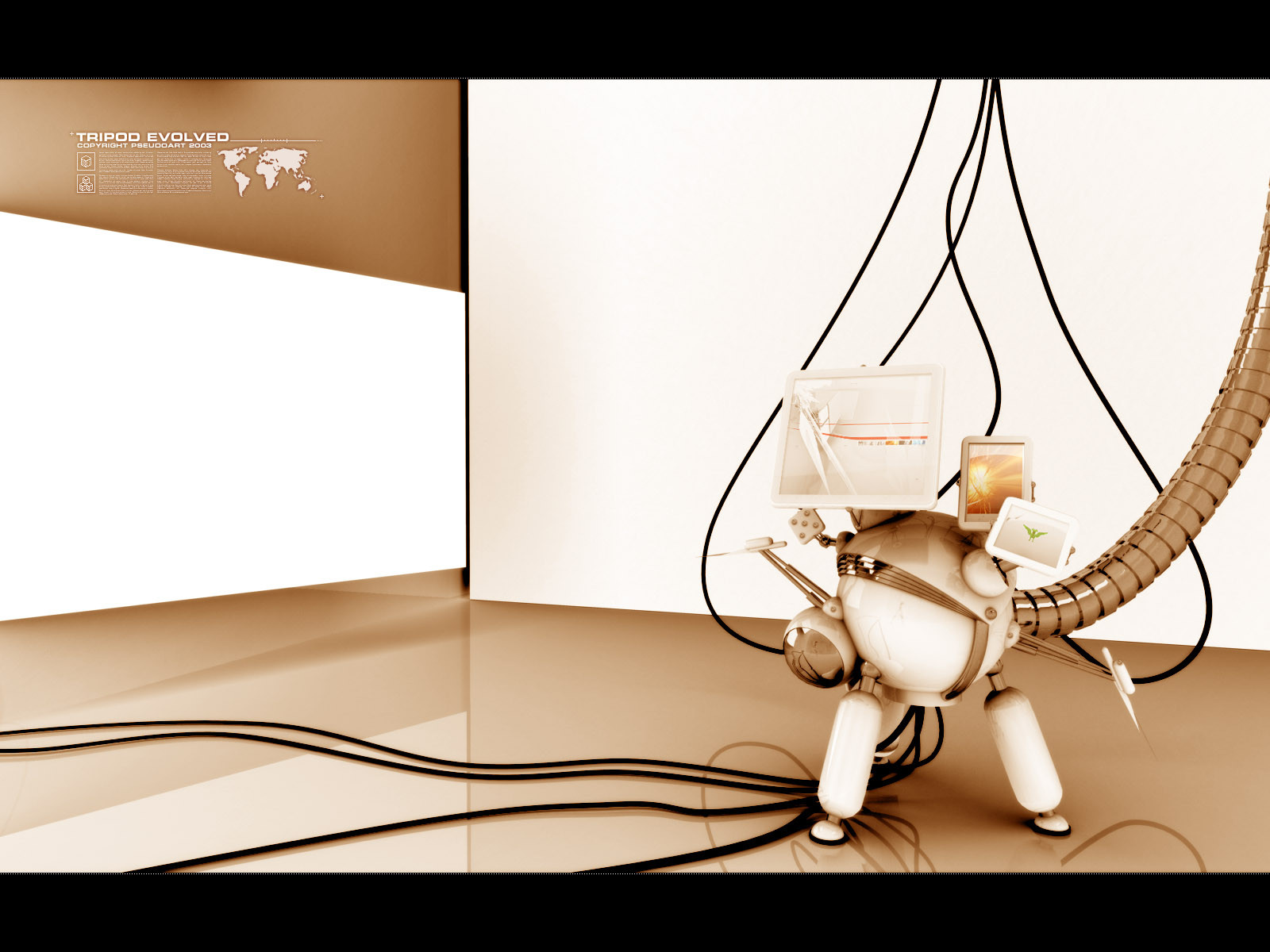
The Picture 'cubes' go into the flow more now - Plus
Recommandations? I'd get more 3D going on, more wires... wires would be good, I'd also like to see more industrial stuff around the 3D render, thus giving it more prescence.
I'd like to see a little more color going on, perhaps a pattern with the pictures towards the top... infact I think that'd be really cool if some of those were colored and a color pattern would really add to it IMHO.
Your losing that "cleanness" of it a little bit with so many little subtle details, so I'd personally back off from those.
I'm not sure it's an improvement, it's just different, it's a alteration would be the correct word I think. It's just as good as the first!
👍: 0 ⏩: 0

like it, much clearer than the first, i like the spacy structure, a good impression of depth you created here.
👍: 0 ⏩: 0

oh wow, thats amazing, i love this image, worthy of a favourite!
👍: 0 ⏩: 0

looks really cool. i like your 3d work as well as your 2d stuff. keep up the great work.
👍: 0 ⏩: 0