HOME | DD
 Janusart — 020 - Step by Step 11
Published: 2014-06-02 18:28:44 +0000 UTC; Views: 727; Favourites: 15; Downloads: 4
Redirect to original
Description
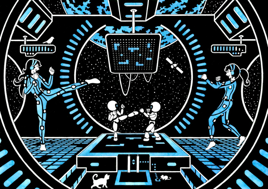
step by step of ''Synchronisation Complete... Then Let's Go!''Composition steps:
For this drawing was to break up the rectangular shape of the drawing to get a more futuristic style. This means, get more curves than lines in the background. I then wanted to invent a game with it's own rules. Only problem with my idea, as there are 3 ''grids'' (16 by 16) that represent the same information, but in different ways, it was very hard to balance the overall composition and colors as moving/changing one element had consequences on all 3 grids (it's hard to explain). In a way it's like with the exposure in photography (I'm new to it), you've got different parameters, and moving one indiviidual parameter can mean resetting others. Those were the composition problems that explain why I spend more than 60 hours on the draft (yes I calculated the time ^^) ...
Creation steps:
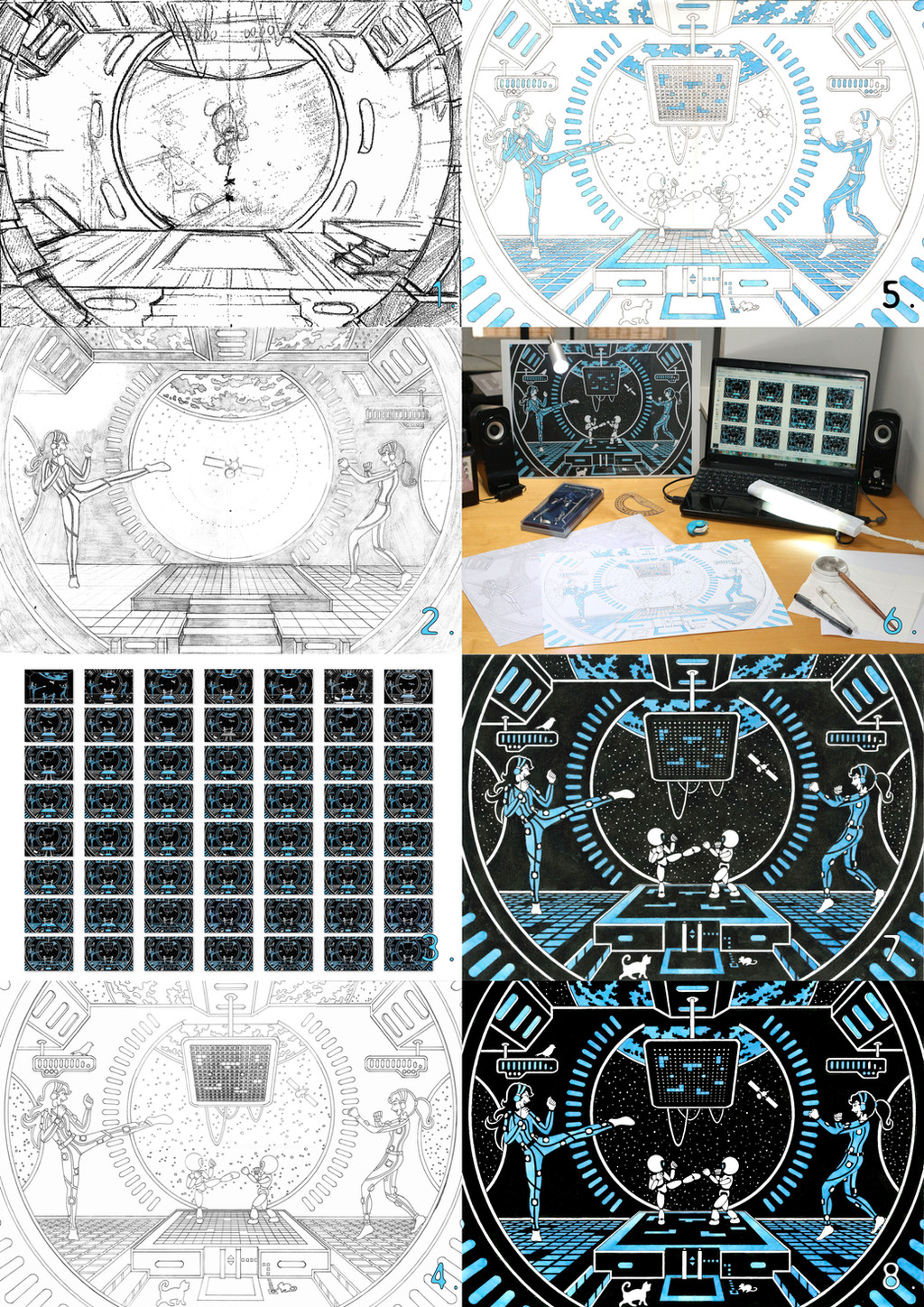
I started by making a very quick A5 sketch to get the general background shape (1). I then created the characters in A4 size (always larger than the final size to work out the costume details and the face expression (which is critical in my drawings as the face is only one thin curve, if it's off by 1 mm, the face can be completely failed. I then created a more detailed background and included a draft ot the characters to get a sense of the room dimensions and work out the size of the steps, cat ... (2). The came the funny part: I made simulations of colors/ character placement/grid information. No real strategy, just trying out things over and over again until I found something that ''looked" interesting. (3) is a selection of versions that I created, but I must have made more than a 100 different things, from simple to very big changes. Onces everything is set and everything is decided, I start the lining (4), this was horrible to make because of all the curves, the size of the circles. and the precision that was needed to make the seperations between the ground-panels and ''pixel dots'' on the center screen. Coloring went perfect even if I took a few hours to train with my new blue ink and find the right dilution (5). (6) is a picture of my current work station. A A3 print of my final simulation in front of me to (try to) avoid any mistake and different light sources to remove ruler shadows that I can mix up with lines. Then came inking ... terrible (I was tired and made lots of mistakes and ink stains that implyed removing/changing elements of the drawings (7). I'm not proud but I could have done worse (ink wrong panels or ink the small 2 by 2 mm pixels in the center screen). (8) is the classic digital color/contrast enhancement of the A3 scan of the picture to get the dark black and ''marble'' texture of my ink.
If you have any other questions, don't hesitate !