HOME | DD
 Janusart — Synchronisation Complete... Then Let's Go! (Inked)
Published: 2014-06-02 18:21:47 +0000 UTC; Views: 1466; Favourites: 63; Downloads: 13
Redirect to original
Description
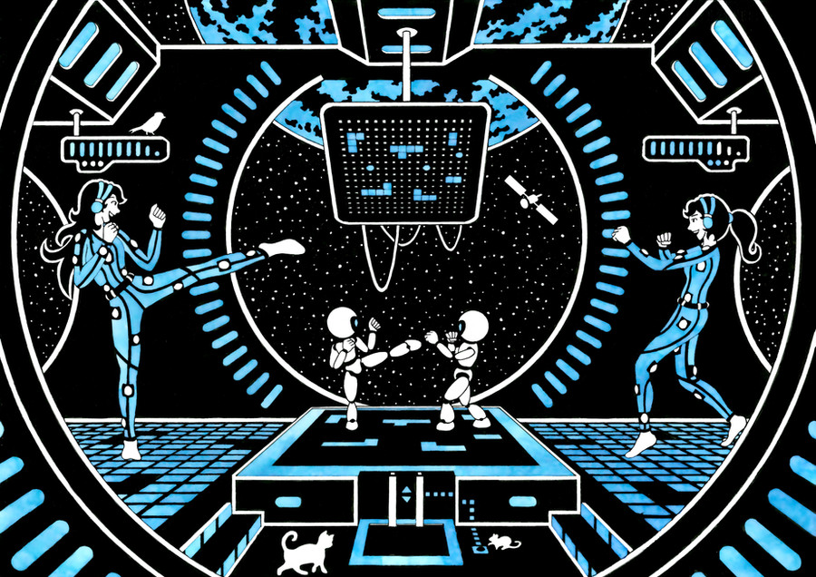
Hello everybody, After a very very long time I’m back ^^ with a new drawing ... It’s Blue !
This drawing is an entry to a drawing competition entitled ''Koko to Asoko'' organised by the organisation ''Walking art'' for a convention in Paris (Japan expo) .The theme was the interaction between man and robot and drawing had to be blue or orange, which explains why I had to change from my classic red ink. I decided to go for a funny interpretation hoping to contrast the other pieces that I anticipated to have a dark ‘’ambiance’’. The entries can be found at: www.kokotoasoko.fr/index.php?i…
Drawing this proved to be very tricky: as all 3 grids represent the same information, balancing the colors was very hard. Furthermore I had to learn to use my new giant compass as well as my new blue ink that does not behave like the red ink and that needs to be diluted. But fun to draw overall, I especially liked adding the funny situation between the cat and mouse, but not sure people will get it ...
I’ll update the page in about 2 weeks to give the results.
TIME: draft: 65h, lining : 19h (this was horrible...), inking: 13h30 (2h30 for red)
TOOLS: technical paper CANSON A3, indian ink, 0.05 liner STAEDTLER, Blue Drawink Ink MAJUSCULE (1/8 diluted)
3 important stains, 1 that I could hide with white pen and for the 2 others I had to sacrifice some details ...
Step by step of the drawing (more detailed that usual) available here:
------------------------- FRANÇAIS -------------------------
Et voila, enfin du nouveau ^^!
Dessin réalisé dans le cadre du concours ''koko to Asoko'' organisé par l'association ''Walking Art''. Le thème était l’interaction et le lien homme/robot avec une réalisation A3 noir/blanc + soit bleu soit orange. Le 15 juin je saurais si je suis sélectionné pour être affiché au salon ''Japan Expo'' et si oui les visiteurs pourront voter les jours pour choisir leur dessin préféré! Autres dessins du concours: www.kokotoasoko.fr/index.php?i…
J’ai voulu présenter une vision joyeuse et humoristique (fidèle à mon style) de cette interaction pour espérer contraster avec les autres œuvres que j’imaginais (à juste titre pour la majorité) être très sombre. Ci-joint le paragraphe d’introduction que j'ai présenté pour le concours:
''Deux équipes se font face pour un combat qui se joue en trois ‘’rounds’’. Deux binômes homme/robot : l’un décide avec ses neurones, l’autre agit avec ses pistons. Attention à bien synchroniser ses mouvements… et attention ou l’on met les pieds (ce qui n’est pas uniquement valable pour les bipèdes) !
Si vous avez bien compris les règles et si les participants en chair et en fer sont prêts, alors 3…2…1…, que les meilleurs gagnent !''
EDIT: cette année c'est bon je suis sélectionné ^^, rendez-vous stand BB33 à Japan Expo 2014 pour soutenir mon dessin !!!
Related content


Comments: 22


Originality
Vision: I love the very.. I don't know what to call the style of art, really. At first it looks so simplistic, minimalistic, and then you actually look at it, and, it's so Detailed!
Originality: Looks very Tron-Ish, however, going back to the Vision, it's so detailed!
And there's the fact that you're pulling the classic "Robot VS Robot controlled by movement" Gig, it just takes away from some of the picture, if you get my feel?
Technique: It seems as if you coloured everything majorly blue, again giving it a more Spacey feel somehow. Then you coloured over the blue, with a lighter blue, in a puffier brush, to make it although it was glowing. Very /cool/ indeed. (Badum TSS)
Impact: I do believe that this is the overall impact of the picture? I give it an overal 4.5/5. Great Job with this picture, It's rare I write Critiques.
👍: 0 ⏩: 1

Thanks a lot for taking the time to write this very precise analysis. I really appreciate the ''vision'' part you wrote, as it reflects exactly what I am looking for: getting in a lot of details but keeping them in harmony to provide this very strange simplistic look.
For originality, I agree about the general robot VS robot concept (even if I saw the movie real steel during the creation of the piece ... really sad to see a movie almost had the exact same concept...), I therefore tried to add the grid concept to make the game more complex that simply a battle.
For technique I actually only ink once in blue (before adding black). But the ink is very tricky to use and doesn't spread well. But I learned to use it to get this marble glowy look that I love.
It's great to get constructive feedback, really helps to improve!
👍: 0 ⏩: 1
Happy to help. As I said, I don't write critiques very often, because when I do, I sit there for like 5 (very poetic) minutes, writing them.
👍: 0 ⏩: 0


Extra ^__^ b! Je n'arriverai jamais à une composition si propre et organisée => je pars d'un mini brouillon tout pourri, puis je passe directement sur la feuille finale et je modifie au fur et à mesure. Ce qui fait que je n'ose jamais montrer le "step by step", tellement je suis bordélique et peu "pro" xD! En tout cas, j'espère bien que tu feras partie des sélectionnés cette année!
👍: 0 ⏩: 1
Merci de faire un tour ^^. J'avoue que je suis un peu un maniaque de la composition et l'emplacement de chaque élément est littéralement millimétré sur mon dessin ... par contre aucune improvisation possible quand je commence la réalisation, et du coup, en cas d'erreur d'encrage .. c'est la catastrophe (ça a été le cas 3 fois sur ce dessin et j'ai dû retirer des détails). Mais pour tes dessins j'arrive pas à me dire que tu les improvises au fur et à mesure ... le résultat est toujours super bien équilibré!!! On croise les doigs pour les résultats (même si j'ai peu de doute sur ta sélection ^^)... Il y a vraiment plein de styles différents cette année.
👍: 0 ⏩: 1
De rien, c'est toujours un plaisir de visiter ta galerie!
Hahaha, je vais taire les secrets de production, sinon tu risques de faire un arrêt cardiaque tellement je suis "approximative" lol
Je pense que je suis très peu patiente, donc je n'ai absolument pas le courage de faire des étapes très propres comme toi.
Ne sait-on jamais, j'ai effectué la colo à la "barbare" vu que je manquais de temps =_=...
Oui hein, c'est chouette de voir de la diversité ^__^
👍: 0 ⏩: 0

Fab work. I particularly like the cat and mouse touch at the bottom. :-D
👍: 0 ⏩: 1
haha, thanks for noticing. I always try to add a funny detail in my drawing, this one with the cat and mouse is perhaps the most hard to understand, I hope you got the joke ^^
👍: 0 ⏩: 0

I love this style, great use of minimal colours
👍: 0 ⏩: 1
Thanks a lot, really happy you like my style ^^
👍: 0 ⏩: 0


I like your style and ideas! This one reminded me a bit of "Tron"
 (Wink)")

👍: 0 ⏩: 1
Thanks, I actually didn't think of Tron, but there might be some ressemblance
👍: 0 ⏩: 0


thanks, it's hard to find original concepts ^^
👍: 0 ⏩: 0