HOME | DD
 jasonhohoho — Sons of the Bat... Part 2 (of 5)
Published: 2012-08-30 06:58:22 +0000 UTC; Views: 8951; Favourites: 256; Downloads: 0
Redirect to original
Description
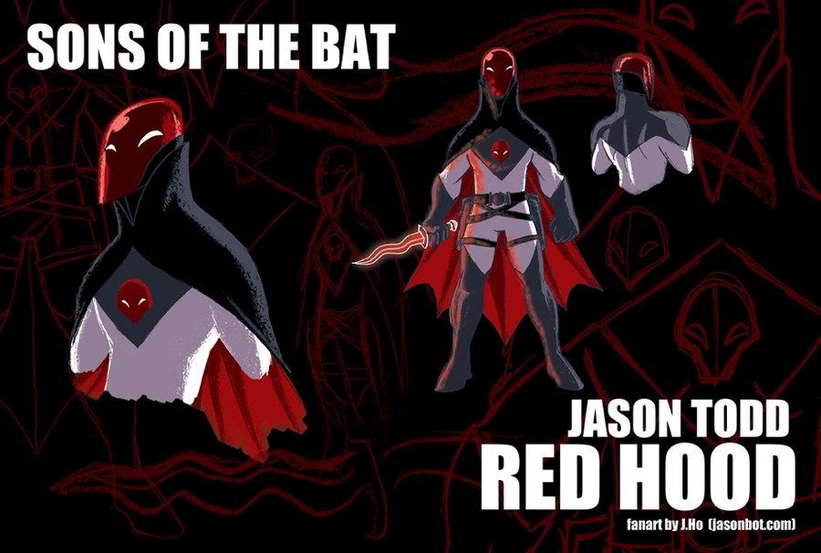
Also posted on my sketchblog: [link]Up next is the troubled Jason Todd , AKA Red Hood:
- Age: Mid 30's
- Whatever may have transpired in the past, Jason has found some degree of redemption and inner peace, and he's now 'back in the fold,' as a trusted member of the Batman family. However, he's definitely the "Wolverine" or "Raphael" of the group--a maverick who does what he sees fit and frequently comes in conflict with the others.
- This probably doesn't qualify as a re-design, really it's just a minor tweak of the Frank Quietly-designed Red Hood costume. To me, the white, black, and grey represent the ill-defined boundary between right and wrong, which plays into Jason's persona perfectly. The red symbolizes Jason's connection to both the Joker and Robin, but also represents the violence in Jason's life.
- I did however change the emblem on his chest from a skull to a more abstract face. It's meant to invoke the "face" that was often found on Batmobiles (and other Bat-vehicles) of the 40's and 50's. Just a little something to tie the design closer to Batman's visual motifs.
- In imagining a rehabilitated Jason Todd, his appropriation of the Joker's former identity as Red Hood is even more powerful. I'll probably always think of The Killing Joke as the definitive Batman story, so the poignant irony of Red Hood as a 'good guy' really strikes a chord for me.
- His kris is a hard light construct, and a nod to his past connection to Ra's al Ghul and the League of Shadows. No longer armed with pistols, his holsters hold non-lethal weapons--perhaps a dart gun and a taser?
I should mention that the pieces in this series are colored with a Photoshop gouache brush setting that I picked up from an excellent tutorial by which you can find here:
I'm having fun with these, so I hope you're enjoying them as well, dear reader. I would say tune in again, same Bat-time, same Bat-channel, but I've been posting so erratically, I can't guarantee the time. But I guess it is the same Bat-channel no matter what. Listen, I'm over-complicating this. Just come back soon, okay? THANK YOU!
Related content


Comments: 8


i like the design but just not for the Jason's red hood...
i do not see him in tights.. i liked the design from the animation under the red hood best...he looked good with the jacket..without the jacket..even without the red helmet and just the domino mask on...
not sure about the kris either...maybe too lethal...i can see him using a gas gun like sandman or something...i also like the tazer idea...
👍: 0 ⏩: 1

i think the reason i like the frank quietly costume is because it's so goofy and so superhero-y. whereas most people like to make the batman universe more and more serious, i like to see his world really tied into the craziness of capes and tights!
")
👍: 0 ⏩: 1
cannot argue that point...so jason trying to different goes the brighter costume...i cana deal with that
👍: 0 ⏩: 0

i love that phrase, "pop pulp." i just might have to borrow that some time!
👍: 0 ⏩: 0