HOME | DD
 JaziSnake — REQUEST: In_The_Gloaming

Published: 2009-08-28 20:09:33 +0000 UTC; Views: 476; Favourites: 17; Downloads: 4
Redirect to original
Description
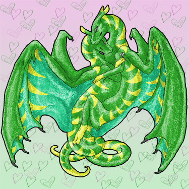
Request from [link]
He asked for a dark and masculine dragon with interlocking male symbols on the thigh, so there we go. Experimental shading on the inner wing.
Related content


Comments: 21

My only question is where the other arm is XD;
Sorry, I have bad eyes.
I still envy your spriting skills though D:
👍: 0 ⏩: 1

Nonexistant because it was being a pain ;D
And bah, nothing to envy D= Still got a ways to go before it's good enough for people to envy.
👍: 0 ⏩: 1

Oooo O_O very cool. I love the super dark purple and blue!

👍: 0 ⏩: 1
Thank you so much <3 *flail*
👍: 0 ⏩: 1


It looks looks pillowy agaiiiiiinnnnnnn -flails-
I do like the colors though. Especially the contrast of the darks against the bright symbols o3o
👍: 0 ⏩: 1
Crystal I really don't know what you mean by pillowy D= I am following a light source and toning the muscles, so it shouldn't look pillowshaded at aaaaaaall D= *flails*
👍: 0 ⏩: 1
It might be the contrast but it looks all... ASKADAJAFLDBBDSJKHLDSHLLLNKNKNJSJDKS
;-;
Ill have to see you in person to explain it right
👍: 0 ⏩: 1
I think you're disliking my contrast =U Cause I'm sure it's not pillowshaded XD I like mah high contrast thank you o3o
👍: 0 ⏩: 1
Well part of it is contrast part of it is a lack of proper blending
Like I said, I have to get it to you in person
👍: 0 ⏩: 1
Proper blending? Lovie not every pixel piece needs to be dithered o3o So come over to my house and we can beat each other over the head with this~
👍: 0 ⏩: 1
Itsn't not a matter of dithring, I told you that before. It has to have good tone and good blending, which can be done more than one way.
And I will when I can find a way out of my house other than ways that will get me locked away >.>
👍: 0 ⏩: 1
Which is, contrast. I like my sprites to be at a higher contrast. If I lowered the contrast, therefore making the tones all blend in with each other, then would it stop looking so wrong in your eyes?
Psh, lemme kidnap you ;D
👍: 0 ⏩: 0
