HOME | DD
 jchanders — Nibbling on the heath

Published: 2005-06-25 04:11:15 +0000 UTC; Views: 342; Favourites: 9; Downloads: 20
Redirect to original
Description
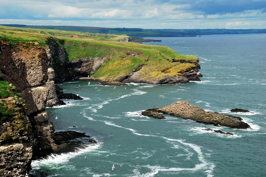
Once again one of the cows on the Horneboeg Heath in Hilversum.Related content


Comments: 12


A "frog" perspective is my favourite one. Together with composition and very nice palette of colors, it make a great photo.
👍: 0 ⏩: 1

Great you like it. And many thanks for the fav.
👍: 0 ⏩: 0

wow! thats a wonderful shot!!!! beautiful colors too
👍: 0 ⏩: 1
Great you like it that much. Thanks a lot for the fav!
👍: 0 ⏩: 0

 (Smile)")

A very nice shot. I enjoy the perspective from down low. Nice colours, as well. I have to question the coloured borders, but that is a matter of taste.
👍: 0 ⏩: 1
Very good you like the shot. As to the coloured borders, you will see that I am experimenting with that a bit. Just white and black are so boring. At least that is what I think now.
👍: 0 ⏩: 1
I have experimented with colour once or twice; I may do so again in the future. Certain shots do seem to be helped by coloured borders, while others are better complimented by black and white. I choose black and white to make a neutral impression, rather than risk turning off the viewer. But what is art, if not taking risks? Therefore, you should continue to use what looks good to you.
")
👍: 0 ⏩: 1
Well, it is good you mentioned it. Indeed one should be very careful for using colour for frames.
👍: 0 ⏩: 0

Thanks a lot for the fav. Very good you like it so much.
👍: 0 ⏩: 0