HOME | DD

jFury — Final Shootout

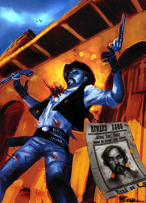
Published: 2008-03-17 13:34:55 +0000 UTC; Views: 5921; Favourites: 153; Downloads: 266
Redirect to original
Description Another concept/illustration piece. just for fun and practice.
Related content
Comments: 24

The-Ironwing-Kaiser [2012-06-14 06:59:01 +0000 UTC]

>.< Bullseye.

👍: 0 ⏩: 0

oponok [2010-07-25 00:05:41 +0000 UTC]

This great piece is featured, here: [link]

👍: 0 ⏩: 0

Archonyto [2010-07-16 22:12:43 +0000 UTC]

Amazing work. Heart shot...yea that will end your wild run.

👍: 0 ⏩: 0

MephMan [2009-05-29 06:51:21 +0000 UTC]

Fantastic!

👍: 0 ⏩: 0

GreySidewinder [2008-06-09 01:16:55 +0000 UTC]

That is very conforting to see... conbining Guns and Art is one of m favorties

👍: 0 ⏩: 0

Ricardofantasyart [2008-05-12 08:15:21 +0000 UTC]

Very nicely done!

👍: 0 ⏩: 0

ComfortLove [2008-03-26 04:48:01 +0000 UTC]

I do love your brush strokes.

👍: 0 ⏩: 0

Sempai-Tem [2008-03-22 19:03:48 +0000 UTC]

Feels like one of those old mexican masters with those color combos. And theme.

👍: 0 ⏩: 0

skullard [2008-03-21 00:03:40 +0000 UTC]

Somebody just made $500!

👍: 0 ⏩: 0

MysteryofAlbesila [2008-03-18 22:32:22 +0000 UTC]

awsome colors!

👍: 0 ⏩: 0

Woodie84 [2008-03-18 02:46:02 +0000 UTC]

awesome!

👍: 0 ⏩: 0

HardcoreSouma [2008-03-18 00:38:04 +0000 UTC]

hey this is mad!!! love it

👍: 0 ⏩: 0

drwbrn [2008-03-17 20:45:50 +0000 UTC]

that's gotta suck haha

👍: 0 ⏩: 0

ScottyShoemaker [2008-03-17 20:33:45 +0000 UTC]

Love this Joe!!
-Scotty

👍: 0 ⏩: 0

StevenSanchez [2008-03-17 19:29:21 +0000 UTC]

Just watched 3:10 to Yuma last night, very accurate

👍: 0 ⏩: 1

jFury In reply to StevenSanchez [2008-03-19 15:49:15 +0000 UTC]

i still haven't seen that movie yet.

👍: 0 ⏩: 1

Sempai-Tem In reply to jFury [2008-03-22 19:03:10 +0000 UTC]

put it on your to do list! Pretty bad ass for a remake movie.

👍: 0 ⏩: 0

FictionArtwing [2008-03-17 17:43:12 +0000 UTC]

Oh, wow, I'm loving the contrasting colors! Niiice!

👍: 0 ⏩: 1

jFury In reply to FictionArtwing [2008-03-19 15:50:37 +0000 UTC]

thanks, i wanted to try and keep it to just two complimentary colors as much as i could (the reward poster kinda messes with that idea, but it was just something for fun )

👍: 0 ⏩: 1

FictionArtwing In reply to jFury [2008-03-19 19:50:55 +0000 UTC]

I think the reward poster's fine the way it is. If it had been done in either of the two colors, I think then it might've looked a little messed up...

👍: 0 ⏩: 0

martabeceiro [2008-03-17 17:01:12 +0000 UTC]

i love!!!!

👍: 0 ⏩: 0

robokop [2008-03-17 16:15:36 +0000 UTC]

Very cool!

👍: 0 ⏩: 0

SteelJoe [2008-03-17 15:16:37 +0000 UTC]

a cannon blast right through the heart, awesome

👍: 0 ⏩: 0

thebluecanary [2008-03-17 15:03:41 +0000 UTC]

Better each time. Great work! Keep it up!

👍: 0 ⏩: 0