HOME | DD
 JocelynSamara — SHANGRI-LA:CV - Menu Differences
Published: 2012-03-27 12:40:53 +0000 UTC; Views: 3184; Favourites: 13; Downloads: 31
Redirect to original
Description
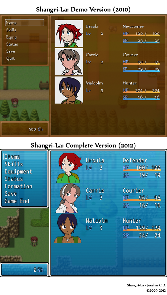
Okay, so as I've mentioned somewhat recently, Shangri-La is seeing progress again at long last. I am using a different program now, which has sort of forced me to start over. This... isn't a bad thing, though. Rather, I'm trying to see this as a welcome excuse for overhauling some of the sloppier aspects one might remember from the demo version. So, for the next few weeks, I'll be trying to periodically post comparisons of what the game used to look like, versus what it now looks like. And by the way, your opinion matters. If you like or dislike something, speak up!Today's episode introduces us to the new menu screen. In the original demo version, I'd drawn Face graphics for all of the main characters (and if you've been watching me for a while, you'll know how thoroughly I HATED the way they looked). So, the first thing I'd like to draw your attention to is the newer, cleaner Face graphics (and without those eyesore white boxes containing them).
The menu screen itself was meant to look like wood in the demo as well. I dunno, I thought it was "naturey" or something, fitting well with the setting of the whole game being on an island. The end result, now that I look at it though, is that it was really just very... brown. Blah. I AM open to suggestion on this, but as of this moment, I am rather fond of the "clean, clear water" shade of blue that now makes up the menu's color.
The font for the original demo version was "Nyala", the same font I use for the title. It's legible (though, due to resolution issues, it looks icky here), but has this exotic feel. Currently, for the Complete Version, I'm still using the new Maker's default font, (mostly because I haven't figured out how to change it yet). On the one hand, I miss the original font for how well it blended with the feel of the game (in my opinion). On the other, the current font IS rather classy. I feel like it might not fit the atmosphere quite as well, but it's extremely clean and legible. Thoughts are most welcome.
Another thing you might notice is that the new maker includes a "Formation" option for quickly and easily changing party members. The demo had it's own contrived and archaic system I made up, so seeing this streamlined is very welcome. Still, a personal question to you as the players: should I allow party changing at ANY time, or would it be better to make the option only explicitly available in the town and "Safe Rooms"? The restriction could add more challenge, but I could see how the freeform approach would be appreciated too, so I hope to hear your thoughts on this as well.
I don't even wanna talk about the maps yet. Stop trying to look through the menu.

And yes, if you're observant, you might have noticed the HP and SP counts for each character are different. Initially, that was an accident, but I am sticking with some certain statistical changes. I think the Complete Version will do better in individualizing the strengths and weaknesses of each character.
Besides your thoughts, questions are welcome too. I figure if I keep the players' thoughts involved while I'm producing the game, I'm more likely to create a game everyone can enjoy. I'm striving for a release this year, but I won't promise anything (as that's backfired for me several times already). That aside though, I really think we're getting there this time.
Anyway, I hope you've enjoyed this return to Shangri-La. There are many people who've been waiting a very long time for this, and honestly, I can't apologize enough. It was never meant to take this long. On the plus side though, I feel it bears potential to be a far greater game as a result though. So, I sincerely thank you for your patience through this.
If this is the first time you've heard of Shangri-La, let me direct you this way for more info [link] . The only downside is that some of info is dated. The Complete Version will probably be a pretty different beast.
©2009-2012
Shangri-La and all other aspects of the story are copyright material belonging to me.
It is being made with RPG Maker VX Ace, which belongs to Enterbrain.
Related content


Comments: 37

i can only find links to demo o-o
👍: 0 ⏩: 1

There only is a demo. I haven't finished it yet.
Someday...
👍: 0 ⏩: 1
well i hope you finish it so far its fun
👍: 0 ⏩: 0

A few points in advance:
1. I know, this is kinda late, but I've seen the menu only shortly ago, so I'm only answering now.
2. I really hope I'm not going to sound too harsh or like I'd want to get you down. I most certainly don't, but what else I've seen of the game is really nice and i kinda feel like it deserves a more ... refined menu. And also, all that stuff I'm writing, I have been told on my last projects by my profs over and over again, how else would I know about this ^^
3. Please don't think, that I'm only pointing out stuff from afar. If you'd want me to contribute to the game, I'd be glad to. However, until now i've got the feeling, that this game is something you want to do yourself, so for the moment i will only be offering critique.
now for the real stuff:
1. Concerning the blue bg-color: Does water matter enough in your game, to justify the blue? That's one of the important questions, because this and similar shades of blue are also easily associated with spacy or heads-up-display interfaces. That most certainly wouldn't fit your story. So is there enough subconcious "waterwaterwater" in the head of the players to automatically recognize the blue as water-themed? If the program your using allows for that, it might help to add a subtle water-texture instead of just a plain gradient. Of course the same would work to turn the "... brown" into a wood- or earth-theme.
2. What brings me to the next point: the gradient. Again, I don't know if the program allows such fancy, but if possible, you might try to have all panes use a global gradient. right now, you have a tone A and a tone B and each pane sets a gradient from A to B. but this results in different shades of blue on one and the same y-height. (i hope, it's clear what i mean. if not, just send me a message and i'll edit an example for you).
3. The SP-bar: This seems to be copied directly from your brown concept, and while it still looks nice and all, it now collides with the blue of background, since the left end of the bar has almost the same shade as the bg. If one of the characters (esp. Carrie) had low SP, the bar would be very hard to make out.
4. The font: Yes, the default font is a bit away from your games style, even though it works much nicer in the blue, than it would in the brown. However, it has the big advantage of being legible. You want the people to play the game, not to decipher the menu. However, you could try to use Nyala in a bigger fontsize (the default font in the new menu is also set bigger) or maybe use a completely new font for in-game-text. There are highly legible fonts, that match your style and it's no crime to use two fonts, if they're choosen and applied well.
5. The outline: i kinda saved this one for the last. I get the feeling it really doesn't fit in there. All the time, you're style is absolutely aware about being 2d, but suddenly this border has a pseudo-3d-style (and, i cannot refrain to say, kinda looks like a long strip of toothpaste). Maybe, if you want to keep the water-theme, you could apply it to the border as well. possible results would be a subtly wavy outline (as if you were to photograph a very calm sea, with the camera on surface-level, pointing to the horizon) or, a darker blue border, reminding of a swimming pool's tiles (where else do we see large rectangles of water?).
I really hope this is of some help (remember, that was my intention about 20000 lines ago? ^^)
best wishes,
Tobl
👍: 0 ⏩: 0

I'm stuck on meeting the villagers. I think i met them all and i dont know what to do next.
>.>
👍: 0 ⏩: 1
You do have to meet all of the villagers, but once you've talked to them all, the game will proceed automatically. Here's a little checklist for you:
1. ROY is on the farm directly south of Ursula's house.
2. CLIVE is practically right next to him.
3. East of the farm is a building with a pair of boots shown above the door. Inside, you'll find GLEN at the table...
4. ...LINDA at the bookshelf...
5. ...and AKBAR behind the desk.
6. To the west of the farm is the restaurant where you'll find CYRUS behind the counter, who will give you a loaf of Bread.
7. ...KIKI in front of it...
8. ...and JEFF at one of the tables.
9. North of the restaurant and on the following screen, you can find ALUXES.
10. South of the restaurant, is a house with a hammer above the door. ANGUS is inside. He will give you a Short Sword before you go.
11. Cross the bridge and continue south to find a house with no sign. Inside, you'll find ANNA.
12. Right next door is a house with a star sign above the door. You can find MOLLY behind the counter inside...
13. ...and KENJI snoozing in the bed.
14. Behind that house two children are playing with their dog. TOMMY on the left.
15. And SANDY on the right.
**. The dog's name is OUTLAW, but you're not required to talk to the dog.
16. The house with the bag above the door is home to LAWRENCE. Lawrence will give you 300 Shells (the game's currency) and proceed to open the shop for business right there.
17. Finally, just slightly to the northwest of that, you'll find MILDRED in her garden.
You are not obligated to talk to them in this or any specific order. As long as you talk to them all, the next scene will start up. I hope that helps. ^_^
👍: 0 ⏩: 1


I quite like the the cleaner boxes, and the blue color; but I agree with you on the fonts. The old font, even when a little blurry, just feels... I don't know, righter? This being the first time that I've looked at Shangri-la I don't really think that my input is all that great, but I do enjoy not having to see stupid boxes around the characters faces. It looks more professional this way. Good luck on the game, and do you know if the program needed to run the game works on Mac?
👍: 0 ⏩: 1
At this time, I'm led to understand that it will not run on Macs. However, I AM looking into whether or not there's a way to make it work. There may be some kind of emulator or something that allows it to run, but I haven't been able to confirm this yet.
👍: 0 ⏩: 0

imho, I think I like the design of the old menu better, in regards to colour and letter style, but the the persons are much nicer to see and easier to get into.... I especially like the fact that in the second version they are all in different positions....
~ME!!!

👍: 0 ⏩: 0

I must say, the new menu looks better including the new face pictures.
👍: 0 ⏩: 0


Carrie as a courier!! LOL
It's funny cuz it's ironic!!
👍: 0 ⏩: 0

Why does Malcolm in that picture remind me of Rudy?
👍: 0 ⏩: 0

noticed the stat differences Ursula got nerferd, lol, but really, looks amazing, map looks kinda pokemon-ish... not that i was looking, but all in all looks amazing, cannot wait for the full game, or even a revamped demo
👍: 0 ⏩: 0

The new portraits looks much better, I like! The font, however, leaves much to be desired, as I do like the old font better.
About changing the party in only certain places, I would suggest that could be like, a whole new difficulty like an easy or a hard mode, with the hard mode restricting it to only changing the party in safe zones, but, that's just me.
👍: 0 ⏩: 0

I like the new style much more than the old. Just an esthetic opinion.
For the character switches, I think that it would be better for the challenge of only switching in "safe rooms" and towns.
👍: 0 ⏩: 0

Personally, I kind of like the more earthen, natural, wooden look of the brown menu background. But, I definitely see how the blue could be connected to water (reminds me more of the sky), and it's certainly not a bad color.
As for the font, I like the old one a lot better. The new one just feels too plain, generic, and impersonal; the old one fits the feel of the game more. I mean, I guess the new one has the advantage of slightly better legibility, but I don't think that that's that big of an issue.
The portraits look a lot cleaner this time around! And I like the idea of a formation control. This looks like very good progress!
👍: 0 ⏩: 0

I have to say I'm really liking this new menu over the old one. One slight nitpick I have is that the mugs seem too close together, but I think I'll get used to eventually. Great work either way.
👍: 0 ⏩: 0
owo, i think ill follow that link and play that some day (in two weeks)
👍: 0 ⏩: 0

ASDLFKJGIUHROIAGAW!!!!!!!!!! SHANGR-LA!!!!!! URSULAAAAAAA!!!!!!!

👍: 0 ⏩: 0

The newish menu looks a lot like Tales of Symphonia's. Which isn't a bad thing from my PoV.
I need to learn how to use Maker. Would like to be able to create games for my school.
Can it take gamepad inputs? *completely clueless*
👍: 0 ⏩: 1
If ever there was a time to try and learn to use RPG Maker, it'd be now. The learning curve can still be complex if you're new to it, but the latest version (RPG Maker VX Ace) is the most user-friendly by far.
And yes, it does take gamepad inputs, and I believe you can customize button settings too (although I haven't messed around with that too much, so I may have to get back to you on that). The game still plays functionally well via the keyboard, but I admit, I prefer a controller myself.
👍: 0 ⏩: 0

Lynn, I would, maybe, shade the pic's a bit more to make them look better. Afterall, if you're trying to make a game, make it awesome
 (Wink)")
👍: 0 ⏩: 1
Agreed. I actually intended to shade them, but you remind me that I hadn't quite gotten around to it yet. But yes, will do. ^_^
👍: 0 ⏩: 1

I find it sad how little difference is in the graphics.
👍: 0 ⏩: 1
If I may, are you referring to the sprites?
I haven't really had much of an opportunity to work with them yet, to be fair. But the new Maker does work with the same resolution and pixel proportions of the original. So while I may make some changes to make things more accurate to my designs and whatnot, most of the spritework probably won't look TOO different. Map layouts, art, enemies and pretty much everything else will, but not so much the sprites (unless I suppose some extremely talented and extremely generous spriter comes along and offers their time and effort for little compensation, but I don't anticipate that really happening).
I personally am okay with how the sprites themselves look, but am willing to accept input if you or anyone else has any thoughts on this.
👍: 0 ⏩: 1
Well i actually meant the graphics that come with the editor hasn't changed over such a long time. I probably should have been a little more specific. ^^
👍: 0 ⏩: 0


Hmmm. The face graphics are obviously a big improvement. The menu colour I'm not sure about. The clear water look has its merits, but I liked how the old look blended with the background, also I think the warm colour fit the atmosphere of your game slightly better.
More pronounced differences between characters is probably a good thing, simply because this old-school kind of RPG, although I love it dearly, can become repetitive and distinct playstyles help a lot.
About character change, whether or not one can change the battle makeup outside of safe zones isn't that important to me, I was fine with those rooms in the demo, but it makes a very big difference whether you get all character's dialogue all the time or have to choose whom to take where as to get the best comments, quips and conversations. The latter obviously has more replay value, but I very very much prefer to get all dialogue, especially in a game that focuses on human relations more than the fighting. Otherwise it's a permanent nagging feeling about what you might be missing.
👍: 0 ⏩: 1
I'll toy around with some different menu colors and designs, perhaps displaying them and making a poll to see what people like best. I like the light blue menu, but I think you make a good point about the warm color thing honestly.
I should probably mention that regardless of how party formation is chosen, story will reflect it as though everyone is currently there. In other words, even characters aren't in your active party, they'll still be available to communicate with in the Safe Rooms, and they will still be present to contribute their own dialogue in scripted scenes. I'm like you; I hate missing something simply because I'm not using a certain character or whatever. In short, the only really difference between being able to switch the party on the fly versus being restricted to switching the party in certain situations, is a gameplay thing.
For instance, if you could change on the fly, you could use an inactive party member's magic to heal yourself between battles rather than consuming your active party's SP or your items. Or if a character's just not working out for you (the keep getting KOed or don't have adequate strengths against the enemies), you can switch them out at any time for someone more competent. The restricted formation may not allow such freedom though, thus making dungeons a little more challenging.
👍: 0 ⏩: 0
Absolutely! [link]
This is a download link for the demo version being referred to above. The demo does not necessarily reflect the Complete Version though. Designs, maps, battles, etc. will probably be very different in the Complete Version. Still, the demo is probably the best way to get a feel for the story and characters. (Plus if you finish the demo, there's a bonus password that can be used to unlock "something special" in the Complete Version.)
👍: 0 ⏩: 1

Thankyou! I am on chapter 2 already! Hopefully when I get to chapter 3 I have a box of tissues handy... XD
👍: 0 ⏩: 0

Ohh! I get it now! I didn't really understand this until just now. When you said Shangri-La was a game it never occured to me that you were making a video game... XD I feel dumb.
👍: 0 ⏩: 0