HOME | DD
 joereimer — Alethia
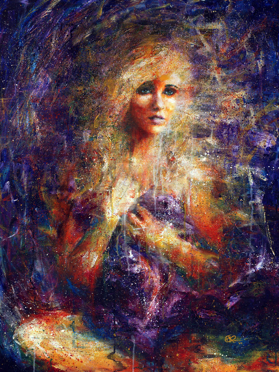
Published: 2009-02-01 02:44:09 +0000 UTC; Views: 7175; Favourites: 309; Downloads: 0
Redirect to original
Description
Acrylic on Canvas30"X40"
Check out all of the steps for this painting here: [link]
If you are interested in purchasing this piece or prints, please visit my website: joereimerfineart
Related content


Comments: 31


Wow! I love this piece. All of your work is truly amazing.
👍: 0 ⏩: 0

This is probably my favourite of your figuratives.
👍: 0 ⏩: 0

wow this is breath taking.
i could stare at it for hours.
how long didit take?
👍: 0 ⏩: 1

Thanks,
I worked on it over a couple of weeks. I would say about 8 hours in total, which is actually long for me.
👍: 0 ⏩: 0


This art piece is really nice. We can derive many meanings from her face, such as she is dreaming about beautiful things such as love or thinking about someone who she misses very much. The light around his neck and on her face helps us to derive such kind of meanings which is really good looking. Good luck!
👍: 0 ⏩: 0

Hello! 
You have been featured in my journal [link] and in this news article [link]
👍: 0 ⏩: 0

huge difference, I like the re-worked face a lot more. It still stands out as the most focused point but it feels like it belongs there. I think it stood out as being a little too focused before ")
👍: 0 ⏩: 0

stunning work here. you say you reworked the face of the portrait, and simply put, the face is what sticks out in front of all the rest and honestly it is a minor distraction. compared to the rest of the painting, it's like an unrealistic focus on a camera, not that realism is it's main draw, I'd much rather be clouded to the image as a whole.
👍: 0 ⏩: 1
Thanks for the comments. I agree completely. Before I reworked the face I felt like there were two things wrong with it: the proportions and the fact that it "stuck out" too much. I feel like I've definitely got the proportions right now, but I probably didn't cloud it up quite enough. I'm going to work on it a little more still so it doesn't stick out so much.
👍: 0 ⏩: 1
that makes me happy. I thought i might have been a little too critical, but obviously, constructive criticism is your game. highly appreciated. keep up the good work; if I feel the urge I might just let you have it again.
👍: 0 ⏩: 0

This is intensely emotive. I really like the palette you chose, it gives it a stark and impressive atmosphere.
👍: 0 ⏩: 0

Love the motion and color in this work. Congratulations. Fav.
👍: 0 ⏩: 0


Love the celestial feeling I get from this and the colors are really lovely.
👍: 0 ⏩: 0

I really like the abstract approach. I'm feeling like the face is floating. The eye seems to have nowhere else to go. It's a very curious thing
👍: 0 ⏩: 0

That's so amazing! So interesting style of art.
Beautiful!
👍: 0 ⏩: 0


Another great one Joe! I'm curious, have you thought about doing more landscapes? Just wondering if you find people prefer the ladies to the scapes, or, are you just having fun with painting girls lately. Personally I like both your subject matters equally. either way, the work looks great and it keeps getting better!
👍: 0 ⏩: 1
Thanks  (Smile)")
👍: 0 ⏩: 0


Pretty light and compatible colors with lots of intensity
👍: 0 ⏩: 0
