HOME | DD
 JOKE-on — Ram

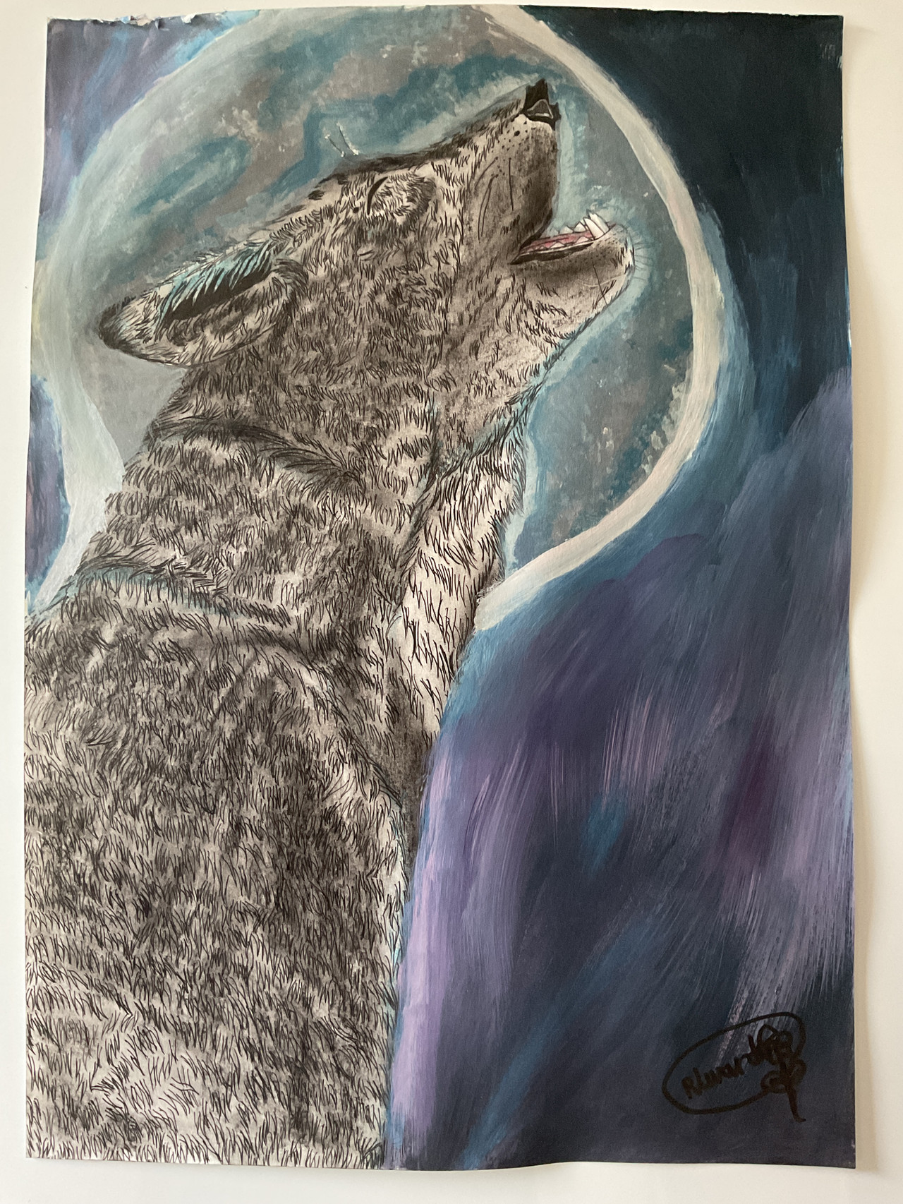
#animal #goat #ink #mufflon #ram #blackandwhite
Published: 2019-07-16 23:56:57 +0000 UTC; Views: 265; Favourites: 41; Downloads: 0
Redirect to original
Related content


Comments: 9


👍: 0 ⏩: 1

Thank you for the helpful comment, I’l Try to give more contrast to my piece.
👍: 0 ⏩: 0

Hello, I'm here in behalf of ProjectComment
First off, good job on the likeness of the ram. Drawing something very realistic like this is NOT easy. I also like the graphic background. It's not interesting design choice and definitely pops out. It's not one of those pen and ink drawings where the background is just blank. Two points however:
There's something going on with the horns. They look unfinished? If this is the ram that I'm thinking of then the lines shouldn't be straight and they should follow the form of the horns more. There is some form visible due to the lines connecting in the center but beyond that they're just straight lines. It seems as though you were starting to run out of energy? Understandable, consider how much work inking is.
Another thing is the contrast of the ram compared to the background. Right now the background completely overpowers the ram. The ram itself could use a bit more darker shading here and there. The head area is already pretty great and would need just a little bit of darkening in the shadowed area but the neck area is barely shaded. Again, I understand that inking is a lot of work but contrast is really important. I keep neglecting it myself all the time when doing graphite drawings. It's such hard work getting things dark enough but it's definitely worth it.
All in all this is a great drawing. You did a good job and like I said already, inking is a lot of work so kudos on pulling this off!
👍: 0 ⏩: 1
Thank for the comment !
I see what you meant about the horns, I was trying to do a twisting effect but it didn’t really work, for the contrast , I thought it was enough .
👍: 0 ⏩: 1
Contrast is hard in traditional art. I always think I've gone dark enough as well and yet I always have people telling me to add more contrast. With tools like Ink it's also incredibly nerve-wrecking because there is no Ctrl + Z. I, personally, am often too scared to go darker than I already have. Here I think it would've made the ram stand out a bit more. But of course, that's just my opinion
 (Wink)")
👍: 0 ⏩: 0

Wow, how long did it take you to put all that detail in this?
👍: 0 ⏩: 1
Pretty long , about 2 days.
👍: 0 ⏩: 1
I can really see that.
Good for you! Line art is so hard!
👍: 0 ⏩: 0