HOME | DD
 JonathanWyke — H and M style test colour
by-nc-nd
JonathanWyke — H and M style test colour
by-nc-nd
Published: 2010-02-09 13:13:31 +0000 UTC; Views: 2481; Favourites: 17; Downloads: 146
Redirect to original
Description
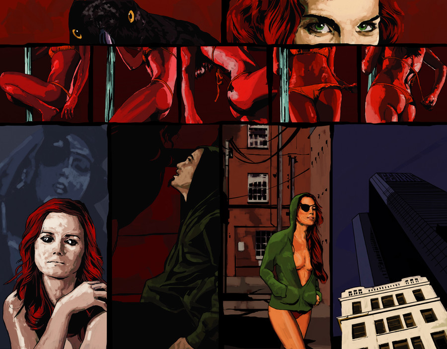
and UPDATED ONCE MOREFinal colour pass. Bits I like: basic layout, especially the golden triangle that would please my old art school lecturers. Woman's eyes, top right. The strip strip.
Critiques very welcome!
UPDATED AGAIN
Another couple of panels painted. Green echoing from the eyes at the top to the jacket below, as the blue of the bottom left panel will reflect across to the buildings in the one remaining uncoloured panel.
More than anything else, I think this is showcasing my lack of ability as a colourist. Is a little annoyed at own rubbishness.
UPDATED.
File size made more reasonable for a test/WiP, top two panels painted, eye patch moved due to stupidity of artist unable to read simple words.
Colour start on IanX's Huginn & Muninn strip. Very big file.
A continuation of my style 'audition' for it. Colour added, as I always think in terms of colour when I draw something. A work-in-progress, and will be updated as more panels are coloured.
Comments and Criticism more than welcome.
Story and Concept ©Ian Struckhoff, Artwork ©Jonathan Wyke
Related content


Comments: 20

Overall

Vision
Originality
Technique
Impact
As an avid enthusiast of art, comics and line art I can see a number of things you did right and a number of things you did, well not wrong but less than adequate. First the rights, smart colors and shading for the woman and the last frames. The story telling is as much about color as it is about the line art. The stripping part of the panels has very good shading one the body and the positions are tantalizing as they should be.
Now for the not so rights: First the panels themselves. Since you used the darker colors for your process it should have been a natural place to separate them with a brighter border. This will separate the story elements instead of blurring them together. Next I would say that the use of reds on reds fails to give the appropriate mood. Remember that contrast makes stronger statements when pushed to the limit than trying to create something using tones within one spectrum. The reds blend too much together and rob your work of some of its potential splash value. You could have grabbed a lot of attention with some colors muted for the backgrounds.
This being said I want to point out some things I also see that while not out of context of the piece do bother me. The rough none symmetric lines of the spaces between the panels is usually reserved for harsher comics that want a raw nasty violent streak. Since there is no fighting or struggle scene it seems a little like an attempt to push the boundaries of the piece when it was not needed.
I am also lost with the last couple of frames. What woman in her right minds is going to walk down an alley in a big city wearing nothing but a hooded jacket and an eye patch? Strippers might take it all off in the collective safety of the club she works but you are not going to see a stripper walking around naked and so close to naked in the public especially from the club unescorted. Also the sudden transition at the bottom of the page, the last frame, might have been better placed as the intro to the next page, unless of course this is the end of the comic.
Ian-x has already spoken of the technique and the pace and I feel he is correct for the most part so I will not repeat it again.
Overall it is a nice piece and shows strong skills in coloring and shading, I just feel that it could have been a little better.
I hope to see more from you soon. Good luck.
👍: 0 ⏩: 0

Overall

Originality
Technique
Impact
Overall, this is excellent work, a great showing for the tryout and a close match to how I imagine the book. It's a bit odd critiquing a work that I wrote, but I thought it would give you the best feedback.
I should say that, if you're selected for the role, we may want to do one more pass over this page, but more of a revision than re-doing anything. That actually fits with the normal process of pages in progress anyhow.
Anyhow, on to the critique...
The overall choices for the layout are excellent. The pacing and storytelling here are, in my opinion, very strong. At each step, I get the right idea of what is happening... including the appropriate degree of mystery for now.
The one thing that I would change about the layout is more space between the panels. I'm a big fan of a standard grid, with a white background and black outline for each panel, and clear space between the panels. For dark pages like this one, a light outline and black space works as well. These panels feel close, which works well for the top half of the spread by doesn't seem to fit the timing of the last four panels.
The style of the line art is absolutely perfect for how I imagined the story. It's a fantastic combination of stylized line work and photo-realistic shapes. This is most evident in the top half, and in the backgrounds and cityscape.
In terms of the overall style of the coloring, I think it's strong but I can see immediately how it could be better. I think you should reserve the painted-shading technique for certain panels and elements (like the red panels, as you did) and default to the flatter style that we see in the first two panels, and in the backgrounds.
There are some strong color choices, and some that I'm less sure of.
The all-red scheme works well for the stripping strip (heh) but those colors should be held in reserve, so seeing them elsewhere lessens the impact.
The colors in the second to last panel suit the setting, but I'm not sure that they give the impression of night time. The last panel, with a cooler, more limited palette, feels more night night in a city to me.
The final criticism isn't down to the technique, but is more specific to this story. I think we may want to work on the transformation design further--
The panel where it starts is a good effect, especially in the eyes, but it doesn't make the crow connection clear enough.
By the time it is complete in the second to last panel, she doesn't seem changed much-- she has an eye patch, and the man's hoodie, but she's not a stylized character. There's nothing here that can carry over to other incarnations of this character, and distinguish it from the incarnations of the other crow. I think her color scheme should be more distinctive, or else she should add some crow, feather, or tattoo elements-- something with a hint at the supernatural, without going over the top.
Obviously, as a critique, I've pointed out a number of things that should be fixed. That said, I think that fixing them is well within your ability, and more importantly that the overall effect is much stronger than the individual points I make might suggest. This artwork makes the strongest case I've seen so far for a style suitable to the book-- especially the line art.
👍: 0 ⏩: 0

I think this is great! I like the style and colors! especially the red panels
👍: 0 ⏩: 1

Thanks! Bits work I think, but the top half is more successful than the bottom, which is annoying
 (Smile) - :)")
👍: 0 ⏩: 0

You, with color, it really brings out this page. Nice page Destiny.
👍: 0 ⏩: 1
Thanks, there are bits of this page I really like, but other aspects I'm not at all keen on. Still, if I was ever happy with something I'd done, I'm sure the world would end with the shock of it.
👍: 0 ⏩: 0


Thanks very much! Coming from someone who's line-work is as clean and beautiful as yours, that's wonderful to hear
👍: 0 ⏩: 1

I really like the style of this. The combination of almost photo-real lines with poster-style colors really works for me.
Right now my main concern is with the palette-- It's a bit daring to use a lot of bright bold reds. Usually comics colorists hold out on using red for when they want something to stand out.
I wonder how this would go with a more muted red, and a bit warmer so the hair is more natural red than fire-enging? Just a thought.
👍: 0 ⏩: 1
Ta.
As for the palette, my plan was to have the club scene upto the transformation literally dripping in red, as contrast to the Aesgard scene before (currently uncoloured, but will be neutrals). Kick-in-the-teeth colour. As the scene shifts to outdoors, then colours go more to a more realistic look, but locations to have their own specific tonal feels.
The red of the hair was chosen to provide a direct visual link to the stripping strip.
Having said all that arty bollocks, you're probably right, and once I've gotten to the end of this page, I'll re-look at it if you want?
👍: 0 ⏩: 1
I like that the stripping scene is so colorful and intense, actually. The idea of a "red light" makes a good theme for the page, and I'm definitely not suggesting you drop it.
What about taking every second of the small stripping panels and muting the color a bit, like a rhythmic flashing light? Then use more faded red and natural red hair in the muted panels, but not the "red light" panels?
Another way to tie all of that together would be to have a subtle red glow coming from a doorway in the first panel outdoors, which helps reinforce the transition between panels.
All of this is just suggestion... You don't NEED to listed to me at all at this stage. My thought was that you can finish this page to your own liking as your try-out, then we can always re-work it a bit for the final book, if you get the gig.
👍: 0 ⏩: 1
must...listen...and obey...ian...
👍: 0 ⏩: 1
Haha! If only more people treated me with the respect and abject subjugation I deserve.
 (Wink) - ;)")
👍: 0 ⏩: 0
I just realized that her eye-patch is on the wrong side for Huginn... Though as long as the book is consisteny, which is which is pretty arbitrary.
👍: 0 ⏩: 1
Thanks to the wonder that is Illustrator, I'll swap it over next time I go into it
👍: 0 ⏩: 1

Colour the fun stuff first!
I think the profile in the bottom panels looks a bit simplistic, but I'd imagine you'll flesh it out during the colouring.
Also, proforma: you are fabulously talented, yadda yadda, will consume your soul, etc. etc.
 - :D")
👍: 0 ⏩: 1
Ta
...the fun stuff? you mean the building or the raven?
👍: 0 ⏩: 1
I meant the sexy bird, of course.
The raven.
👍: 0 ⏩: 0