HOME | DD
 JourneytoRevenge — Simple Thoughts
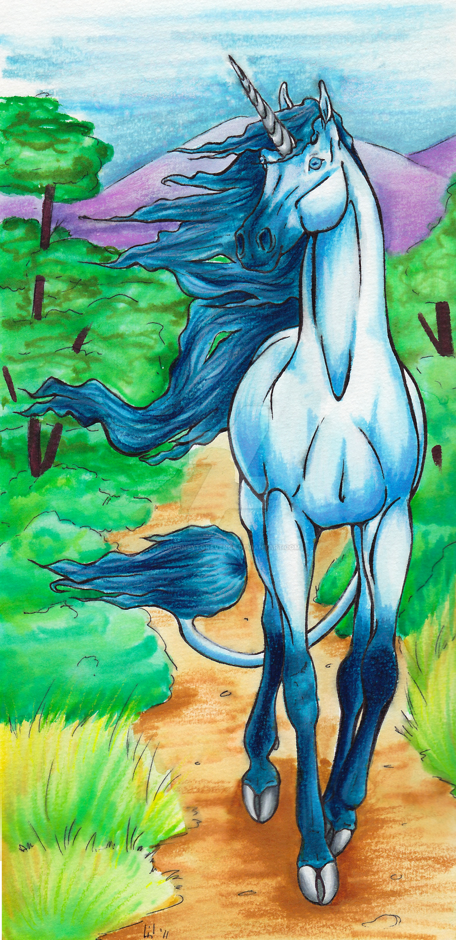
Published: 2011-07-27 21:13:14 +0000 UTC; Views: 644; Favourites: 37; Downloads: 0
Redirect to original
Description
The more I look at this, the less I like it. :/ It was an attempt to get out of a rut, but so many things went wrong, I'm more irritated now, than I was before. I suppose it's my job to nitpick.It's been a while since Windswept got some attention. I was looking at ~YOB 's unicorns, so I felt the need to draw one myself.
Markers and colored pencils on watercolor paper
Related content


Comments: 9

This is absolutely beautiuful. The color work is fantastic! And the depth is just like WOW.
👍: 0 ⏩: 1

Thank you! I'm not happy with how bright the BG got, so I might play with it.

👍: 0 ⏩: 0


wow hun! that's really good!
great mixture of both types of traditional coloring.
=]
👍: 0 ⏩: 0


Beautiful! I love those legs. Don't be afraid to add more color to the background. It looks flat against the unicorn and makes it less appealing. Adding some red into everything can make them look more alive. Even the mountains. Mix colors like no tomorrow!
👍: 0 ⏩: 1
I wanted to make them pale and washed out, but I put too much color. D: I'll try again to make them fade out the further away they are.
👍: 0 ⏩: 0
