HOME | DD
 KayFedewa — BBA Preview Scene - Page 2
#bba #bloodspill #comic #swiftkill #wolf #wolves
Published: 2014-10-20 04:00:07 +0000 UTC; Views: 58635; Favourites: 969; Downloads: 226
Redirect to original
Description
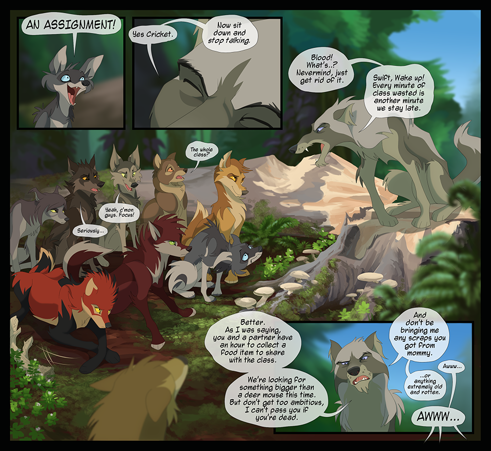
and I are launching a Patreon. If you're interested, check it out at www.patreon.com/blackbloodalli…This is the second of an 8 page set from a "preview" scene from the new BBA world. One of these pages will go out every two weeks on Mondays. This is to show you the new art style and format of the webcomic and give you a taste of what's to come.
We hope you will enjoy the preview while we take time to prepare for the release of the beginning pages of the main story arc, scheduled for early 2015.
looveeeely environments by the talented
Download for larger version!
NEXT:
Related content


Comments: 191

i know this was just a preview, but i really wanna know how did they get away from the giant death bird
👍: 0 ⏩: 0


aww beautiful wolves and this is this such amazing page
👍: 0 ⏩: 0


aaaaaah the ol' group assignment that's worth a shit ton of points :']
👍: 0 ⏩: 0

I love Riptide and that orange-eyed one that says 'Seriously...'
👍: 0 ⏩: 0


Was just looking back at the page to take in things again and forgot if I commented on this before as I just noticed it again... Swift's pupil doesn't seem to be colored in... or is that just something to do with the lighting in the area
👍: 0 ⏩: 1
Then again I could be wrong and my screen is making the pupil look like it's part of the "eyebrow" line. I tried looking at the download and it didn't make it any bigger for my screen.
👍: 0 ⏩: 0

First of all really glad to see it come back to life! Art wise you guys really improved so there's nothing to pick at here. Mu only beef however is the chromatic aberration. It makes a lot of the characters look kinda fuzzy, as well as the text in some places. That is all : )
👍: 0 ⏩: 1

Ya im gonna be taking that off and reuploading the page - i agree that its not a good fit for this!
👍: 0 ⏩: 1
Looking forward to seeing that and more : )
👍: 0 ⏩: 0

")

j'aimerais te demander quelque chose, tout d'abord désoler de ne pas parler en anglais mais mon anglais est trop mauvais pour ça ^^'
voila je trouve que tu fait un travail tout a fait fantastique et j'aimerais faire découvrir ta BD a ceux qui ne te suivent pas déjà sur DA. J'aimerais savoir si tu était d'accord pour que je mette les pages et les NEW de BBA sur le forum d'un jeu en ligne, j'avais déjà fait ça avec la BD d'Arven, je ne sais pas si tu connait, et sa avait bien marcher.
Voila j'aimerais avoir ton autorisation pour mettre ta BD sur le forum tout simplement pour faire découvrir ou redécouvrir BBA aux autres joueurs ?
👍: 0 ⏩: 1
")
BloodSpill est adoraaaable *-*
y aurait-il un endroit où trouver les pages en français?
👍: 0 ⏩: 1

Oh my Gosh, they look amazing! This whole new comic style looks amazing!! Good work guys!
👍: 0 ⏩: 0

Aww blood doesn't gave the rope collar and now markings anymore ...
Cool new designs through, I love how confident riptide is~
👍: 0 ⏩: 1
Maybe she'll have them later on, when she gets older?
👍: 0 ⏩: 1
Well they look more realistic without but I'm just still caught up on the classic comic
👍: 0 ⏩: 1
Hehe but we're not here to read about a realistic-wolf comic, are we?
👍: 0 ⏩: 1
Hah yup indeed!~ were here for nonsense!!
👍: 0 ⏩: 1


You've really pushed the shapes and forms of these characters, wow

👍: 0 ⏩: 0


YAAAY! This looks beautiful! One thing though and I know you meant to do this, but the "3D" effect with the blue and red lines you've added over the image is a little bit straining on the eyes and it would probably be better off if it was not there.
Otherwise, wonderful work! Those expressions omg. Keep it up!
👍: 0 ⏩: 1
Thanks Hail, im gonna be removing it cuz I think thats the consensus!

👍: 0 ⏩: 0


Are some of those coyotes or just young skinny wolves?
👍: 0 ⏩: 0


In this one are they regular wolves, or dire wolves?
👍: 0 ⏩: 0

Sadly, I'm one of those who prefer the old style to the new one, maybe it's just because I'm reading it since the beginning and I'm too used to the other style and it's now feeling weird to change it. But sincerely I think it's mostly because of the eyes, I don't know, it's makes the characters look... Less alive? Can't really tell, since it's just the first page after all!
But I also think it's may be just a matter of taste, and that you guys are still doing a good job on your comic, even if for me it isn't as appealing as before.
👍: 0 ⏩: 0


Yo!
Looking back at the page, I've noticed that the colours seem slightly off-centered (you can see green and red around the edges of the wolves, and especially visible on the speech bubbles). I think it's an issue with DA's uploading format, as the file you sent me is perfectly centered and doesn't show this. It's no big deal of course, just thought I'd point it out
👍: 0 ⏩: 1

We were trying an effect to get it looking closer to how a television might. however it's so noticeable, we might not do it in the future. It was meant to give a subtle warmth but it's instead a bit distracting, according to these comments
👍: 0 ⏩: 1
I see! So the effect was intended to be like this.
I can see its purpose, I love the idea! But I have to agree that it's a little too evident  (Smile)")
👍: 0 ⏩: 0

Ah, the return of a legend
I'm digging this new style. Each character stands out on their own with different body shapes and expressions, there's a lot of diversity on this bunch and you can tell what their personalities might be like just by looking at them. Good ol' Bloodspill doesn't look so imposing and threating though
And 's background work is eyegasmic as always
The only negative thing I can say is that the characters on the ground look kinda "detached" from the background. It'd help to cover their paws with a few grass strands and adding a bit of the surrounding background colors on them in overlay, imo.
Good luck with the Patreon btw ^^


👍: 0 ⏩: 2
great feedback. thanks so much for comenting night
👍: 0 ⏩: 0
Yeah we could probably amp the overlay. It's there, but maybe it's too subtle.
Figured the moss was a bit too short to cover the paws too much, but maybe masking them out just a touch could help folks infer the loamy feel more.
👍: 0 ⏩: 0


that tan/golden one is just like 'I don't care what your saying, look at my HAIR. Gosh its so perfect!' X3
👍: 0 ⏩: 0

I really glad you are starting another one since I loved your old one I love how you are trying something new in how you are drawing your comic.
👍: 0 ⏩: 0

| Next =>