HOME | DD
 Kayxer — Design Tutorial
#design #tutorial
Published: 2015-08-02 19:59:29 +0000 UTC; Views: 2595; Favourites: 116; Downloads: 34
Redirect to original
Description
NOT FOR FREE USE.This is not multiple designs for free OR for sale. This is a tutorial using a Premade Design I recently made, that only the BUYER of said design would be allowed to use personally if they so desire.
HOWEVER.
I thought maybe a little tutorial on how i make designs might be beneficial!? It's not hella important but.. Someone asked, so i decided to turn it into a submittable tutorial incase anyone was interested!?
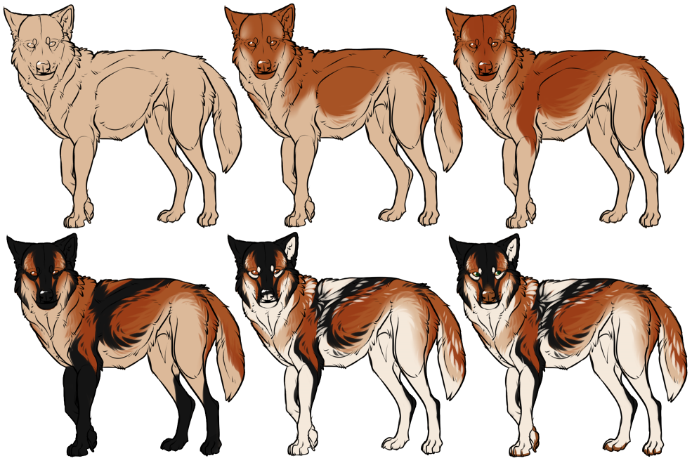
Not ALL my designs are laid out like this but MOST are. I use a "layer" system. This doesn't mean I actually use multiple layers for my designs, no. Actually I color it all on one layer.
Coloring it all on one layer helps blend the colors together better and gives a more realistic and natural look.
BUT I lay down each color in a pattern similar to how genetics determine color and placement in real life wolves and dogs. It makes the colors and markings flow nicely.
My designs will usually only have 1-4 colors in the design, though every now and then if I get a nifty idea it'll have more blending going on with a larger color pallete.
Anywayysss... Idk if this will actually help anyone but!? Here ya go I guess!
Art (C) Me
Related content


Comments: 10


Then regular/default one. I tamper with the settlings sometimes but thats mostly for shading. I p much use the regular "brush" brush for everything. Sketch, line, color, shade, even bg.
But yea. I just sometimes fiddle with the blend/dilution/persistance/opacity/etc settings. And just test to see what looks good.
👍: 0 ⏩: 0

Do you choose your colors before you go? Or do you choose your colors as your are designing?
👍: 0 ⏩: 1
Depends. I usually pick a base color, and figure out what would look good with it. But sometimes if i have somthing jn mind i'll have 2-3 colors and kinda blurr/messy mark with them then figure out a solid design pattern after
👍: 0 ⏩: 0

this helped me a lot in understanding how to make designs look nicer. Thanks
👍: 0 ⏩: 0

I do my markings/patterns the same way - one color either goes under or over another color, never both. Makes it look more fluid and believable. Your blending is excellent.
👍: 0 ⏩: 1
Same same! When you have colors that are both under and over with no real system it can be both hard to duplicate, and give an awkward difficult to understand flow.
👍: 0 ⏩: 0

This is really cool! I like to think of it as dog markings in real life to. There is the base "reds", (phaeomelanin), covered by some kind of black marking (eumelonin) diluted or not, and then white erases or covers that. It's facinating to me XD
")
👍: 0 ⏩: 1
SAME. Though I don't follow 100% to the code of genetics, I love it nontheless and use it in almost all of my designs.
It's hot, realistic, and flows well in almost any style or piece of art. It's great.
👍: 0 ⏩: 1
YES its easy for me to set up the layers that way too! I usually have to make another layer for the white LOL Yea sometimes the best characters are the ones that don't follow 100%!  (Smile)")

👍: 0 ⏩: 0