HOME | DD
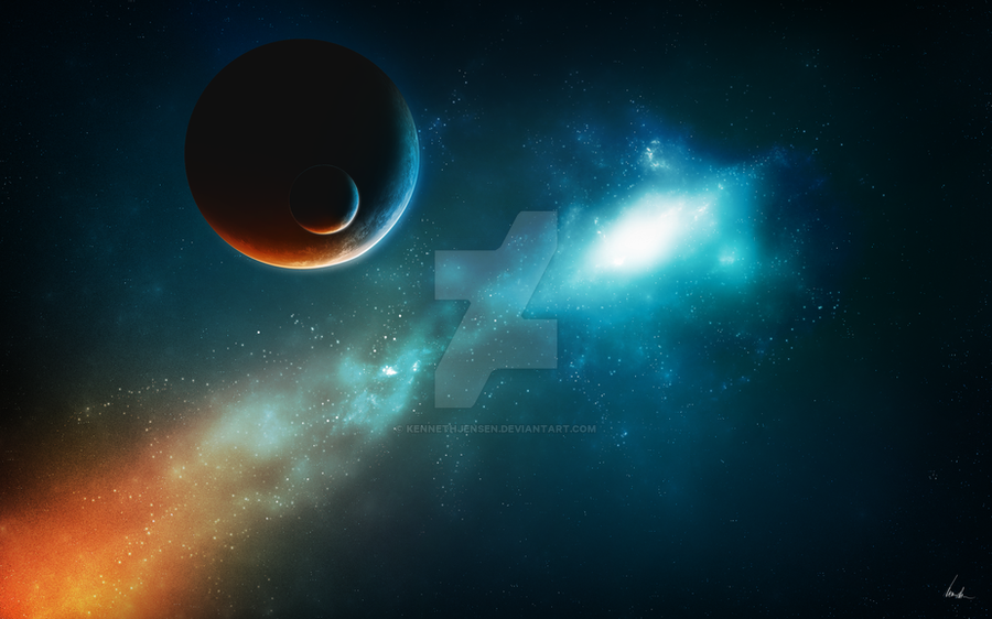
 KennethJensen — Starset
by-nc-nd
KennethJensen — Starset
by-nc-nd
Published: 2011-09-03 20:19:18 +0000 UTC; Views: 6626; Favourites: 181; Downloads: 961
Redirect to original
Description
So i was thinking the other day that instead of just come up with new things, i could try to alter the ideas i have had from previous work. So what i did was that i took a look at Consumption (one of my previous works [link] ) and i thought "What can i do different second time around?"I didn't want to deviate too far from the consept of the original piece. So after some work, this is the results.
So enjoy, hope you like it.
Starset in 2560 x 1600.
Related content


Comments: 37

")

Nice picture!
Can I ask you how do you create all those pics if I may ask? ^^ Are you using a program? If so please tell me!
Keep up the good work !
")
👍: 0 ⏩: 1

Thanks! I only use photoshop with some resourcefiles that i make in advance. (i use anything from handpainted textures, my own brushes to rendered apophysis pictures, the clue is i make everything myself)
So if you think of software, i use apophysis & photoshop
 (Smile)")
👍: 0 ⏩: 0


Amazing picture!!O__O
Very good job!^___^ *applauses*
👍: 0 ⏩: 1
Thank you. Appriciated
👍: 0 ⏩: 1


Thank you! Appriciated
👍: 0 ⏩: 0

Wow, what a masterpiece! Compared to the "original" this shows how much you have evolved as an artist!
-----------------------------------------------
NB: The following text contains critique based of personal preferences!
-----------------------------------------------
Overall this is a 10/10 (hence the fav). However, if you want to go beyond great, there are a few minor details that could have been even better.
The background is a bit repetitive. There's a LOT of clusters of 3 stars in a row all over the background.
On the planets on the most intense red area it looks like the color is "burnt out".
The red glow is a lot more grainy than the blue glow. Either the same amount of grain across the entire image, or no grain at all. Combining no-grain with a lot of grain looks weird.
👍: 0 ⏩: 1
Thank you! The red area is not my favourite, but that's how it ended up. So i guess i have to do better NeXT time. Something weird happen'd with the coloring this time. But i will practice some more and make future work better.
As for the stars, that's training on my part (increase spread on the brush or something) so that i won't get the clusters in the future.
👍: 0 ⏩: 1
Nothing wrong with a cluster of stars, but not the same cluster all over the place
I do look forward to seeing your next piece though
 (Wink)")
👍: 0 ⏩: 1
It's already in the works
👍: 0 ⏩: 1
Nice! Looking forward to it!
👍: 0 ⏩: 0

Woww this is really beautiful. I love the atmosphere and the contrast between the two colours.

👍: 0 ⏩: 1


Thank you. Glad you like it
👍: 0 ⏩: 0

Great imagery the light and color play are awesome.
👍: 0 ⏩: 1
Thank you. appriciated
👍: 0 ⏩: 1
It looks like you worked really hard on this one.
👍: 0 ⏩: 1

Amazing work. I wish I had that talent for backgrounds.
👍: 0 ⏩: 1
I still say that sentence to other artists all the time. But with practice, everything is possible. But anyways, i'm glad you like it and thanks for the comment
👍: 0 ⏩: 0

Thank you. Appriciated
👍: 0 ⏩: 0

Hi again :} and welcome back
I like the idea of the two coloured lightening of the Objects. Like a good vs. evil theme - always enjoying something like that. But somethings awkward, I can see the source of the blue light but not the one of the red one. Is it a comet or also a nebular, or a supernova? Its like the source isn´t there. (ok hard to describe and diffecult to understand what I´ve ment
Ok next one ^^ There is an empty space at the lower right corner, between your signiture and the blue nebular, I don´t know why, but I have to stare at it. Maybe some more stars would fill it. Or you could move the smaler planet at the other side of the great devide it would look like a % (don´t know the english word for this...percent sign?) but this would solve another thingy I would mention.
I think the smaler planet is too close to the bigger one, like its been covered, you have this theme (big planet meets smal moon) for some time and solved this issue better, like: [link]
or [link]
also the centered arrangement of the tiny stars seems too neat, you´ve done it better in:
[link]
there are some sparkling stars and some that do not shine so bright. And dosen´t looks like someone had put them there for a reson. They are just too close together.
I hope I didn´t displeased or offend you
so...I like it anyway ^-^
grtz K.


👍: 0 ⏩: 1
This is what i like about you. Always giving the honest answer. But thinking about what you say here, i must admit that you're right on all fronts. But some of These things ended up like that because i wasn't happy with the results (like the source for the orange lighting)
So instead of making some s#%t lightsource. I placed it outside the map (litterally) as for the planets, i just wanted to try somethig new from a perspective pov.
But when it comes to the stars and the empty space, you Are absolutely right. But i never redo a published piece, so i better have this in mind for the Next one.
Once again, thanks for the support and help so far. You Are a true source for inspiration and motivation.
Sincerely
Kenneth
👍: 0 ⏩: 1
uhm...
and 
You are always welcome,
liebe Grüße,
Anne


👍: 0 ⏩: 0
