HOME | DD
 kilara — Project ORIX
Published: 2006-09-29 02:06:33 +0000 UTC; Views: 10764; Favourites: 129; Downloads: 52
Redirect to original
Description
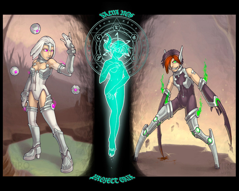
Three were made in the image of the Amsk.The first attempt was a mistake of epic proportions. Because of the over abundance of emotion, She became violently bi-polar, and began to distroy things. Therefore she was code-named Attack.
The second attempt was a better result. She had little to no emotive responce, thus nothing could get through to her. She was code-named Defence.
The third is still yet to be known. For she had escaped during initial testing. She was meant to be able to help the others, and make them well. She would have been code-named Cure.
Currently Attack is confined, and Defence is employed to recapture Cure. Hopefully her time in the outside would will help her become more useful.
--------
A little bit of a spoiler for XM here... and I know that some people might reconize these characters. That is because I am reusing some characters that had no story. Tho their personalities are far from what they were before.
Eventually I will move all of my homeless characters into XM, or give them to my friends.
I don't remember how much time this has taken me, mostly because of my comp resetting, and the fact that I took way too many breaks. XD
I guess about 10-15 hours... about.
(Comments = good, Favs = pointless)
XM and project ORIX © Me
Related content


Comments: 85

Neato! ")
👍: 0 ⏩: 0

i like the effects, and would love to see cure with an offit like the other twos
👍: 0 ⏩: 0

Cool, cute and wow ideas combined.
I like simplicity added with details. Something soft but still clear. Starscape pops to my mind, when I look at colors of this piece. The spaceships and space look like these characters.
Childish bodies (big heads) and not much clothing, that's another concept I don't see too often in 
In the end, I love simple ideas in this picture and no added cuteness in it. Huge bonus for absence of sugary smiles.

 (Smile)")
👍: 0 ⏩: 0

I prefer the "Lost Scout" version of Ty much better than Attack. It was much more detailed.
👍: 0 ⏩: 0


ehehehe ")
👍: 0 ⏩: 0

Artwork is always best served with a dose of spoilers ^_^
👍: 0 ⏩: 0

The colors on this are amazing and the background is fantastic. Only thing is that I think the girls arm is a wee bit too long. But I could be just seeing things since it's supposed to be at an angle.
👍: 0 ⏩: 0

well i'll go for a comment then
awesome. I especially love that silhouette in the middle

👍: 0 ⏩: 0

So, Ty became Attack... and Kilara's Cure... but I don't recognize Defence. o:
Anyways. I like Attack the most. She's kind of freaky with those legs, but she looks really cool.
It kind of looks like Defence has some kind of psychic powers to levitate those balls surrounding her.
Can't wait to see more pictures of these two/three
👍: 0 ⏩: 1

Defence was an old D&D character I had, and I only like posted a few pics of her... Her name was Relic. and yes she does have psionic powers. XD
don't worry you will be seeing more!
👍: 0 ⏩: 0


wow, I think I know who the third one is 
👍: 0 ⏩: 0

hail the SHINY EYES OF DOOM
love the contrasting colors, great work!
👍: 0 ⏩: 0

Neato tryptich. Oh ragh. Ty wins my heart over yet again with her charming mania.
👍: 0 ⏩: 0


OH . This is fuckin amazing ! I love the colors .... Mecha legs look really cool , and realistic ! You've got your own style , gotta check your gallery ^w^ !

👍: 0 ⏩: 0

mmm lovely pair, mechanical legs are twisted and cool
👍: 0 ⏩: 0

Very cool. I like the one on the far right, who I'm going to assume is Attack. His hair is awesome
👍: 0 ⏩: 0

I love Code-name Cure. She just creeps me right out. I dunno if it's her face, expression, pose or maybe the fact that her legs are all bionic. Something about her is just....wicked. ^__^
I'm fairly intrigued now, about this story! Do you normally post your stories on DA? Or should I be looking somewhere else for your wonderful inspirations?
👍: 0 ⏩: 1
The one with the bionic legs is Attack... Cure is the centre one.
and I don't have my full story posted, because of security reasons. but if you read the little quirps in the discriptions of the pics I post, you can get a little feel of the story.
Oneday I'll post all of the stories.
👍: 0 ⏩: 1
Awesome! XD I will keep an eye out!
👍: 0 ⏩: 0

You need crits? Okay... But I'll still fave it. :3
So... The side pictures should fade more into a gradient into the middle pic (oooh, really hard to gues who it is XP), because I think it's too quick of a fade-down. Also, the shadowing on the caracters should fit-in more with the feel of the background (ex; a light red light from the lava (is it lava? o.O) on the right-side pic, so it means the highlight should be a bit reddich and that the shadowing should be the other way around). Also, the smoke comming out of 'Attack' should have a more smokey feel IMO, so it should fade higher up, if you know what I mean.
Is that I good crit? =3
👍: 0 ⏩: 2
The middle part is not sposed to be a fade in... the black have an actual purpose, that will be revieled more in the story. And the reason the characters stick out of the bg, is because I was trying to get a somewhat symbolical effect...
yinyang?
I am surprised that no one had seen the symbolic part, and how few see who the middle person is... tho I bet you read the comments XD
👍: 0 ⏩: 1
Heh, yes I do<3 And I actually paid attention to the little details. The pic with Kilara as an Amsk...?
And I said that the middle the borders of the side pics could fade in more with the black of the middle one, 'cuz it just seems abrupt.
I'm sorry if you weren't looking for crits, but I just understood that by 'faves are useless, comments are favored'. Know what I mean? o.O
 (Wink)")
👍: 0 ⏩: 1
the fading in is meant to be abrupt... the black is a character...
👍: 0 ⏩: 1
I know, I just say I think the fading would be better of it were slower, dun go all claws and teeth out on me because I said that... D;
👍: 0 ⏩: 1
I am sorry, I don't mean to sound like I am angry, I am just trying to let you know that things are purposeful. I am not saying that the pic is perfect.
👍: 0 ⏩: 1
It's okay, I still love it<3 XP
👍: 0 ⏩: 0
By the way, the pic is still pure awesomeness, but you asked for crit<3
👍: 0 ⏩: 1
I didn't nessesarilly ask for a crit, I am just mostly pointing out how I find that favs are utterly pointless, and should be removed from the system, or at least have a way that artists can disable them like they can disable comments...
👍: 0 ⏩: 0

I like the middle one, its best suited for its environment... It looks the best too.... The first ones face is slightly off on proportion... The third is just unapealing... Overall I think you did a good job, and it does look nice!!
-kazu

👍: 0 ⏩: 1
XD!
The 3rd is meant to be unappealing
LOL
👍: 0 ⏩: 1

holy cow
I love the description and the charecters
*FAVIES*
👍: 0 ⏩: 0

I love the glow on the center figure along with the symbol painted there. Very cool.
If by 'favs = pointless' you mean that people should comment when they fav, I completely agree with you. Favving randomly without leaving a thought to the creator about -why- one favved it, is quite pointless to me too. >.<
👍: 0 ⏩: 1
Actually Favs seem to have lost all meaning, one is what you have just mentioned, the other is the who fact that it is no longer the way to get to front page (for those who actually want to be on front page), it just fills your message centre with pointless messages.
I could go on... but for now I'll just wish for a Fav disabler feature.
👍: 0 ⏩: 1
Oh wow, I never considered that they don't go on the front page anymore. I actually didn't -know- that.
*marvels in ignorance*
I don't understand why there are favs anymore, then... other than it may be a boost on the artist's confidence that someone liked the piece so much they favved it. Then again, some people just randomly click 'add to favs' so that sortof nullifies that. I'd like to think that if someone favs something on my page, that they really liked it, that they appreciated the work I put into it. Again with the ignorance, or perhaps that's just naivety. >.<
👍: 0 ⏩: 1
It kinda looses that feeling once people start going through the entire gallery faving every pic from you.
👍: 0 ⏩: 1

totally love tys new design <3
and the whole pic is gorgeously done from the lines to the colors

👍: 0 ⏩: 1
I should probably do a comparison pic between Ty-demon, and Ty-bot.
So that people see the differences and simularities.
XD
That would really confuse people XD
👍: 0 ⏩: 0

I LOVE Attack's design and Defense is beautiful, I could tell her purpose before I even read the story. Can't wait to ser Cure! Awesome job <3
👍: 0 ⏩: 0

Great job....so to make sure I am not mistaken is this going to be for a comic or somethin?
👍: 0 ⏩: 1
It will be a lesser part of the whole story, yes.
👍: 0 ⏩: 1


oooo awsome, i like attacks legs, i wouldent wanna git stepped on by those *squish* Defence's floaty type ball things are also equally cool and i like that spell thing at the back of cure's head, did you draw that yourself?? *bursts*
👍: 0 ⏩: 1
Sorta, it was designed by me and so on, but my drawing wasn't perfectly geometric, so my friend ~Aberael remade it in photoshop, making it look perfect!
👍: 0 ⏩: 1
| Next =>