HOME | DD
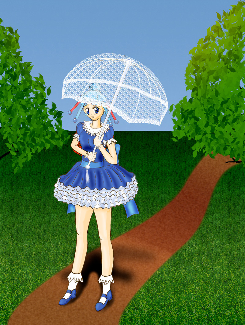
 KinnoHitsuji — Pallas with Parasol
Published: 2009-07-10 23:05:13 +0000 UTC; Views: 642; Favourites: 20; Downloads: 17
Redirect to original
Description
Work in Progress. Almost done. Need to eat though.Anyway, it's Gothica Lolita Baby style... I always thought of her in this sort of style, or a frilly style. Also Perriot-type styles.
The parasol was so hard to do! Especially at that angle.
The lace I got from two resources... 1 was a pattern maker, and the other was from a Japanese website with lace.
Credits:
[link] for the main part of the parasol
The lace is from ::Screentones:: who lifted it off of a Japanese website. Because I think that site aggregators shouldn't get credit for other artist's work especially when they don't give credit, I'm listing the Japanese website. I believe it's this one: [link] Even if this is a misattribution it's a good site.
Edit: added base colors. Wow messy. I also finished the lace on the parasol. I'm happy.
Edit: Cleaned up the messy coloring, finished the parasol. Still needs highlights and shadows.
Edit: Added highlights and shadows. Trick I learned is that you can give an object weight by adding in a shadow.
Related content


Comments: 8


It has been interesting to follow the process of creating this picture, which also reminds me that I improvise a lot rather than plan. I notice that my eye seems drawn to the tree to the right of Pallas, perhaps because she isn't centered in the picture; were you going to crop the picture later to center it on Pallas, or add other elements in the background to her right?
👍: 0 ⏩: 1

Centering a figure all the time is bad idea. A lot of artists do it, but if you follow the golden mean, that's a better plan. Watch TV, I bet you anything that the eye in in the middle of the left of the frame or right of the frame in close up. Rarely is a face centered on TV. It's a trick and a good one.
Even with that I completed it and got lazy because I didn't want to draw the other trees in the park.
Your eye is probably drawn to the right because of the big bright spot against a cool color background. Yellow against blue and green. (Blue and green are analogous colors). blue and yellow are complimentary. So it has nothing to do with composition, per se, it has to do with 1. laziness. 2. I took out the sun because I didn't want her to be backlit causing color issues.
With the heat the way it is and crunch time in school, I'm learning from my mistakes and moving on. There is a clear Elios Deficiency and I think I want to fill it.
👍: 0 ⏩: 1
I suppose you're right about centering; as I look at my own pictures, the faces aren't necessarily centered but I do try to have the composition be balanced so there isn't too much empty space (or I think you might have called it negative space the other day) on one side or the other of the main subject. It sounds like you're moving on from this picture but I was thinking it would be neat to fill the large space to Pallas' right with something besides the path, tree and grass, maybe something evocative of childhood to reinformce the childlike aspect of her personality suggested by the Gothic Lolita costume, or ironic or symbolic in some way.
👍: 0 ⏩: 1
Filling too much negative space is bad Makes the picture look cluttered and busy. Using it well is the key. However, I think breaking the horizon line more probably would have helped, but I have other projects to finish first that I've been promising for a while.
👍: 0 ⏩: 1
It is true a picture can be easily cluttered, but I've thought about this particular picture quite a bit and I think it wouldn't necessarily hurt to have a relatively simple extra element in the intermediate distance (like a wishing well, or a picnic basket, or frolicking kittens, or whatever) in that open space. I often fail to take advantage of negative space - perhaps because I'm more concerned with centering images than leaving myself good negative space - but it seems to me this picture of Pallas, which is already good, would lend itself to a small extra element being added to take advantage of the open space.
👍: 0 ⏩: 1
Not doing it, I have 2 art projects due, demand for the manga I'm drawing, another picture to draw, and other life. While I can understand the need for a midground, other life is more pressing. The main concept was not the overall picture, but the dress on Pallas. The original sketch may be better because of the foreground, midground, etc aspect, but since mission was accomplished, I'm not stressing over it and moving on.
👍: 0 ⏩: 0
