HOME | DD
 kiyo —
Demons of the first circle
kiyo —
Demons of the first circle
Published: 2008-09-09 18:28:58 +0000 UTC; Views: 17212; Favourites: 428; Downloads: 511
Redirect to original
Description
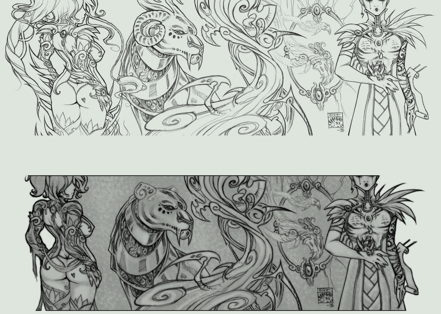
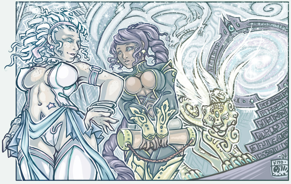
For Exalted: Books of Sorcery, Vol. V - The Roll of Glorious Divinity II.The lineart above is what it was before I was asked to change some things. Sadly, I really liked my horned lion and spikey demonic armour. :<
Perronele, theodozj (or whateverthefuck), tomescu, passion morays, and sesselja.
Related content


Comments: 44

I liked it better, too. More busy, but also more balanced and looks cooler.
👍: 0 ⏩: 0

EEE! The armor, the lion, and the bugs are my 3 favorite demons in the game and OMG! you drew them so well! Either one is amazing really.
The armor in the first one, I think the only thing I'm a bit eh on is the shoulder spikes. I love the spikes on the gloves, though.
As for the lion, either one! Though, the top one makes it look more like a demon lion so I really think the top one makes a bit more sense.
I'ma...just gona go squee in a corner then now. Dont mind me...
👍: 0 ⏩: 0


come on man, you should shade the first version, don't erase those beautiful details =O
👍: 0 ⏩: 0

Just... wow. Both versions look amazing, but I do like the spiky armor better.
👍: 0 ⏩: 0


ooh,spiky armour ftw!!
 (Smile)")
👍: 0 ⏩: 0

this is amazing! both versions of it. im a big fan of fantasy and this is def one of the best ive seen
everyone link and comment plz! [link]
👍: 0 ⏩: 0


the first pic is unrestrained no matter how u look at it which is why i like it more ")

👍: 0 ⏩: 0

composition-wise the second one works so much better. though the idea of horned lion may be impressing to some, but to me the shape of the second lion is much richer and defined, than the horned lion. And the hair of the girl to the left too i think is much better in the second one. Because it's simple and clear. and it breaks from the repetitive vertical lines that you had going on in the first picture. Over all i think the negative shapes in the second picture is much more interesting. so I'm glad you did those changes. very good both of them. I like your line work, reminds me of James Jean's.
👍: 0 ⏩: 0


omfg that would be a beautiful tattoo design
👍: 0 ⏩: 0


I miss the horns and armor too. D: I love the first one so much more. <3 It's amazing!
👍: 0 ⏩: 0

I think that the first version looked cooler. HORNED LION! WHAT'S TO CHANGE ABOUT THAT? 
👍: 0 ⏩: 0


Nicely done!, I liked the flow and movement!!
Saludos!
👍: 0 ⏩: 0


damn, I really like the horned armour too, too bad. (Just contact them next time they want to change something and tell them to check out your DA page, and how many people liked it better the first way >.<
 (Wink)")
👍: 0 ⏩: 0

i like the first on much better mainly beacuse its how u wanted it...but also i like the girl on the lefts hair..
overall very well done..
👍: 0 ⏩: 0


The "lion" in the top one didn't look like a lion.
If you could have made it look like a lion first - *wearing* horns - it would have probably made the cut.
I noticed you lost a lot of hair along with the spikes - was that also suggested by the customer?
I rather _like_ the simplification that resulted - but then I'm having trouble with my eyes lately. Cleverly coloring/shading the first one would probably negate my complaints.
Your work is quite inventive, clean. and precise.
Come on over and give my work a good rip-n-tear critique!
👍: 0 ⏩: 0

the terrible problem with freelance work - the owners of the IP can always muck it up...
👍: 0 ⏩: 0

Yeah, I prefer the top one too. Very nice work though, to say the least.
👍: 0 ⏩: 0

I have to say, the Stomach Bottle Bug picture really freaked me out when I first saw it. I kept looking at the guy, going "What sort of demon is he..." and then I noticed the bug crawling out of his stomach. Ew. Ew.
So, yeah. Very effective.
👍: 0 ⏩: 1

Hahaha, yeah, that's a Sidereal with a demonic stomach bug. Lovely.
👍: 0 ⏩: 0

The original is kind of sexier. D: I LIKE HORNS.
Beautiful work in both versions, though.

👍: 0 ⏩: 0

well, in my opinion both versions look strikingly beautiful...
👍: 0 ⏩: 0

both are great, but yeah, i really like how much crazier and spikier the perronele armor is in your first one! why didn't they like it??
👍: 0 ⏩: 1
I don't know. Something about the demonic armour not being able to grow spikes, which I thought was kind of... lame. :/
👍: 0 ⏩: 0
shimmyshammy [2008-09-09 18:52:52 +0000 UTC]
A very strong and excellently presented selection of designs that indicate how your expertise as an artist have grown more so and how your work feels vibrant and loveable through two forms of media.
The variation of designs and clean assortment of digital skills are truly majestic and the formation of characters that are expressed here is strong. It shows that you can work in any form given and demonstrate it with a feisty and vibrant attitude.
Keep it up
👍: 0 ⏩: 0


I really like it better the first way too. I love how the horned lion looked XD
👍: 0 ⏩: 0