HOME | DD

Kleinschmidt1 β€” qwik invite community

Published: 2006-12-23 23:27:45 +0000 UTC; Views: 7282; Favourites: 50; Downloads: 269
Redirect to original
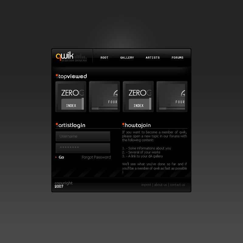
Description Still a W.I.P, ignore the "howtojoin" part

[link]
Related content
Comments: 33

sm0kiii [2009-05-14 09:59:57 +0000 UTC]

nice wrk

πŸ‘: 0 ⏩: 0

tukz [2007-07-02 10:02:43 +0000 UTC]

nice job

πŸ‘: 0 ⏩: 0

sh00ky [2007-06-17 21:38:12 +0000 UTC]

wow nice what for font in qwik

πŸ‘: 0 ⏩: 0

EARLYHAVER [2007-05-07 20:22:36 +0000 UTC]

Mensch du bist ja richtig gut!

πŸ‘: 0 ⏩: 0

kolstan [2007-05-02 20:11:42 +0000 UTC]

It was really nice, I did not like the "artistlogin" part, but overall, REALLY nice..!

πŸ‘: 0 ⏩: 0

amrtalaat [2007-04-12 13:11:59 +0000 UTC]

wow its beautiful

πŸ‘: 0 ⏩: 0

Jonnotie [2007-01-25 22:34:42 +0000 UTC]

Great work. I Featured this design in Unknown webdesigners | Edition 2 .

πŸ‘: 0 ⏩: 1

Kleinschmidt1 In reply to Jonnotie [2007-01-26 10:46:54 +0000 UTC]

yay ! thank you

πŸ‘: 0 ⏩: 0

Lammbock [2007-01-18 07:19:23 +0000 UTC]

zu dunkel und dadurch zu unΓΌbersichtlich :/

πŸ‘: 0 ⏩: 0

neXtar [2007-01-13 14:01:09 +0000 UTC]

Very Nice Design again - You make realy clean ones.

πŸ‘: 0 ⏩: 1

Kleinschmidt1 In reply to neXtar [2007-01-13 15:43:15 +0000 UTC]

thanks a lot

πŸ‘: 0 ⏩: 0

Fabi-FR [2007-01-02 21:14:11 +0000 UTC]

cool and clean... That`s what I like!

πŸ‘: 0 ⏩: 1

Kleinschmidt1 In reply to Fabi-FR [2007-01-03 17:35:51 +0000 UTC]

thanks bro

πŸ‘: 0 ⏩: 1

Fabi-FR In reply to Kleinschmidt1 [2007-01-03 17:41:07 +0000 UTC]

πŸ‘: 0 ⏩: 0

krugonN [2007-01-01 09:00:30 +0000 UTC]

Nice!

πŸ‘: 0 ⏩: 0

Codex-nz [2006-12-28 05:19:14 +0000 UTC]

nice, i really need to work on my web design skills eh.

πŸ‘: 0 ⏩: 0

lbmixpro [2006-12-25 04:54:23 +0000 UTC]

Looks awesome, shading and all. But how did you get it vertically centered?

πŸ‘: 0 ⏩: 0

Jonnotie [2006-12-24 20:01:52 +0000 UTC]

Looking good

πŸ‘: 0 ⏩: 0

Madsoul [2006-12-24 13:30:51 +0000 UTC]

I love it a nice feeling to it. Like the edges on everything, the colours. The light line on top of the gradient on the top of the side, i like all the details.
The orange red colour in the logo is perfect.
The font i the menu is perfect.

πŸ‘: 0 ⏩: 1

Kleinschmidt1 In reply to Madsoul [2006-12-24 13:40:25 +0000 UTC]

thank you

πŸ‘: 0 ⏩: 0

Kleinschmidt1 [2006-12-24 11:36:12 +0000 UTC]

Thanks

As I said before, I'll work on the login/howtojoin part

πŸ‘: 0 ⏩: 0

bl1nks [2006-12-24 11:12:32 +0000 UTC]

sehr schΓΆn gefΓ€llt mir sehr gut!
ich find den login allerdings ziemlich passend

πŸ‘: 0 ⏩: 0

Werrny [2006-12-24 10:59:36 +0000 UTC]

great!

πŸ‘: 0 ⏩: 0

mD-06 [2006-12-24 10:48:48 +0000 UTC]

klein aber fein

πŸ‘: 0 ⏩: 0

SabotazZ [2006-12-24 10:09:34 +0000 UTC]

klein und gut

πŸ‘: 0 ⏩: 0

Kuzaj [2006-12-24 09:43:18 +0000 UTC]

wow wieder mal geil

πŸ‘: 0 ⏩: 0

ZevuArt [2006-12-24 07:49:54 +0000 UTC]

I liked the effect that u used in this work

πŸ‘: 0 ⏩: 0

JagarValley [2006-12-24 06:32:46 +0000 UTC]

really nice and smooth.

πŸ‘: 0 ⏩: 0

ShADowPr0ph3t [2006-12-24 03:27:47 +0000 UTC]

Nice and simple. I agree with another poster that the login box is a bit big but overall the design is nice.

πŸ‘: 0 ⏩: 0

aimeta [2006-12-24 01:37:27 +0000 UTC]

nice aber wie auch die andern ,find ich auch der login bereich is nen bissi zu fett

πŸ‘: 0 ⏩: 0

sp-eciaL [2006-12-24 00:41:16 +0000 UTC]

recht QuuuuuL, aber der login-bereich sieht nen bissel FETT aus ^^

πŸ‘: 0 ⏩: 0

A-sherz [2006-12-23 23:38:39 +0000 UTC]

Luvin it man, nice n clean, simple yet effective. only thing i dont like is them login boxes, bit big ent they. Apart from that though its the sex

πŸ‘: 0 ⏩: 1

Kleinschmidt1 In reply to A-sherz [2006-12-23 23:40:48 +0000 UTC]

Thanks, I'll work on that

πŸ‘: 0 ⏩: 0