HOME | DD
 kpearce — The Hulk Colors Final
Published: 2011-08-25 09:09:39 +0000 UTC; Views: 1197; Favourites: 25; Downloads: 12
Redirect to original
Description
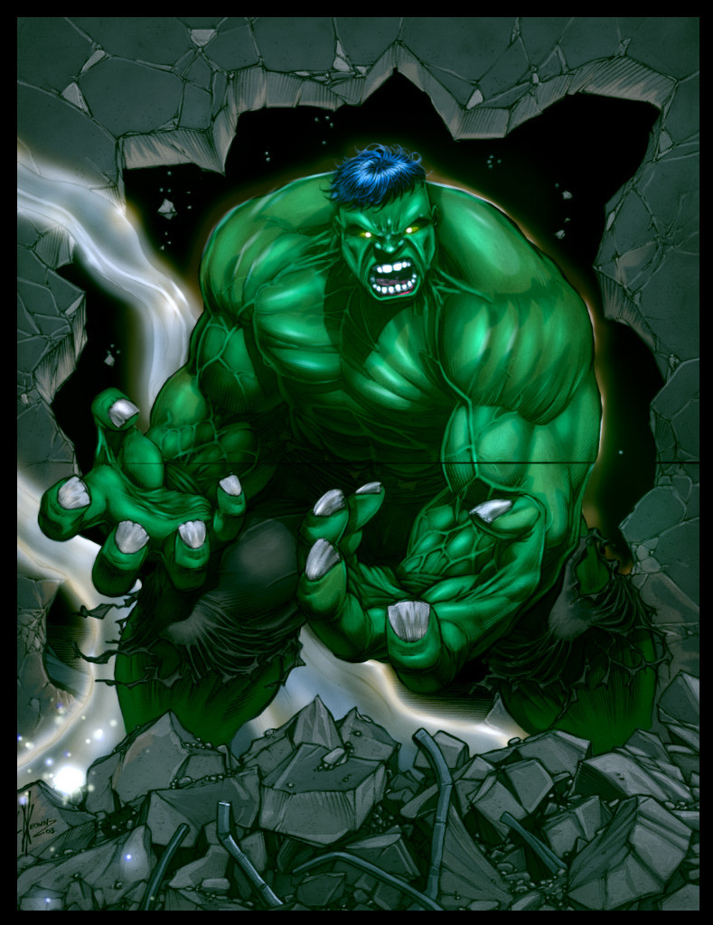
Dale Keown - The Hulk pencilsColors - Me
This is the final version , could have done more with the fingernails and highlighting.
Related content


Comments: 12

Nice Form but i feel like the colours aren't dynamic enough. It feels like you just got green layer and used a multiply/overlay layer. I Suggest making the shadows a teensy bit bluer and the lighter bits a teensy bit yellower, if you don't understand how this will help I can link you to some art where I feel this works out well.
The harsh shadow underneath the head tells me you have strong direct lighting from the top side, but I don't see the reflection/vibrant lighting I expect from such a close light source.
(The Shadow under the head displays a close light source, but the rest of the form kind of shows a far/ambient light.)
To be honest this is really good.
👍: 0 ⏩: 1

First thank you for saying it's really good , after reading your comments I found everything you said really helpful , although there are alot more layers to this than only a multiply/overlay combo , actually there is no overlay layer at all to be honest..but I understand what you were getting at , at last count I probably had 6 different layers.
I tried the hints you suggested in your comments and found they really helped (especially adding the yellow to the highlights , which I swapped for a yellow/green swatch but really tried to punch using a screen technique with my brushes set to a lower pressure at around 26% if I remember and that seemed to give a nice effect.)
The shadow under his head I am also going to try and punch , as well as other areas I initially saw that lead me to want these types of feddback comments.
It seems the shadows are the areas that may be lacking in this..I need to really hit those to make this work properly I think.Thank you for the great feedback and suggestions!
👍: 0 ⏩: 1
Can't wait to see the results. ")
👍: 0 ⏩: 0

nice! i probably would have made the details in his face a bit sharper... he looks kind of blurry. also make the smoke smokier. but i do like it and the rubble is very nicely done
👍: 0 ⏩: 1
After I loaded it back into photoshop I started to play with the highlights/shadows around the face , after I stare at this I see what you mean and agree if I punch some hard highlights into the face , it'll make it pop more.Thanks a ton for the feedback!
👍: 0 ⏩: 0

Excellent colour job! Shading is awesome especially with the veins. They look quite filled with rage.
my only real critique is that the entire composition looks a bit too 'soft'. With such and angry picture the shading should be a bit sharper if you know what I mean?
👍: 0 ⏩: 1
After reading this I loaded the psd and started playing around with shadows and tried to sharpen and darken vital areas like you suggested.Thanks for taking a look and the feedback it's much appreciated!
👍: 0 ⏩: 0

anytime  (Smile)")
👍: 0 ⏩: 0
