HOME | DD
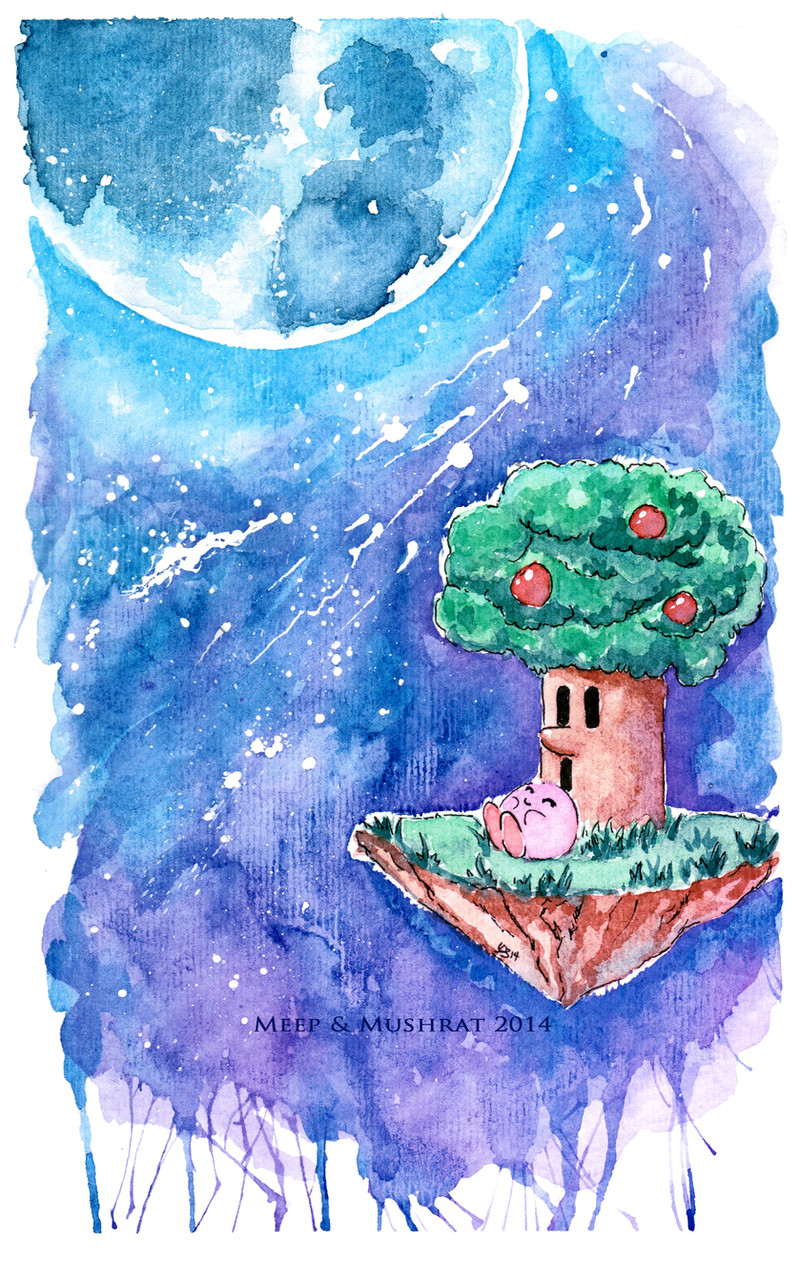
 L-Y-N-S — Kirby and the Apple Tree
Published: 2014-05-16 22:03:19 +0000 UTC; Views: 2161; Favourites: 199; Downloads: 0
Redirect to original
Description
Painting practice...I haven't done a Kirby art in a while so I thougt I would practice moons and skys. I'm not sure this came out too well, I'm debating putting it on my Etsy for sale.Watercolors - 3 hours
Featured Works:
_____________________________________________________________________________
ETSY
Follow me on INSTAGRAM
Related content


Comments: 24

Cute!
I was glad to read that you used this painting to practice skies and moons, because that's actually my favorite part of this! I think the starry night sky here and big, glowing moon/planet is pretty stunning.
I like that you did not use black to make that starry night sky -- I love how you blended blues and purples together to create it. I makes the glowing light of the moon feel stronger -- the light from the moon is softly lighting up the night sky, and it gives everything a really peaceful atmosphere. And it makes for a livelier, more exciting scene than a jet black sky.
I like how the light from the moon is bold and bright and at the same time soft. I like how the bright blues softly fade into the darker tones around the planet. And I like the sense of energy that gets added to the sky because the colors are blended in all of these different, kind of wild splotches, and how the bottom of the "frame" is lots of dripply, splattery marks. The scene is peaceful, but it's also got a lot of energy and life and excitement to it from how you blended those colors.
And the stars are fun. I like how they're placed, how they're composed -- how they follow this kind of trail in the middle of the painting that grabs your attentions and guides your eyes along the painting towards the glowing moon. They have a sense of motion to them that adds to that energy in the painting.
Kirby and Wispy look cute. I like the different textures you created throughout their part of the piece -- the leaves feel different from the grass which feels different from the rocky bottom of the floating island. The trees this dense, organic feel from the darker tones of the leaves' shadows, and the rocky bottom has more rigid shadows that give it a harder, rockier feel. I like the sprigs of grass and their darker tones, though I wish the rest of that grassy surface has some more variation in tones, as most everything else in the painting does.
I think the weakest part of this is that white "border" around the island/Wispy. It hews pretty close to things, but not in a very clean way, and feels a little distracting. I think if the color of the sky can't run right up to the edges of the island, a bolder, more intentional white "halo" around it would've worked better. Either a thicker outline, perhaps with a styled shape to it, to make it pop in a fun way, or a soft glow, like there is around the planet, that softly fades into the sky around it.
But overall, it looks great! I love how you created such an exciting scene! That sky has this great, big sense of wonder to it -- you really brought it to life! Great job. : )
👍: 0 ⏩: 0

This has to be my favorite work of yours ^^ It's VERY nice.
👍: 0 ⏩: 1

I'm glad they're friends... That tree isn't always so nice to Kirby!
👍: 0 ⏩: 1


Nice job with the watercolors! I really do love the effects
")
👍: 0 ⏩: 1

I really love the coloring here! It's beautiful and fantastic!
👍: 0 ⏩: 1


Oh my gosh, it's Kirby! I like that little guy! Nice work. I like the moon and the little patch of ground lol.
👍: 0 ⏩: 1

Yea! Thanks im happy you like it!
👍: 0 ⏩: 1


