HOME | DD
 Legrandzilla — MM28 Godzilla Before and After
#commission #godzilla
Published: 2017-11-23 13:22:54 +0000 UTC; Views: 401; Favourites: 29; Downloads: 4
Redirect to original
Description
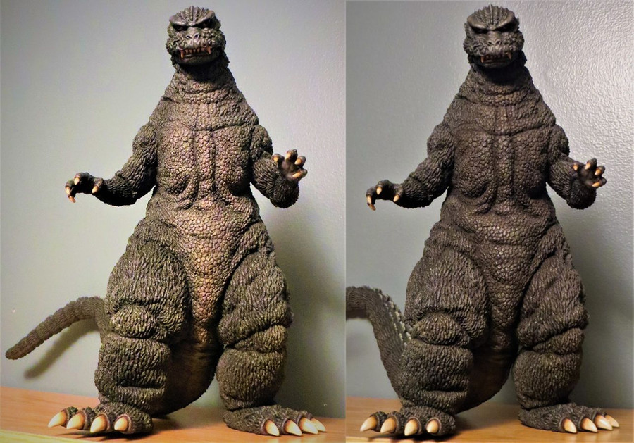
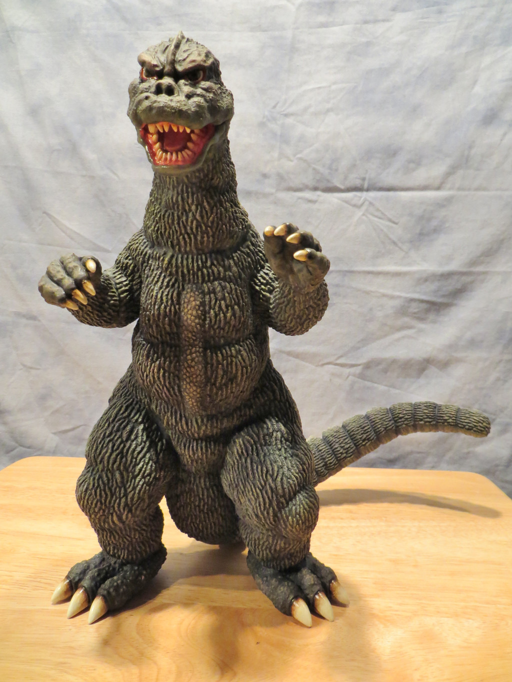
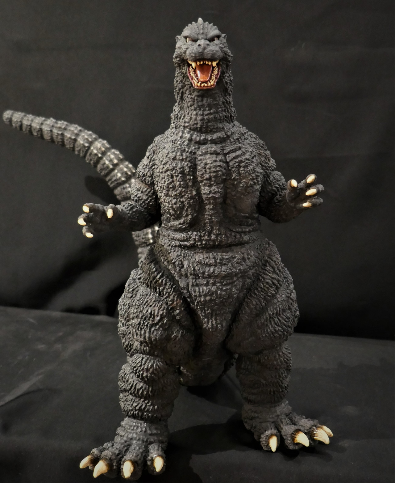
My preference when paining most Godzilla's is to have some color variety, usually I lighten the belly and under the tail and around the throat and chest area I like to add warmer tones like you see in some animals and also to give the impression of heat at its core. Also I like there to be contrast to show the 3 dimensionality of the sculpt, it makes it have more weight and realism in my opinion.The client wanted me to repaint it because he preferred a more consistent color theme, so I attempted to do that. How did I do? Hope he likes it now!
 (Smile)")
Related content


Comments: 12

I agree, I prefer the color variety in the left one
👍: 0 ⏩: 1

Thanks! So I am not crazy lol!
👍: 0 ⏩: 0

I prefer the first one, looks like an actual animal instead of a suit like the repaint. but thats just me.
👍: 0 ⏩: 1
That’s my thinking too
👍: 0 ⏩: 0

Nice, I can really can tell the differences :3
👍: 0 ⏩: 1
Thanks! Which do you prefer?
👍: 0 ⏩: 1
Hmmm, the one in the left ^^
👍: 0 ⏩: 1
Thanks! Do you like it better now?
👍: 0 ⏩: 1

either one looks good to me, but yeah
I like the darker one a little better
and you're welcome
👍: 0 ⏩: 0