HOME | DD
 lightfootcomics — Coloring Pulse WIP
Published: 2011-04-16 08:21:26 +0000 UTC; Views: 2169; Favourites: 27; Downloads: 81
Redirect to original
Description
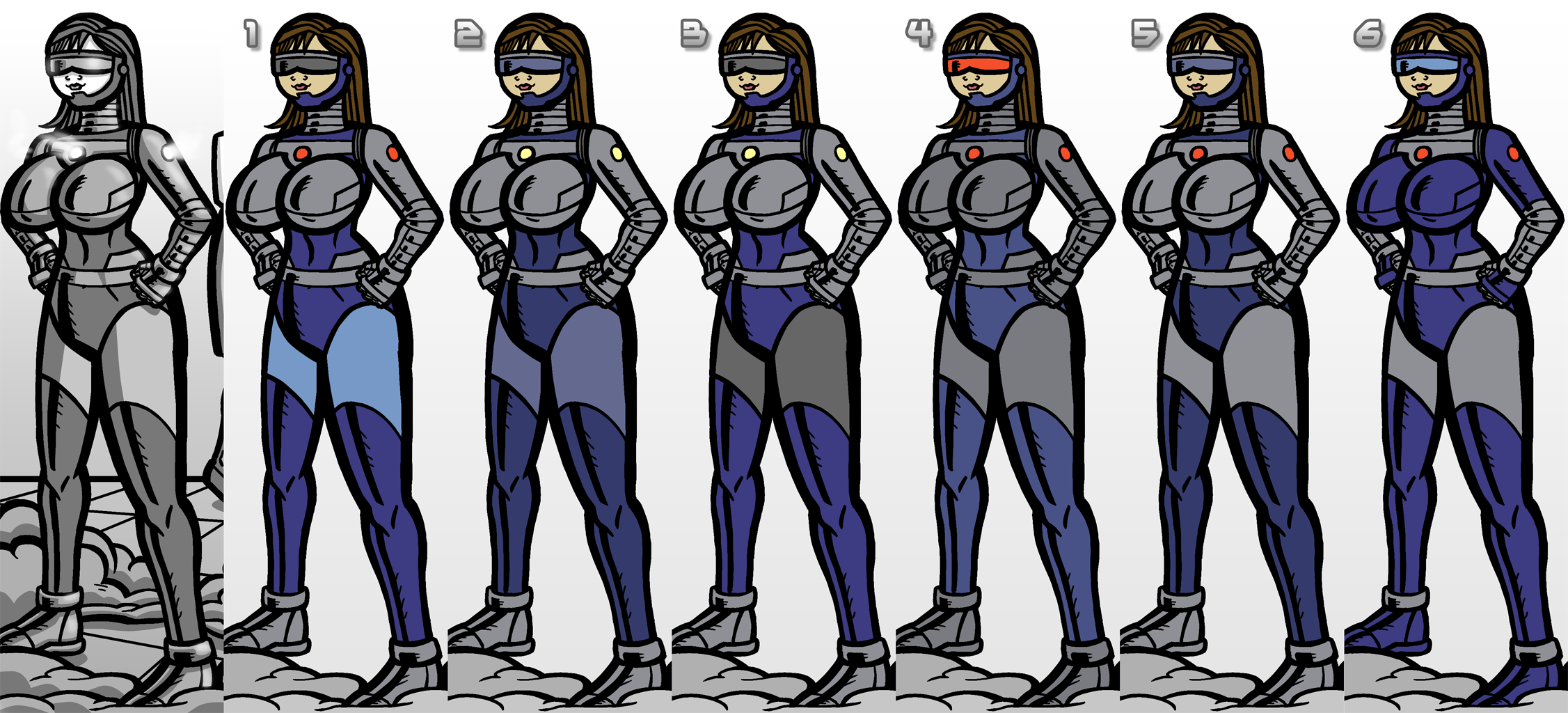
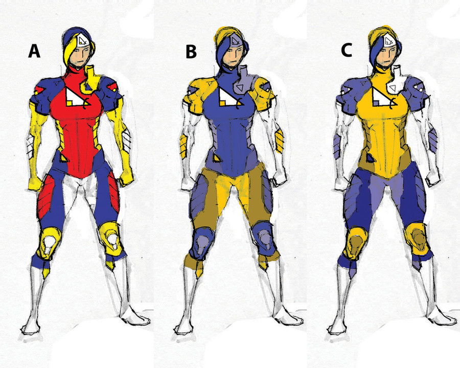
I've been meaning to come up with an official color scheme for Pulse. I suppose there's no reason why it has to be exactly the same as before, so I could consider other options.I've already shown the suits in black and white, so it's possible that I should follow the same pattern of light and dark areas.
The picture on the far left is (obviously) a panel from a recent page. I decided to color this picture as an example, deciding it was more efficient than drawing an entire picture for this purpose. This is a picture of Annie, but Tabitha's suit might be colored the same way.
The options:
1. Similar to the original. The dark visor (which could better hide their faces) is the only difference.
2. Muted blues, darker blue legs, blue visor. Yellow lighted elements instead of red.
3. Similar to #1, but yellow lights and dark gray thighs.
4. Kind of a odd option. Lighter blue, darker gray, red visor.
5. Darker blue, different combination of other items.
6. I thought I should also include the coloring option from 's gift art, shown here- [link]
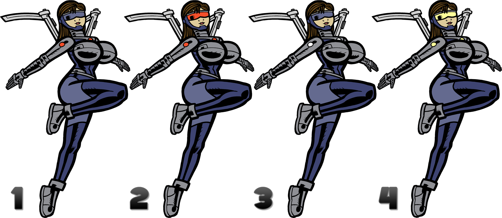
Any opinions? Some that you like or don't like? None of these show the wings extended, but this includes most of the costume.
Related content


Comments: 18

I like 6, but with the light blue color of 1 on her legs
👍: 0 ⏩: 0

I like strong contrasts, so number four would work for me.
👍: 0 ⏩: 0


6 doesn't look metallic at all. My vote is for 4. the colors seem more... in tandem, if that makes any sense.
👍: 0 ⏩: 0

I would have to say #6 works the best imo. Maybe take the gray area in the thighs and add the metal/silver ribbing pattern like you did in the neck and forearm area.
👍: 0 ⏩: 0

I think that it would be best as #6, but with #4's visor.
👍: 0 ⏩: 0


i like number 3 but i like the flare you have coming out of the chest and shoulders of the mono one
👍: 0 ⏩: 0


 (Smile)")


Id say go with 6, but give her 4's visor
Maybe give the upper breastplates light gray, while maintaining the dark blue "underboob" and side panels. Make it look like she's wearing a bustier.
👍: 0 ⏩: 0

Another vote for 4, the red of the visor really helps draw the eye
👍: 0 ⏩: 0

Definitely 4. The splash of color draws the attention to the face and expression, which, given where this comic is going, I'm assuming you'll need all the attention-drawing above the neck as you can get.

👍: 0 ⏩: 1

Agreed. 4 is the way to go, at least in regards to the visor.
👍: 0 ⏩: 0
