HOME | DD
 Lilyas — Lilyas Logo
#blue #green #initials #letter #letters #monogram #orange #purple #red #text #words #blueorange #ls #orangepurple #purplegreen #redblue #redblueorange #sred #letterletters #letterswords #blueorangepurple
Published: 2009-04-26 23:30:34 +0000 UTC; Views: 58834; Favourites: 663; Downloads: 0
Redirect to original
Description
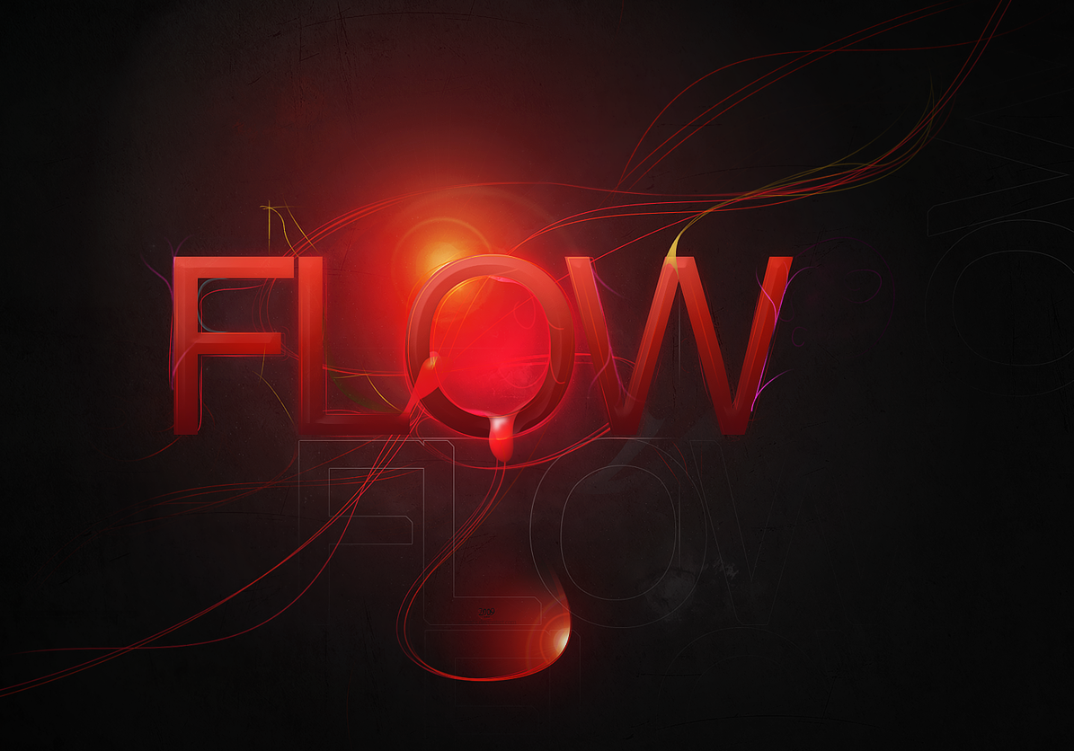
I am working on a new web design for myself and thought about a suitable logo to start with. I know this design is more an artwork than a logo but I think it can be easily reduced to very few colors and simplier shapes. I am not sure if I will incorporate this one but so far I like it. These are my initials L.S. for Lily Seidel.PLEASE, if you have some helpful thoughts about this design advise me of them! What do you like in it, what would you change? Any critical feedback is welcome!
EDIT: Wow, thanks for the numerous comments so far! There are many interesting aspects for improvement. But I have to mention (since many people criticized it) that the "Lilyas" writing is more meant as a signature/watermark and doesn't really belong to the artwork!
This is a vectorbased design completely done in Photoshop CS3.
 My Design Collection
 © Copyright by Lily A. Seidel 2009. All rights reserved. You may not use my work without my written permission.
Related content


Comments: 183

Vision

Impact
I really like this design Lily but if I was to make one observation it would be that the ribbon wrapped around the L draws the eye away from the main part of your logo. The first thing I focused on was the S shaped ribbon.
It seems the L should be more prominent maybe putting your Lilyas insignia on the L.
I do like the reflective feel you've given this image. It really highlights the logo itself.
Just a thought Lily.
Overall I believe your once again showing your talent as an artist and a ability to be very creative.
👍: 0 ⏩: 0

Overall
Vision
Originality
Technique
Impact
If you're going to use this for your website you need yo think small. The thing with logos on the internet is that the screen can be very deceiving. I really like this as a piece of art, something that surely reflects your kind of work.
There's nothing wrong in having a logo that shows that BUT logotypes need science and balance. I am almost certain that you can make a great logo out of this "experiment". My hints would be: remove the excessive lightning, work on a word mark for your name and use it below the symbol or at the left, the smallest and tiny details will get lost on website banner size so you might as well remove it (you can have a different mark for web use) as it will only appear as noise.
As for the colouring, many people say that logos can't have many colours and gradients, I disagree. That is precisely what I like the most about your work, so, instead of printing it with Spot on colours (Pantone) you can use digital printing and use a grid of Cmyk, it will do just fine. Just remember one thing, Less is More.
Hope this helps,
João
👍: 0 ⏩: 1

Thanks so much for this useful comment!!! It's very helpful for me.
")
👍: 0 ⏩: 0

I like this a lot. The colours do burst from the page and pop, and the lines are clean and legible. The find details are delicate and very pretty, however, I feel that on the whole it may be a challenged to make this a logo. It should be simpler, and possibly monotone in colour (because logo's need to be re-sized to smaller or larger for anything from a letter head to a t-shirt design), without so many fine details that may be lost if you make it smaller, etc. However it's certainly a striking and memorable image. It'll look great on a website, and on t-shirts etc.
👍: 0 ⏩: 0

Overall
Vision
Originality
Technique
Impact
Visually this is a great piece. It's got great lighting, nice gradients and overall nice typography treatment.
However, this would make a poor logo because it cannot translate well to print. It would translate well in motion media but print is the main issue.
You would have tremendous problems trying to get the colours printed because of the gradient. For me personally I feel a little overwhelmed with it because I always have a liking for simplicity. From a technical standpoint, what is the black and white version of your logo? Does it look equally good?
Did you try scaling this down? How does the gradient change when scaled down? The floral elements around the logo, would they be visible? If not, it means the logo is inconsistent at various sizes. Inconsistency can affect your branding. Lastly, is the logo recognizable at a small size?
Based on your truthful answer of these questions, I think you can decide whether or not you want to use this.
My advice is simple though: tone it down, use less colours, remove the elements around the L and S. Yes, that would make it less artistic but it would be more functional as a logo.
I'll say one thing, the logo shouts creativity because when I saw it, that's what came to mind. The other thing that came to mind was 'music'. The letters and even the effects around it communicates music to me, that more than design.
Good Luck.
👍: 0 ⏩: 1

Fair response, although I disagree with the part about having "tremendous problems trying to get the colours printed because of the gradient." The designer could still get this printed, and an offset printer could still do a great job of making it look good. This looks like a 5-color PMS job (or a CMYK job) and technically it could work just fine. The question is more about whether it's a good logo, and the answer to that has already been addressed.
👍: 0 ⏩: 0

Overall
Vision
Originality
Technique
Impact
Technically:
+ Some great Detail and Gradients
+ Crisp and Sharp in most parts
+ Nice Colors
- PS Bevel and Emboss effects look lame (would remove)
- The blurry text also looks out of place and crappy
- Ending of "L" looks strange and unbalanced (right side)
As a Logo:
+ Possible to use centered and with text below
- In small scale nice details will be gone (does it still look good without them ?)
- Very hard to place on a website or any other place where it should be left aligned
?- Can it be used in black and white (or 2 colors), try it out by removing everything else but the S & L and scale it down to something like 96x96 px
?- MAYBE S&L could be place in a filled circle to make it easier to use in some situations
All in all i think its a nice design, but as a logo which will be hard to incorporate in most designs/mediums. You could take the same idea but work on a "shape" only B&W version FIRST and when the B&W version looks great and balanced, add details and effects like you did here. I think that would be the way to go e.deviantart.com/emoticons/w/w… " width="15" height="15" alt="
 (Wink)")
👍: 0 ⏩: 1
Thank you very much for these useful tips!!! I appreciate it a lot. I will definitely do some postwork on this design.
👍: 0 ⏩: 1


Overall
Vision
Originality
Technique
Impact
It's a very nice design, no doubt about that. But would it work as logo? Honestly, I think for a logo that this may be a bit too much.
You'll have to take into consideration, that this logo will also be used for print like on a business card. And if it was up to me, I would try designing a logo that I could afford to print as well as use it in other mediums (ie. use a set number of colours like 5 max, etc). The fact also remains, if you're going to use this as a sign-off on your printed artworks, whether this would stand out more than the artwork itself or will it be completely hidden against a multi-coloured artwork.
My advise would be to stick to something simple and something that would work in all mediums e.deviantart.com/emoticons/s/s… " width="15" height="15" alt="
 (Smile)")
👍: 0 ⏩: 1
I think you are completely right here. The actual logo design must be much simplier than that for the reasons you named. All these nice details get lost anyway when it's resized to a suitable size. I will think about a printable version considering your suggestions. Thanks very much for your feedback!
👍: 0 ⏩: 1

Overall
Technique
Impact
I like the look of this piece. The color scheme works very well. I like the fact that it's a bit whimsical. But I don't think it will work as a logo. Perhaps if you simplified the forms a bit. You will loose most of the detail you've obviously put a lot of effort into if you scale it down too much. The forms are good though. I think it's an excellent start. The letters themselves could easily be self-contained. If you want "Lilyas" in there, I'd also figure-out another way to work that out. Maybe the "SL" with the name underneath? Kepp playing with it. e.deviantart.com/emoticons/s/s… " width="15" height="15" alt="
👍: 0 ⏩: 0


can u please please please please please please please please please please please please please please please please please please please please please please please please please please please please please pleaseplease please please please please please please please please please please please please please please please please please please please please please make a logo for me too.......name: invader and i want the theme to be orange-black with few hd wallpapers please please please please please please please please
👍: 0 ⏩: 1
What would you be willing to pay?
👍: 0 ⏩: 0


awesome design may you plzz make the design of this word OnaBil Adda using the same design as u did for S and send me to takir29@yahoo.com thank you very much
👍: 0 ⏩: 0

This looks amazing!
I am just starting in photoshop, illustration and indesign for college!
I'm inspired by this work.
One day, I want to make something like this!
Unfortunantly, I have no idea how to do something like this, yet.
👍: 0 ⏩: 0

wow, this is really gorgeous! it's very clean, i love the design, especially the reflection. well done!

👍: 0 ⏩: 0


excuse me m new here but can u pls tell me something i love ur thing n i want T instead of L for one reason can u plssss help me!!!??
👍: 0 ⏩: 1
Hm, yes, I can help you. But usually people have to commission me.
👍: 0 ⏩: 0


Looks awesome
Awesome none the less! XD Keep up the amazing work.
👍: 0 ⏩: 0


the watermark looks shabby at best and the whole things is really low quality
a great start but it needs alot of work
👍: 0 ⏩: 0


I just luv roses...so im gonna be happy for those "Magical roses" to see them ^.^!
👍: 0 ⏩: 0

Not that I need a website or I plan to copy...but this is great. I've been looking for ideas for a logo to give myself (wanted one for a long time)...so if and when I get it done I'll be crediting you. Not that you care at all I suppose. >_>
Oh well. ^^
👍: 0 ⏩: 1

HAI! Just to let you know I'm featuring your art here --> [link] in my journal! Thanks for sharing your inspiring and beautiful resources and artwork!

👍: 0 ⏩: 1

| Next =>