HOME | DD
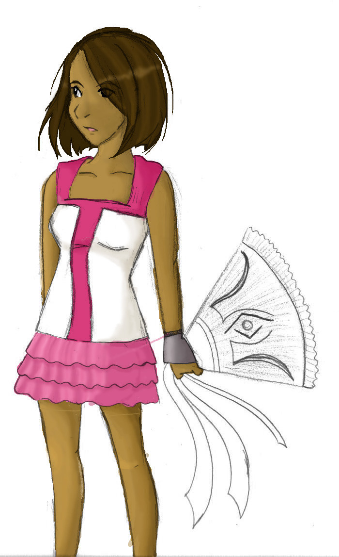
 LinearMango — Princess in Pink
Published: 2008-10-22 00:26:21 +0000 UTC; Views: 162; Favourites: 2; Downloads: 11
Redirect to original
Description
My first REAL attempt at shading so please please pleeeeeeeeeeeease critique on it.On a side note, I love how her skirt turned out and rather proud of how her arms turned out as well.
Related content


Comments: 7

Look a fan!
...sorry
XD you did great for your first shading. You stuck to a single light source and a fairly natural one too. And you got the tricky rounded surface shade down nicely. Like the others you should be ready to push the dark and the light parts further next time.
As for what needs fixing, you have areas that logically by the lines should be shaded (except her chin >.> (Wink)")
her right leg, you made it lighter than the left presumably because its further from the light right? but what is more important is that the angle of the viewer, were seeing more behind that leg than we would of the other, so it should actually be as dark if not darker as the other.
Always ad thin shade next to clothing, it may not seem like much but even a faint shadow will make it pop.
Consider second source shadows. not all shadows are a smooth gradient, thick cloth will leave a stark shadow on skin. as well around the chin area there is the roundness of the neck shadow and the chins shadow. the chin shadow will be stark and shaded a little, while the necks will be a curve gradiant. so you might see a strait edge in the shadow itself between the two.
And don't forget that double shadows are twice as dark^^
oh and I find that using the color chart is better for shadow and highlight making rather than a layer with black and wight over top.
wow, i talked to much, but hey you asked for it Xp
👍: 0 ⏩: 1

hahaha. Yes, I did ask for it and I really appreciate your opinion and advice.
And yes, there is a fan! Buuuuuuuuuuuuuuuuuuuuuuuuuut I'm not even going to touch it for now.....
👍: 0 ⏩: 1
heh, well I am glad I could help^^
👍: 0 ⏩: 0

Just don't be afraid of throwing in darker and lighter colors into the mix. Also, I'd recommend picking your own colors instead of using dodge and burn tools (in case you were using them) because you have more freedom in what colors you do want to use.
Also, there seems to be some strange pixel stuff going on in the hair area. I'm guessing a really hard brush?
👍: 0 ⏩: 1
Ok! Yeah, I was choosing my own colors for the shading. I dint' even realize that dodge and burn could do that. I did however discover the joy of using blur.
Yeah, for really thin lines I don't know how to make it not pixelly (is that even a word XD). There's still so much in photoshop that I need to learn!
👍: 0 ⏩: 0

This is actually very good for your very first attempt. I'm very proud! :'
Continue what you're doing (I'm assuming your using the highlight and darken tools) except push it a little farther. Make the highlights sharper and the shading deeper to give it a more 3D, realistic look. It looks like you were beginning to do that (especially in the skirt) but got afraid to do too much and stopped.
And don't be scared to really highlight the hair. Hair produces a nice sheen.
You've got the basics down, now just don't be afriad to make those darks dark and those lights light! A little practice and you'll develop a style that fits you so you'll know what looks good.
👍: 0 ⏩: 1