HOME | DD
 LiquidFaeStudios —
Escape
LiquidFaeStudios —
Escape
Published: 2012-07-15 23:39:57 +0000 UTC; Views: 15504; Favourites: 1612; Downloads: 0
Redirect to original
Description
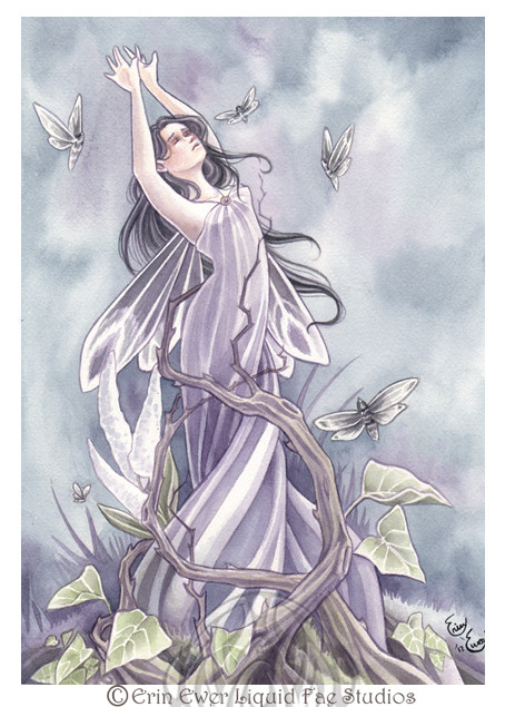
been a while since i submitted an actual painting, lol.I painted this live at "On The Wings of Dreams" in Shepherdstown WV on Saturday, and completed it today.
There are a few parts that came out funneh, but for the most part i really like it.
i decided to go purple! lol
watercolor on coldpress
Related content


Comments: 118

hmm, I assume you mean the large leaves? they are modeled after an arrowhead plant. they make lovely low light house plants. there is also Caladium, which looks very similar but has larger leaves, although the ones in the painting are about double the actual leaf size of a frost caladium. They are very colorful, but the Frost one has that white/green look, like the painting. The vine in the painting is separate, as are the flowers in the back which are modeled after black cohosh.
👍: 0 ⏩: 1


It's my pleasure!
👍: 0 ⏩: 0

")

Just wanted to know what type of watercolors do you use?
👍: 0 ⏩: 1
I use lots of different kinds. its normally not advised to mix brands, for different reasons, such as the amount of medium used in the paint and the types of pigments used in certain colors. HOWEVER, i find that this is less imperative with watercolors as it is with oil paints, particularly with how I use them. so my disposition is that if you find colors you like and are comfortable with, no matter which brand, there shouldn't be an issue. just make sure to experiment on a scrap piece of paper with new colors first. the brands I have use are Holbien, Cotman, MerimerBlu, Venezia, Grumbacher, and Daniel Smith.
Holbien I find very consitant and reliable. cotman is a cheaper paint but its still good for basics. I dont have anything much to say about Merimer and Venezia, both seem perfectly fine. Grumbacher is inconsistent with the amount of medium in each tube, which makes blending difficult, and I avoid it unless they have a particular color I want. Daniel Smith is by far the best, but are very expensive - however definitely worth a look at their website.
👍: 0 ⏩: 1
awwwww thank you so much for such detailed reply! I'm grateful there are artists like you who still take time to discuss their coloring materials to random people *cries*
Too bad I guess here in Asia the following brands you've mentioned are quite expensive, but I'll still try if I can find some of them
One more question, I see that you have a lot of detailed watercolor back-grounds in your works, do you do the character first in your works or the back ground?
Your works are lovely and surreal! keep it up!

👍: 0 ⏩: 1
it would probably be cheaper to look online for materials, but no matter where you are watercolors are expensive.the bright side is they last forever, In the 14 years I have been painting with watercolors, I got my first tubes at 16 years old, and the only colors i have run out of are Burnt Umber, and Black. There is a Holbien color I use for skin, it is part of their Japanese watercolor series and it is called Antique Coral Red. it is an opaque watercolor, and it is rather more pink than red. i find it gives me the perfect starter for skin tone without ever allowing me to go TOO dark right away. I have used this for skin ever since I was 16, and I still have about 1/3 of the tube left. Since you never have to throw out your unused paint you are at an advantage there.
I often advise people to start with the basic colors you will need:
Cadmium red (medium hue)
Cadmium Yellow (light or medium hue, whichever you prefer)
Pthalo Green
Colbalt Blue
Ivory Black
Burnt Umber
With those colors you can mix them to get most other colors. - you can even cut back and not get the brown, which you can mix on your own as well. I just find I use it so much that it would be wasteful of other colors to mix it. these colors will probably cost you around 60 USD - but then every time you have an extra 10 - 20$ you can splurge on another color you want. I started with 10 tubes, my mom bought them for me for my birthday. some of the tubes are still practically full. - even that yellowy green that I use in all my paintings - it is Antique Olive Green, another Japanese Watercolor by Holbien. the tube seems hardly touched, but I have used that color in almost all my paintings since i got it!
It depends on the work. It is often better to start out with the background, but I find the need to start the character before the background is complete. Its a process going between the background and the character, the background usually 2-3 steps ahead of the character. occasionally I do the opposite, but its totally dependent on the composition and the relationship between character and background.
👍: 0 ⏩: 1
Wow, you really take time to answer anyone's queries
thank you so much, the details are just astounding!
I'm amazed how you guys do it systematically, unlike
me who just follow my own steps on how to color...
Its like its really different when you are self-taught and
you are taught from school.
How many years have you been painting?
Thank you so much for answering my queries!
I really appreciate it
👍: 0 ⏩: 1
its not really different, we all teach ourselves. in school you are just lucky enough to be informed of certain things, which makes your decisions more educated. for instance if you mix one yellow, with one blue, you will get a certain green. however if you bought a different brand of yellow and mixed it with the same blue, you might end up with a different green, even if the two yellows had the same name- because different companies use different pigments. it certainly wont stop anyone from doing these things, but its good to know. in my opinion, all artists are self taught. being in a classroom just speeds up the learning process. Its not as though we have a 'system' that we all follow. everyone develops their own system, but the more you know, the better you become at making those decisions. I was taught a certain way to work in my illustration classes, since graduating I have never used it, I dislike it. its a good system, and I learned good things from it. but I don't use it, I do however incorporate parts of it into my personal method.
I've been painting with watercolors for 12 years. before that I used acrylics for a long time, but I wasn't very good, as I was in middle school at the time lol
👍: 0 ⏩: 1
Thank you so much for such detailed info! i wanna feature your replies in a journal! thanks so much for all the details (T_T) helps me in a way on how art works with different people!
👍: 0 ⏩: 1
 (Smile)")
")
👍: 0 ⏩: 1
do you have a facebook page?
👍: 0 ⏩: 1
yes i do, it is under Liquid Fae Studios
👍: 0 ⏩: 1
I'll find that and like the page!
👍: 0 ⏩: 1
liked the page! *follows you now*
👍: 0 ⏩: 1
XD I hardly ever update it lol I try, but it falls behind
👍: 0 ⏩: 0


You're welcome. It must have taken you a while to respond to all the comments though.
👍: 0 ⏩: 0


You're welcome! All you work are so beautiful and inspirational *-*!
👍: 0 ⏩: 0


So beautiful! It's almost like she's trying to fly away~
👍: 0 ⏩: 0


...Very sensually moving work! Purple was a good choice of color for this one.
👍: 0 ⏩: 0


I love the tragic expression and position and the entire color scheme. The butterflies strike me as little helpers helpless to help their friend.
All in all, beautiful.

👍: 0 ⏩: 0

Really really pretty and delicate...[link] I like it [link]
👍: 0 ⏩: 0


| Next =>