HOME | DD
 lollige — Isometric shading tutorial
by-nc-nd
lollige — Isometric shading tutorial
by-nc-nd
Published: 2007-07-13 12:19:30 +0000 UTC; Views: 31663; Favourites: 300; Downloads: 1211
Redirect to original
Description
I made this tutorial long time ago, and im submitting it here now for every1 who is new to iso pixel art and need a little help (Smile)")
------------
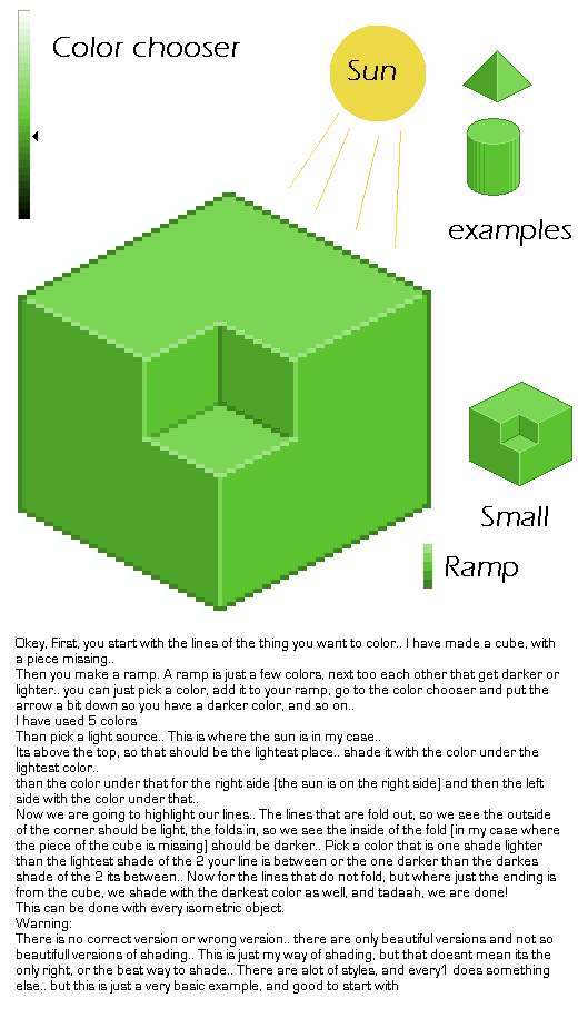
Okey, First, you start with the lines of the thing you want to color.. I have made a cube, with a piece missing..
Then you make a ramp. A ramp is just a few colors, next too each other that get darker or lighter.. you can just pick a color, add it to your ramp, go to the color chooser and put the arrow a bit down so you have a darker color, and so on..
I have used 5 colors
Than pick a light source.. This is where the sun is in my case..
Its above the top, so that should be the lightest place.. shade it with the color under the lightest color..
than the color under that for the right side (the sun is on the right side) and then the left side with the color under that..
Now we are going to highlight our lines.. The lines that are fold out, so we see the outside of the corner should be light, the folds in, so we see the inside of the fold (in my case where the piece of the cube is missing) should be darker.. Pick a color that is one shade lighter than the lightest shade of the 2 your line is between or the one darker than the darkes shade of the 2 its between.. Now for the lines that do not fold, but where just the ending is from the cube, we shade with the darkest color as well, and tadaah, we are done!
This can be done with every isometric object.
Warning:
There is no correct version or wrong version.. there are only beautiful versions and not so beautifull versions of shading.. This is just my way of shading, but that doesnt mean its the only right, or the best way to shade.. There are alot of styles, and every1 does something else.. but this is just a very basic example, and good to start with
Related content


Comments: 26

I beg to differ the correct version is what you are doing. The wrong version is what my High School had me doing.
👍: 0 ⏩: 0

EPIC! I thank you from the deapth of my heart. I also pray that you become a great artist sometime.
👍: 0 ⏩: 0

You don't know how much this helped; seriously thank you!
👍: 0 ⏩: 1

You are very welcome! View more of my work on my website: [link]
👍: 0 ⏩: 0


Oh wow, the color chart I make for my pixels is called a ramp. I never knew that! See, I was just making it off the top of my head... lol. It's a very nice tutorial and I like it alot.
👍: 0 ⏩: 1
(Never make ramps like this, thisone SUCKS!.. allways use a lower saturation for darker colors, a higer for lighter colors, and maybe some hue shifts too.. that makes the picture more intresting..)
👍: 0 ⏩: 1
Good point. I like doing 'checkerboard shading' a lot, for the smoother gradations and to make newer colors. I made a tutorial last night, but I'm using the school's computer at the moment and it's on my computer at home. I might upload it tonight or tomorrow morning. I made a color wheel too, by just putting two different colors beside each other. It was fun.
👍: 0 ⏩: 0

thank you^^ this is helpful")

👍: 0 ⏩: 1

Nice, I've tried making some iso pixel art sometimes but I've never come so far, I'll read this when I feel the need to create some pixel art again
👍: 0 ⏩: 0

Marvelous, man. You could write a book about this, eh? 
👍: 0 ⏩: 1
Thank you
I have thought alot of writing a book/very large online tutorial, but im shure im way less experienced to write everything you will need.. But dont worry, ill write more things like this
👍: 0 ⏩: 1

I'm really new to iso, but I have to ask. On the sides that aren't face the light source, the edge in between them is light, when it would make sense to make it dark.
Anways, great tut, good jorb.
👍: 0 ⏩: 1
light is allways coming from somewhere.. otherwise everything thats not pointed to the sun should be black.. so there is also light on those dark sides.. You highlight the corners, because corners, when you would zoom in very very very much, they are no corners, but they are sort of rounded off..
Now one small stripes of that rounded off thing should reflect the light right into your eye.. that makes it brighter than the other ones.. If you dont really get it I can make an example for you to show it..
👍: 0 ⏩: 1
aw, thanks for that. but when I zoom in on that corner, all I get is ...
[link] your talking when you uber zoom in...
👍: 0 ⏩: 2
yups.. and we are not talking about pixels, they will never get round but real life corners.. they would be very very very sharp if they would not be round.. the corners of your screen, the corners from your chairs, they are all a bit smoothed..
👍: 0 ⏩: 1
*[link]
*unless your talking about when you do an uber zoom in.
👍: 0 ⏩: 0

Thank you lollige, I am going to make a journal page with tutorials which I will add to overtime. This will certainly be going into it....great stuff! 
👍: 0 ⏩: 1
Is there any way you can add that commentary to the actual piece of work. I will be taking a thumb but people may not read your comments?
👍: 0 ⏩: 1
