HOME | DD
 LPCD — Ocelot
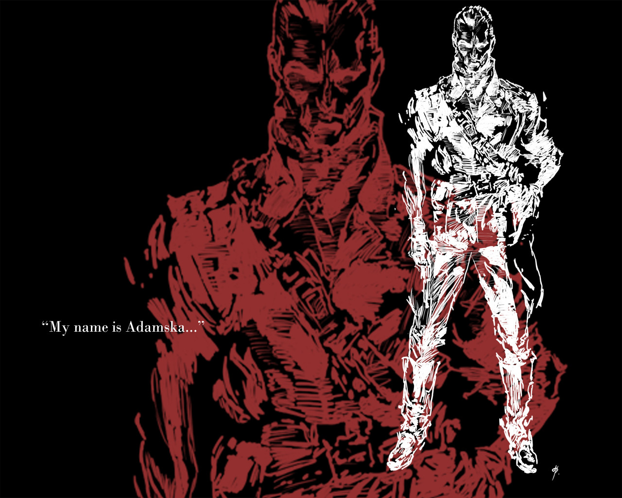
Published: 2006-01-10 21:13:28 +0000 UTC; Views: 1176; Favourites: 15; Downloads: 61
Redirect to original
Description
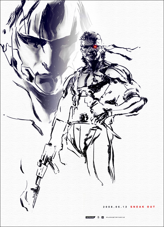
Another drawing from Metal Gear Solid 3This time it's Ocelot... funny character he is
Took me 2 hrs to make in photoshop with wacom graphire 4
Related content


Comments: 56

Thats really cool. Love the scratchy style. Very inkeeping with the style of the art from the game.
👍: 0 ⏩: 1

tks a lot
an animated version is soon to come
👍: 0 ⏩: 0


I never played the game but still...
Impresive metal-gear-solidish effect.
(I want a WACOM aswell!)
Congrats.

👍: 0 ⏩: 1
tks a lot
Wacom is the best thing to help you draw
👍: 0 ⏩: 1
How much di it cost?
Do you have the 4x5, 6x8 or 12x9?
buy me one! 
Tablets and coloring softwares are very R$R$ here in Brazil.
👍: 0 ⏩: 1
lol... agora é que vi que és do Brazil... falas Português, ou nem por isso?
De qualquer maneira, tenho uma Wacom Graphire 4 XL (6x8)...custou 199€, que é quase o mesmo em dolars
👍: 0 ⏩: 0

Wow you drew that!?? Looks so official!! Its good! Ocelot was my favorite character in the game, mainly because hes like the youngest person in the game, only 20 lol. But that really looks great there.
👍: 0 ⏩: 1
yep, I drew it... Official, lol, I gess so... tks a lot... He really is very cool
👍: 0 ⏩: 0

 (Wink)")


he really is a master...
tks for the comment
👍: 0 ⏩: 0

Ocelot?! Ah no way you're awesome for doing this!! The detail and sketchy style is amazing! You need no critique my friend
👍: 0 ⏩: 1

The style you use is very nice. The face and its expressin is very good.
👍: 0 ⏩: 1

good shading nice anatomy and a awesome name

👍: 0 ⏩: 1

Finally!! It looks really good. Very artistic expression.
It's going to be into my favs.
👍: 0 ⏩: 1

Wow, It's so cool!^^ I love the detail, even though I've never played MGS3, but I've heard of the series.
👍: 0 ⏩: 1
tks... you really should play it
If you do... make sure you start from MGS1, MGS2 and then MGS3... It's because the game's quality really improves from game to game... MGS3 is my favourite anyway... the plot is perfect and it merges perfectly with MGS1
👍: 0 ⏩: 0

Im afraid that I can't really comment here as per request, as I dont know what medium you used. Are these sketched then coloured in Photoshop? Or are they completely created in photoshop. I also realise that it's fan art, (I think) and I dont know who the character is... Sorry I'm not much use, but as a teensie bit of criticism, the text looks too... raw. You need to blend it a little bit into the picture.
Otherwise, I think it looks good. Maybe if you explained a little to me as a reply I can comment better after?
👍: 0 ⏩: 1
lol...
well... I did it in photoshop with a wacom...
Yes it's fanart of Metal Gear Solid... Maybe you've heard of it...
about the text, what do you suggest doing?
tks a lot for the comment
👍: 0 ⏩: 1
With the text? Either change the opacity so it fades in a bit, or fiddle around with options for the layer. Right click on the layer and choose.. I think it's options or something *rolls eyes* sorry, I'm not being very helpful, but if you do get there, you can either make it stick out majourly, you can glow it, and make it look nicer
👍: 0 ⏩: 1
tks for the help
I really apreciate it
👍: 0 ⏩: 1
thats okay.. and it's Blending Options
👍: 0 ⏩: 0

This really follows the Metal Gear style. I would imagine that this would take a long time to do in Photoshop.
👍: 0 ⏩: 1
Yeah... It took a while... but I was enjoying doing it...so it didn't seem to matter...
the most troublesome one was Ocelot
👍: 0 ⏩: 0

Nice drawing. The lines around his left hand and waist seem to kind of get confusing, so his hand blends in with his waist. Other than that, interesting drawing.
👍: 0 ⏩: 1

This is neat, but for improvment skills I really donno what to say, I like it ^_^
👍: 0 ⏩: 1

Hope you don't mind a newcomer's comments - I'm bored too.
Not my usual thing, but it looks good. The contrast is nice. It would look great animated (image stands still but the lines kinda scratch and jump around - does that make sense?)
👍: 0 ⏩: 2
Yup...I get it... maybe I'll do just that...
tks a lot
👍: 0 ⏩: 0
Yup...I get it... maybe I'll do just that...
tks a lot
👍: 0 ⏩: 0

I love the overlapped background of this. It gives it a... hmm, I'm really not sure how to describe the feel it gives, but I like it. I also like the inversed sketch -white on black instead of black on white. While it's not exactly original, it's rarely seen. Very nice!
👍: 0 ⏩: 1

looks good (Smile)")
")
👍: 0 ⏩: 1
lol...that's funny...because the first pic of ocelot that I submited didn't have the red Ocelot
I only aded it to give the pic a little more color... and because other people suggested it
Tks for the comment... I'll post a simple Ocelot pic too
👍: 0 ⏩: 0

Cool, even though I'm not a MGS fan I do like the way this has turned out. Reminds me of the copper scratchboards I used to have when I was a kid.
Gotta admit, I like the stuff more colourful, but I guess this is MGS we're talking about. I was expecting a more green and grey scheme, so it has taken me a little by surprise. Plently of creativity. Kudos to you.
👍: 0 ⏩: 1
Tks a lot...
I'm thinking of putting some background on this and the other two drawings I made...
And I'll enlage the text too...
tks so much for the comment
By the way... be sure to check out the other two drawings I made of snake ('Snake' and 'Snake 2')
More characters on the way
👍: 0 ⏩: 0

Ooh.. Ocelot.. that´s the russian with the blond hair, red cap nd black clothes right? Mwhuahah.. I´m playing this game at the moment XDXD.. This is a very nice pic.. it realLy looks like the MGS art style! 
👍: 0 ⏩: 1
| Next =>