HOME | DD

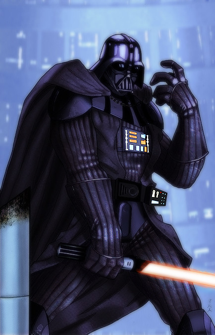
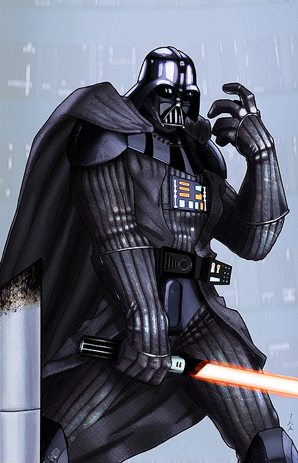
Lu-Kutha — Lord Vader darker

Published: 2006-09-25 16:04:12 +0000 UTC; Views: 2942; Favourites: 64; Downloads: 33
Redirect to original
Description Here is a darker version, just messing around with Vader some more after getting some suggestion on a forum , and came up with another version I also liked quite a bit .

Lines by colors by me, I didnt repaint or anything, just tweaking with layers and such .
Related content
Comments: 14

Zanuth [2022-09-13 13:50:38 +0000 UTC]

👍: 0 ⏩: 0

Yume-Megami [2007-03-11 07:23:21 +0000 UTC]

I like the details in the other one, but I like the mood this version sets. It's much darker and eviler.
Very awsome picture!

👍: 0 ⏩: 0

patzerpro [2006-11-07 18:37:33 +0000 UTC]

looks like the perfect tattoo for my ballsack.

👍: 0 ⏩: 0

kragen [2006-10-07 04:37:37 +0000 UTC]

awsome job

👍: 0 ⏩: 0

Elocinaqui [2006-10-02 03:39:11 +0000 UTC]

Nice drama to this

👍: 0 ⏩: 0

thesealord [2006-09-28 10:42:55 +0000 UTC]

Beautiful work bro -

Snaggle

👍: 0 ⏩: 0

Xander-son-of-Xereus [2006-09-27 06:06:13 +0000 UTC]

Nice improvements!

👍: 0 ⏩: 0

ragelion [2006-09-27 03:50:01 +0000 UTC]

what? another version. Sweet!

👍: 0 ⏩: 1

Lu-Kutha In reply to ragelion [2006-09-27 04:30:58 +0000 UTC]

Yea well I posted it on PencilJack, and during the discussion I made a couple alterations, and I really liked this one too !

👍: 0 ⏩: 0

dcjosh [2006-09-27 03:45:49 +0000 UTC]

outstanding

has Ragelion seen it?

👍: 0 ⏩: 1

Lu-Kutha In reply to dcjosh [2006-09-27 04:33:13 +0000 UTC]

Thank you !

Pretty sure he has

👍: 0 ⏩: 0

vilyawen [2006-09-26 07:55:51 +0000 UTC]

the way Darth Vader should have been.

👍: 0 ⏩: 0

h41i70515 [2006-09-26 07:00:18 +0000 UTC]

I like it, kind of a fog

👍: 0 ⏩: 0

AG88 [2006-09-25 21:13:31 +0000 UTC]

Fantastic job. I love it.

👍: 0 ⏩: 0