HOME | DD
 luiscds — IT Web Site
Published: 2005-04-23 23:25:42 +0000 UTC; Views: 2801; Favourites: 6; Downloads: 814
Redirect to original
Description
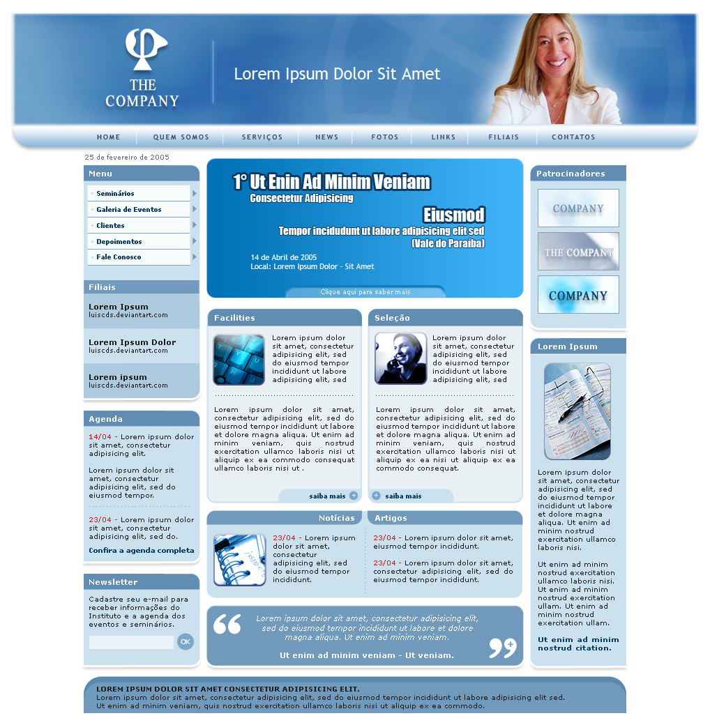
It's the second design I made for "the company". The other was rejected as usual") I might submit the former one soon.
I might submit the former one soon.The top is flash and the rest is PHP. It is a dinamic website. All the content can be changed by the onwer of the company.
I might say that I'm not good, I guess, at coorporate designs, so I brought to my mind some designs from Informer as reference.
Thanks for looking
 (Wink)")
Related content


Comments: 16

Good company page. Great layout and style, gives a good overview.

👍: 0 ⏩: 1
 (Smile)")

hi... it was very good .. i like very much of your style... visit my new porfolio too, hhhee and fav+ if you want... bye bye bro [link] [link]
👍: 0 ⏩: 1


Hey guy!!! Such a long time... 
Thanks for looking :thumsbup:
See you
👍: 0 ⏩: 0

I really like this design. Nice use of different blue's and great overall picture. Allthough there is just 1 thing, the top menu. I 'd say change that a bit, put more detail in, and not just a gradient or something. But still it's worth quite some credit! good job!
👍: 0 ⏩: 1
Hey, thanks for the remark.
H'm, I'm quite satisfied with the menu bar, though I agree with you that it's very simple ans it's better to have some detaisl in it. Next job, I'll try something with more detais on the next one. This is almost finished.
Thanks for looking!
👍: 0 ⏩: 1
no problem! good luck with your designs!
👍: 0 ⏩: 1

i think the big header looks fine, just don't flush the content to either side. centered look cool!
👍: 0 ⏩: 1

nice and clean, Not a fan of hte header being a bigger width than the rest of the page though.
👍: 0 ⏩: 1
I made the top bigger to look better at screen resolutions higer than 800x600. It's a sort of test, because I was tired of making designs for 800x600 only.
Thanks for looking commenting
👍: 0 ⏩: 0