HOME | DD
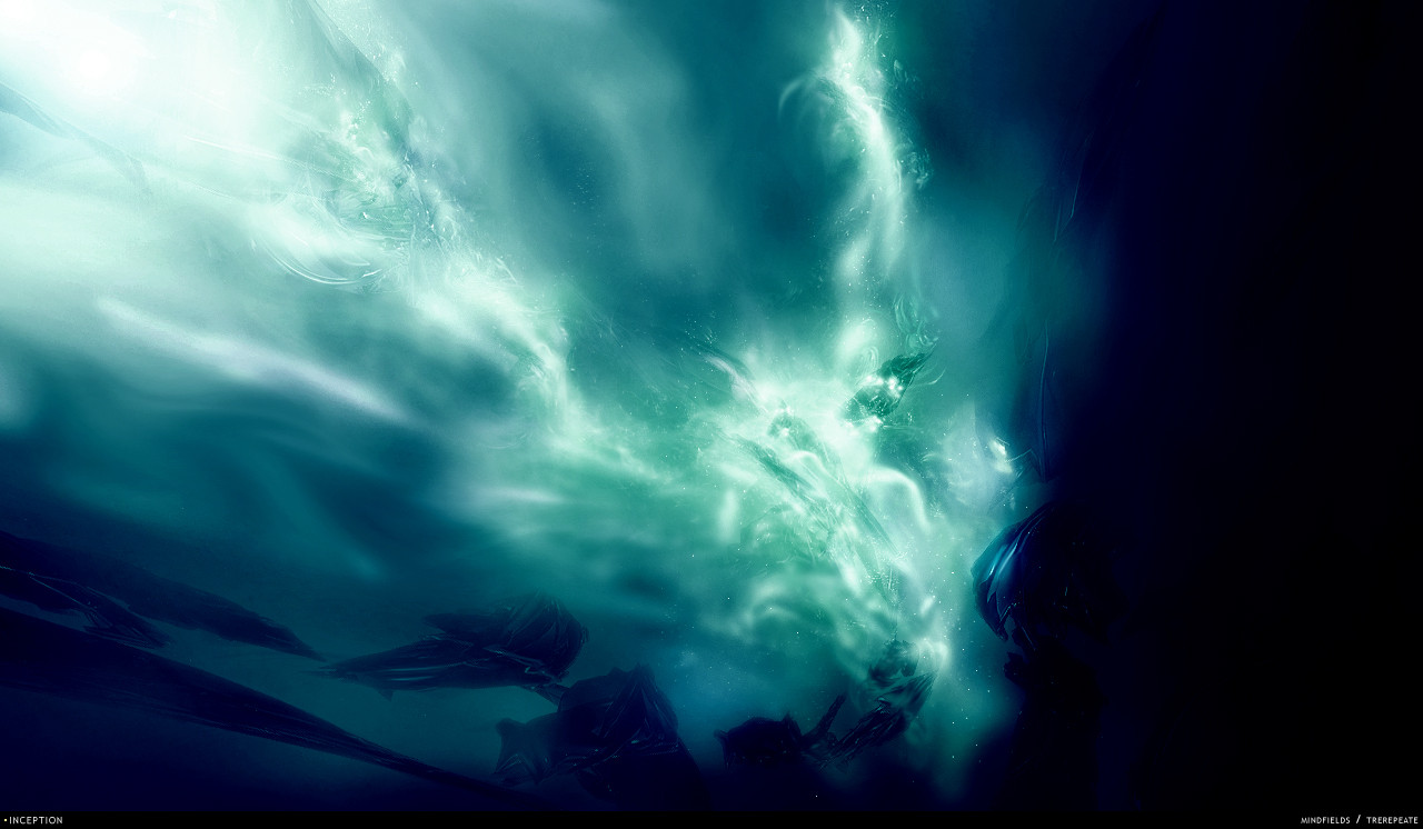
 M1ndfieldS — Supracium

Published: 2005-06-01 14:01:08 +0000 UTC; Views: 1205; Favourites: 28; Downloads: 532
Redirect to original
Description
*korpus + =M1ndfieldS collab for EvokeONE
Related content


Comments: 28


render is looking a bit squashed in some places but nice original work
")
👍: 0 ⏩: 0


wow i really love the lighting in this peice and the brushing, jesus fucking christ you outdid yourself m8, i love you for this.
👍: 0 ⏩: 0

")


wow, thats tight love the fire fx on the render, and the blast up in the corner is wicked
👍: 0 ⏩: 0
wow, thats tight love the fire fx on the render, and the blast up in the corner is wicked
👍: 0 ⏩: 0

 (Smile)")

the 2d looks real cool, but the render seems to stand out way too much. they look kinda like rocks on lava. you may wana outline, feather and fade delete the sides of the render, or maybe blur or bludge somewhat. it knida seems too obvious that the render layer is ontop of most the 2d. great job with teh flowers and brush work coming out of the render, that looks really sweat. the lighting effect of the brushing looks good too, should light up the render as well. gj
👍: 0 ⏩: 1

yea I know about this. the problem is that I accidentally merged the render to the bg when I was half-way this piece so I couldnt change that, only by smudging stuff over it, and it would go at the cost of the detail. so I decided to leave it this way.
👍: 0 ⏩: 1


")

jup jup...like this pic...like the renderis really nice also the colors! great job!
👍: 0 ⏩: 0

looks great, just a little too dark on the bottoms side... if u do the whole picture looking like the top, everything would be cool
👍: 0 ⏩: 0


The render sticks out too much, or like it stands out too much almost like bevel emboss or w/e was put on it. But still good. Gj to the two of you.
👍: 0 ⏩: 0


Awesome, whenever you two collab it rocks...lurvly colours....
👍: 0 ⏩: 0


Don't really see what it is but looks mysteriously awesome
👍: 0 ⏩: 0