HOME | DD
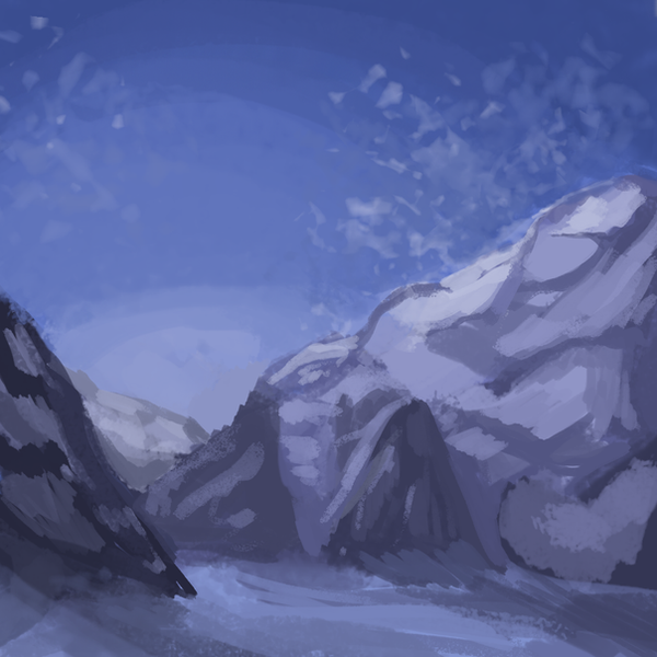
 Magicpawed — Everest: speedpaint 1
Published: 2013-11-30 05:00:07 +0000 UTC; Views: 1234; Favourites: 125; Downloads: 0
Redirect to original
Description
Im going to start doing some daily speedpaints to get better at scenery and painting!
Day 1: Mount Everest (30 minutes)
Reference: photography.nationalgeographic…
Related content


Comments: 28

WHO WORE IT BETTER ? sulfate-free.deviantart.com/ar…
hhahaah oh my god i cant believe we used the same reference great minds think alike nat geo has the best pictures
👍: 0 ⏩: 1

Oh MY I swear I'd seen that reference before and now I know why-
gosh im completely sorry for stealing that ref!
YOU DEFINITELY WORE IT BETTER MELISSA. BY FAR.
👍: 0 ⏩: 1
NO GEORGIA you cant steal refs its just a lovely coincidence VuV
no i think u
👍: 0 ⏩: 0

HOLY TOELDo 30 mins??? wow this is really incredible???!!! i love the colors and the brush you used really makes it look kinda snowy and mysterious :0
👍: 0 ⏩: 1

I need to do this... but I can't seem to find a paint brush texture I'm comfortable with :L
👍: 0 ⏩: 1
try looking for tutorials! I use a PS brush that I edited
👍: 0 ⏩: 1
Right! Thank you. I'll give it a go
")
👍: 0 ⏩: 0


This is actually a very good idea! I'll have to try it.
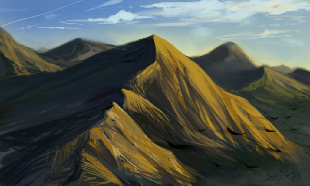
First of all, good job deconstructing the mountain into planar forms, from what I can see. It's a good technique to use when you're painting and blocking in values.
The biggest problem I have with this though is that the contrast is rather low. All your values are kind of crowded around one area, and your darkest and lightest hues aren't all that intense.
Here's a lil thing I did in PS (image>mode>greyscale) to check the values:
As you can see, the photo has much darker values than your painting, and you can't see it but the lighter areas are much lighter too. I'm assuming you did this directly in color (correct me if I'm wrong) and that's why your values suffered. Try and painting in greyscale first so you can just focus on values and leave color for a later date.
👍: 0 ⏩: 1
Thank you so much for this lovey critique.
Today I'm going to try do a greyscale painting- Mainly I am really afraid to go high contrast? Do you know what I mean? I tend to have a low range of grays instead of using everything from black to white.
thank you for that comparison. gosh you must spend so much time on me haha
Hey when you do grey scale paintings, how do you add color? Overlay?
👍: 0 ⏩: 1
Aw no problem!
I really don't, it's only a few minutes out of my day. As long as I'm helping someone it's time well spent!
I know, when you're used to using contour and lineart your value most often will suffer because you're not used to rendering things with shadow and light. You have to force yourself to use darker darks and lighter lights. As a rule of thumb, keep things relatively on the lower end of values while keeping in mind that the brightest you're going to get is the white on the canvas (or #ffffff if you're using digital mediums!) and you want to save that contrast for your focal point.
I paint mostly in greyscale a) because it's good practice and b) painting directly in color is unfathomably difficult for me since I have a such mediocre grasp on color. I haven't really gone from greyscale to color, so I'm not the person to ask, but I'd say that you'd use a combination of low opactiy brushes, adjustment + overlay layers, and hue/saturation sliders. Maybe this ctrlpaint video may help you out, maybe not, seeing it's just an intro.
👍: 0 ⏩: 1
wow yea this is really good advice!!
I cant figure out how to use high contrast (black on white) correctly. Like it looks really gross when I try, so I tend to stay on the middle range.
AND GOSH COLOR IS THE HARDEST THING EVER
👍: 0 ⏩: 1
UhhHhUHHh I've reached the point where I can't really give out advice anymore! I'm no expert on painting and anything past basic tips I'd probably be misleading you.
Check out matt kohr and noah bradely not only becuse they're great painters, but also have a myriad of online tutorials.
👍: 0 ⏩: 1
oh my god ive run you dry aa
leave it to me to ask WAY too many questions.
👍: 0 ⏩: 1
NO it's not you...it's just me not having enough experience to give you accurate advice! Don't bare crosses that belong to me, man.
You can ask me other questions! Just not about painting, it's not my strong point.
👍: 0 ⏩: 0


aaHHHH this is amazingg!!!!!!
i love your colouring style so much !!!!! ;;;v;v;v;v;
and the way you did the mountains Not to MEntION the SNO ;;;;OO")
ahh amazing <3
👍: 0 ⏩: 1

kfdjvmclx way better than mine ..... how do you do mountains T^T ....
👍: 0 ⏩: 0

** This is really beautiful! XD Man I wish I could speedpaint like this You're a talented one, miss Magic ;D
👍: 0 ⏩: 1
Awh shucks, look whos talking!!
👍: 0 ⏩: 1
pftttt you modest little poo ;D
👍: 0 ⏩: 0