HOME | DD
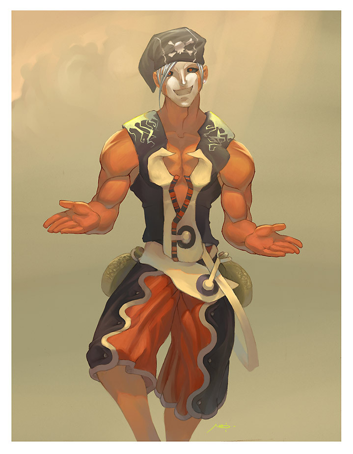
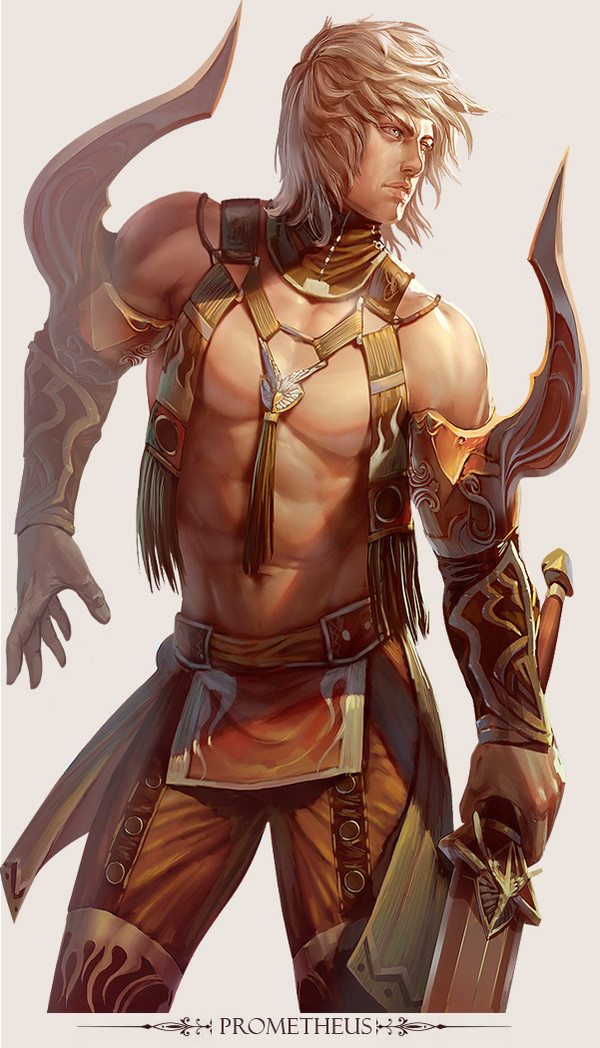
 MarcBrunet — P i e r r o t -Evolve-
Published: 2005-03-17 05:38:18 +0000 UTC; Views: 12186; Favourites: 193; Downloads: 892
Redirect to original
Description
Z color verion is done! After i had a problem with my first file and had to start it all over again, this one went well and i gotta say i'm a lot more satisfied with it. Done in painter8, took me some time since i had to start over the previous one but heh... Hope you guys like ito_ORelated content


Comments: 69


what a long way you have come! i bet youd look at this now and do it totally different
👍: 0 ⏩: 0

this is simply amazing
I love how you did the face and the muscles what I kind of dont love are the eyes how they arent looking at front but I supose that's the way you wanted them
👍: 0 ⏩: 0

this is like....amazing and scary all at the same time. I love the way you painted though...incredible piece D: *fav
👍: 0 ⏩: 0

i love the coloring; it's wonderful.
however his muscles look really really weird,
especially his triceps......

👍: 0 ⏩: 0

I LOVE IT I LOVE IT I LOVE IT!! i want him to be mine! be my squishy!
👍: 0 ⏩: 0


That character design is excellent, and the skin tones from the lighting are great too. Definitely a fave.
Dan
👍: 0 ⏩: 0


thats great for using that program...good job he really has that great evil feel to him....nice
👍: 0 ⏩: 0

OK, this one surprises me as it is the only piece that has an obvious problem;the fore arms appear to be about 45 degrees outward of alignment w/ the uppers. Everything else is to your usual high standard.
👍: 0 ⏩: 2
Righto. Come critique my Work in return, por favor.
👍: 0 ⏩: 0

ahah yeah, but then check the date i posted this! its like 2 years ago
")
👍: 0 ⏩: 0


I love the colours but its not a fav ")
👍: 0 ⏩: 0

Nice colors, I like the new look of pierrot, even if he looks a little scary  (Wink)")

👍: 0 ⏩: 0


And again your coloring is on the top tier. Really great job!
 (Smile)")
👍: 0 ⏩: 0

Well you talented as drawer of Magna Carta! How in world can you color like that... Outstanding!!!
👍: 0 ⏩: 0

damn you can paint good!!!! awesome art dude!!!
👍: 0 ⏩: 0


sweet colors, and sweet drawing. i like your style ")
he looks like 'one happy scary' guy
👍: 0 ⏩: 0

Scary dude *0* But he looks awesome :3 Great colouring and style ^^
👍: 0 ⏩: 0

Cool!
Nice colors!
The way i see it, your style is something between disney and anime
Looks cool!
It works really good!
👍: 0 ⏩: 1


He looks very very chill ^__^ Awesome work, and awesome design for the character! The white along his outfit and face really ties him together so nicely!
Keep up the good work, and keep updating!
👍: 0 ⏩: 1
Thank you so much, i'll try! >_<
👍: 0 ⏩: 0

tight.... them colours Rock.......excellent Job man.......

👍: 0 ⏩: 1
you'd say "cloak" in english u fool, omg u suck
👍: 0 ⏩: 1

We can say 'cape' you moron! You're messed up
👍: 0 ⏩: 0

The use of warm colors and the brush strokes themselves are very inviting! Very nice work 6-6
👍: 0 ⏩: 1

Very cool as usual. 
👍: 0 ⏩: 1

Looks great! I'm trying to get better with painter 8 my self.. do you have any tips?
👍: 0 ⏩: 0
o_o I just hope it's not mine...

👍: 0 ⏩: 0

| Next =>