HOME | DD
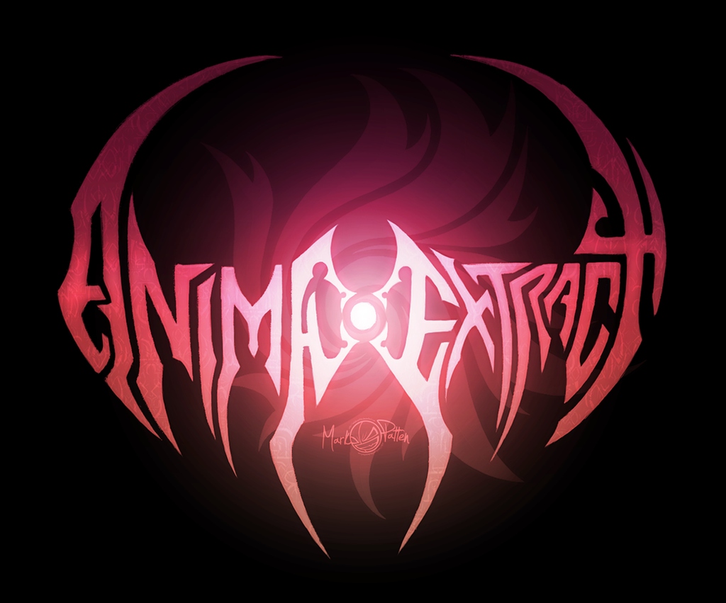
 Mark-MrHiDE-Patten — - ANIMA EXTRACT -
by-nc-nd
Mark-MrHiDE-Patten — - ANIMA EXTRACT -
by-nc-nd
Published: 2012-05-22 09:22:51 +0000 UTC; Views: 5173; Favourites: 67; Downloads: 92
Redirect to original
Description
Just a small little Logo Title to satisfy my personal craving for something different to the COLLATERAL concept art crap (that nobody gives a flying toss about), to my Comic idea.I wanted to put this out there just to cement the idea to myself; currently I've got the rough-ish draft of the first chapter complete. So when I've done all the necessary designing I'll officially start the story I've wanted to tell for over 4 years.
This design was done a bit quickly, still needs some tweaking, but overall the title sums up the feel that I’m going for.
Anima is in reference to the psychological term by Carl Jung; ‘the inner personality that is turned toward the unconscious of the individual'. It also means soul and life which is something that I've wanted to give my characters for ages.
Extract; forcibly remove. No rocket science there.
The logo in the back is the swirl that I'm using as Katherine’s mark, as she is the main character of the whole she-bang.
Unlike previous attempts at characterizing my characters, this story has absolutely zilch to do with Kingdom Hearts. I've got completely creative freedom with this, so I can take this story in which ever way I damn well choose.
The story is a blend of Sci-fi and fantasy elements, or more precisely fantasy as explained through science.
Whilst there is a big overarching plot, a lot of the focus will be on the characters personal journeys and growth.
So please ask away and I'll answer and questions you might have, that doesn't give away too much of the plot.
More in due time, but for now, back to the damn game.
Related content


Comments: 18


Still in the process of writing and working so it'll still be a while yet.
👍: 0 ⏩: 0

Looks a bit rough, like maybe it's supposed to be smaller and the size has reduced quality..
But besides that, it's pretty sweet.
👍: 0 ⏩: 1
More of the fact it was a sketch that I touched up.
👍: 0 ⏩: 1

Ah ha, so this is the comic logo in full detail. It does look quite nice, though with only a logo and title there isn't much I can comment on. Once the concept work for character's start trickling in, then I will see if it is more interesting.
Something to note, you shouldn't really bash yourself so much for using Kingdom Hearts as a creative medium. Plenty of people used established work in order to get their creative juices following and to draw people into their galleries. If you want to bash anything, bash the decision to do too much of it without having your gallery filled with enough of your own artwork. If you lose watchers because you aren't doing KH stuff anymore, then I pity them for leaving. I feel that you are, currently, hitting your creative stride as an artist and I like to see where this road goes myself.
👍: 0 ⏩: 1
Thank You, I think that's a problem I'm having personally, I'm fully invested because I know everything that's happening and I forget that its still all encased inside my head.
Fair case in point, but consistently to this day that most popular piece in my gallery are still made up Nobodies and Heartless n' shit.
👍: 0 ⏩: 1
That is a big problem, since you can't fit too many people into your head to see what you are thinking without various consequences. (i.e. Death)
*shrug* Maybe because its good original work of a medium that people find to be popular. It is not their fault they don't wish to explore a bit more. Once you are up and running though you're other work will reach the attention they deserve.
👍: 0 ⏩: 0

I'm absolutely sure it would.
👍: 0 ⏩: 1

0_o Mother of all things awesome... That's epic!!!
On a side note, it also looks like an emblem from the series 'Air Gear'.
👍: 0 ⏩: 1
Thank You, havn't seen that.
👍: 0 ⏩: 0

Love the font and the feeling, specially because it's not all murky red and black, but a brighter tone with a light surrounded by the black background.
👍: 0 ⏩: 1
It was a happy accident really.
 (Smile)")
👍: 0 ⏩: 1
Damn good accident then
")
👍: 0 ⏩: 0

Thank You, more satisfying than putting some KH font over a hear shaped do-dad.
👍: 0 ⏩: 0