HOME | DD
 martinhoulden — ::ALIEN vs HALO .redux::

Published: 2006-09-27 14:06:33 +0000 UTC; Views: 53662; Favourites: 1751; Downloads: 1474
Redirect to original
Description
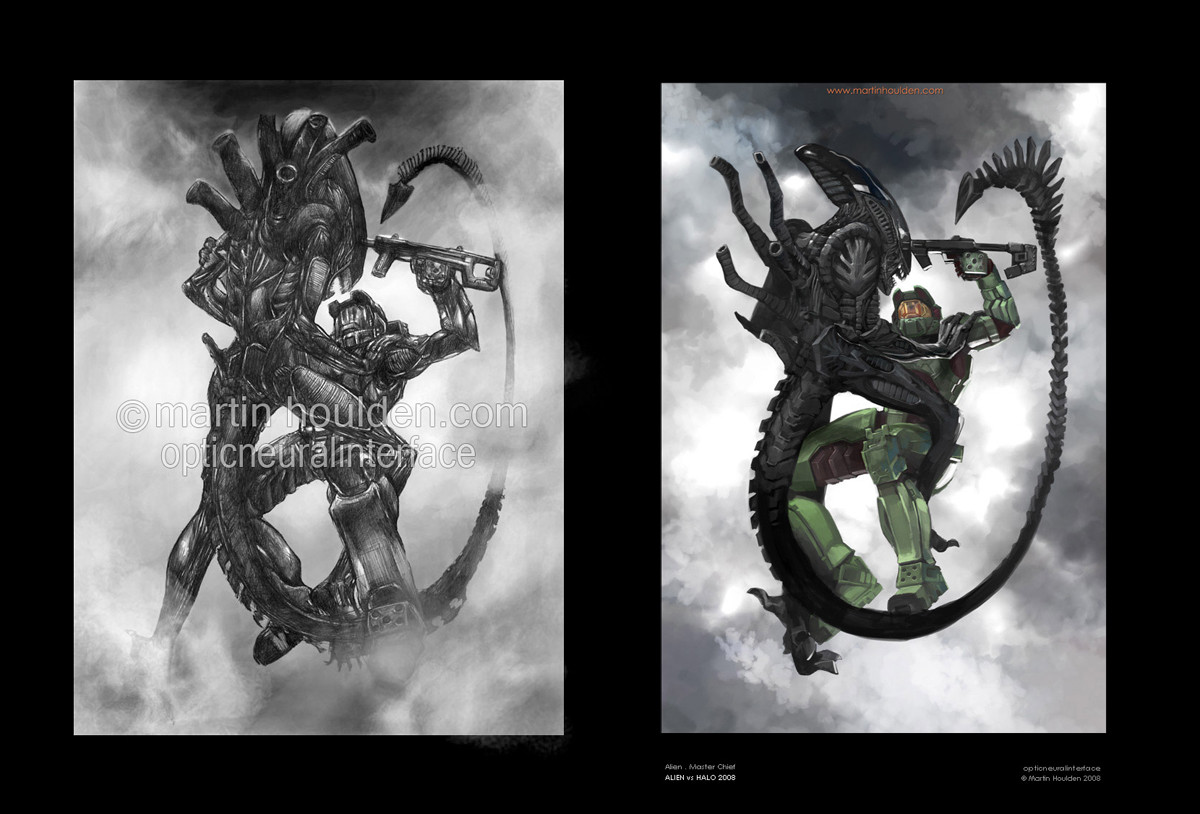
[::: ALIEN vs HALO .redux :::]Hrm. You know, i said i'd never do this. Cos well, i hate it when people latch on to a popular thing and then do NOTHING BUT that until theyre insanely popular. But well, in deviantart's current climate of a screwed up front page, where absolute crap gets faved and becomes more popular than stuff that is actually good, then well, that morale issue is right out the window.
So ... i figured, its been 27 months. Yes ... 27 months, over 2 years, since i last did an my AVH pic. Ive had a rought time of it in the last 2 years ... i dont feel im quite progressing as steeply as i once did ... and i worry im not heading in the right direction. I wanted to (now that im back at uni, in a great place, with my mates, with a crap load of time on my hands) try and establish where i am with my art. And the best way i saw of doing that for me was to try and retackle a picture i had done in the past, and try and see if i was any more able of trying to capture the original vision.
Is it a better picture than the original? pft, i dunno. In some ways i prefer it, in some ways im more proud of it. In other ways i look at it and think, that considering its been 2 years since i did it, it really isnt that much better. The main differences for me are:
Took half the time. 3 hours as opposed to 6.
The detail makes a LOT more sense
The alien looks a lot more like how i originally wanted it to.
Its in colour omg
Its perhaps a little more adventurous.
But then on the downside, i think the original's composition is better. I sat down last night and tried to work out why i still prefer elements of the original. I think it boils down to this:
Craig Mullins does THE most awesome Halo2 pictures. But, the pictures he has done wouldnt make good covers for the game. Theyre specific to a particular moment, and covers of games shouldnt defy specific elements. They should be all round representations of a concept, a main theme. I think the original pic i did is more like a representation of the concept, and the newer one lacks that. Also, the older pic looks much better on CRT monitors with the right contrast, whereas the new ones isnt quite so dependant on that!
But anyway, its not really up to me to decide. The point of the picture was not to replace the original, but rather, for my own purpose, see where i'm at and where im going with my art.
All comments welcome and appreciated. The original is here:
[link]
[::: ALIEN vs HALO .redux © Martin Houlden 2006. Master Chief, Halo © Bungie 2001 - 2006, Alien © 20th Century Fox 1979 :::]
Related content


Comments: 310

Wow, this is awsome.. We need a Halo vs Pred..
👍: 0 ⏩: 0

Holy crap. I thought your firt one was amazing, bu this.. I mean, wow.
👍: 0 ⏩: 0


COTDAMN! this is very nice, love the details on the battle rifle...or whatever it is. I'm personally not a big fan of halo, but love the concept of both the game and this picture.
👍: 0 ⏩: 0


Love it! Your coloring skills are amazing!

👍: 0 ⏩: 0

Well, I'm sure you've found your way by now. But I'm going to say this anyway, even though no one's going to know WTHell I'm talking about. . .
Progressing quickly through stages is always fun, but then one tends to reach a plateau where progress is hard to come by if not impossible.
Similar to my current state in ES3")
But then I realized. . .I'm level 52!
You my friend have accomplished far greater than most ever hope to even get a glimpse of.
👍: 0 ⏩: 1

haha, indeed.
I got to talking with a mater about progression - and i made my own resolution on the matter, which youve kind of highlighted yourself.
If you've never drawn before, and you go from 1% quality to 2% quality. Thats only 1% improvement, but, youve doubled your overall quality! Doubled! Thats crazy. Then you go from 1% to 10% quality, and thats a 10 fold improvement.
But, if youre at like, 40% to 50%, youve improved 10%, just as you did from 1 - 10, but, youve only improved 1/4.
So basically, its the sme as levelling in games. The better you get, the hard it is to improve. Now, im not saying "im really good" or "im a really high percentage" because, i dont think i am. Im just saying, that the rate of improvement is much much less and the difference is less notable.
but then i guess thats the "X Factor" (dont like using that term but ... peh) thats so important. Having that special something that makes your stuff stand out, that technique and improvement cant teach you.
Thanks for your comment!
👍: 0 ⏩: 1

dat bitch iz dead  (Smile)")
👍: 0 ⏩: 0


the coolest thing is the ammo counter its so tiny but contrasts so much
👍: 0 ⏩: 0


I think it's bloody brilliant, what did you use to do all this? *thumbs up*
👍: 0 ⏩: 0

Such a great use of colour! ^ ^
-Sieg
👍: 0 ⏩: 0


Thats awesome. I am SOOO going to favorite this even though I am SO traumatized by Aleins...
👍: 0 ⏩: 0

Aliens are the best creatures ever created, and your illustration it´s really good, I´m very impressed, keep working that great skills that you got
👍: 0 ⏩: 0


By far a well chosen piece to do!...I'm glad you took this little project up, it came out wonderfully-"t"
👍: 0 ⏩: 0

They are both awesome, however I like the original somewhat better because of the black and white-induced....intensity? I duno, bt this one is awesome too!!
👍: 0 ⏩: 0


Its greatbut a little hard to Look at...
👍: 0 ⏩: 0

Does a Spartan helmet have xenoc-proof glass?
cause this one's going for a french kiss...
👍: 0 ⏩: 1
thats for you to decide
 (Cool)")
👍: 0 ⏩: 0

Great colors and concept. really love this one!
👍: 0 ⏩: 0

After played (and finished) halo for the first time I must say that I appreciate this image more.
Mostly because of the recognition of the ammo display, the thing you see most in halo (at least I did, alway carrying around the assault rifle).
👍: 0 ⏩: 1
Halo 1... on PC (shame on me ")
👍: 0 ⏩: 1
shucks ... pc version aint so hot ... but its better than nothing!
halo 2 is out on PC soon i understand ...
👍: 0 ⏩: 1
Yeah, but I've heard the the system requirements are reallyreally high
👍: 0 ⏩: 1
yeah ... vista only as well? And vista is nasty
")
👍: 0 ⏩: 1
Yeah, vista only...
and I'm afraid of vista
👍: 0 ⏩: 1
everyone i know who has tried vista has quickly uninstalled it. Ie a few days later. Ive seen it in action etc. It looks nice but ... =S Its not worth it if it makes your compy go poopy
👍: 0 ⏩: 1
hehe, I've heard that too. Uninstalling vista seems to be what most people do in vista
and I'm afraid the "aero glass" will steal my resources too....
👍: 0 ⏩: 0

<3 is all thatneeds to be said... amzing idea and amazing art, nice job
👍: 0 ⏩: 0

this is stunning, beautiful, ... everything! Keep up the good work, especially the great Halo artwork! (;
👍: 0 ⏩: 0


The Masterchief can pwn this freak 24/7.....and nice pic there
👍: 0 ⏩: 0

Awesome, love the angle.
And I couldn't agree more about the state of DA, if I see another big boobed anime girl on the front page I think it'll confirm my suspicion that 90% of this community are prepubescent teens.
Not that I'm bitter of anything!
👍: 0 ⏩: 1
haha. I think people either love the angle, and get what i was going for, or just ... really dont get it XD I know thats true of my mate anyway
thanks for the comment and of course, i agree!
👍: 0 ⏩: 0


Wow, this is a very nice piece. I'm a HUGE fan of both these characters and the colors are very cool.
That wacom thing, is it that much easier, because somthing like that would have taken me hours.
👍: 0 ⏩: 0


oh wow that really sucks.. He only has one shot left.. yeowchies.XD
👍: 0 ⏩: 0

HALO HALO HALO HALO!!!!
GO LIL DUDE GO!!!
too cool; lurvs this style of art, jjust gets me thinkin....

👍: 0 ⏩: 0

<= Prev | | Next =>