HOME | DD
 martinhoulden — ::ALIEN vs HALO .redux::

Published: 2006-09-27 14:06:33 +0000 UTC; Views: 53480; Favourites: 1754; Downloads: 1474
Redirect to original
Description
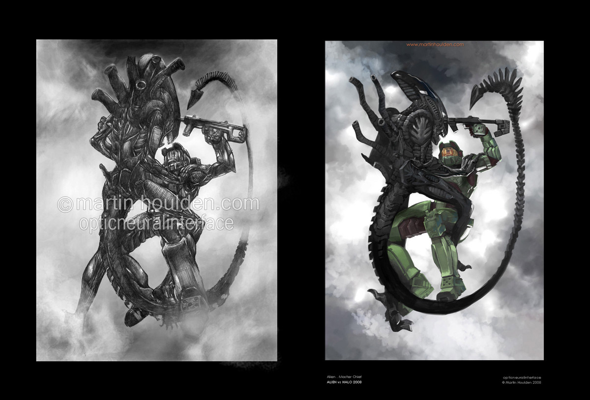
[::: ALIEN vs HALO .redux :::]Hrm. You know, i said i'd never do this. Cos well, i hate it when people latch on to a popular thing and then do NOTHING BUT that until theyre insanely popular. But well, in deviantart's current climate of a screwed up front page, where absolute crap gets faved and becomes more popular than stuff that is actually good, then well, that morale issue is right out the window.
So ... i figured, its been 27 months. Yes ... 27 months, over 2 years, since i last did an my AVH pic. Ive had a rought time of it in the last 2 years ... i dont feel im quite progressing as steeply as i once did ... and i worry im not heading in the right direction. I wanted to (now that im back at uni, in a great place, with my mates, with a crap load of time on my hands) try and establish where i am with my art. And the best way i saw of doing that for me was to try and retackle a picture i had done in the past, and try and see if i was any more able of trying to capture the original vision.
Is it a better picture than the original? pft, i dunno. In some ways i prefer it, in some ways im more proud of it. In other ways i look at it and think, that considering its been 2 years since i did it, it really isnt that much better. The main differences for me are:
Took half the time. 3 hours as opposed to 6.
The detail makes a LOT more sense
The alien looks a lot more like how i originally wanted it to.
Its in colour omg
Its perhaps a little more adventurous.
But then on the downside, i think the original's composition is better. I sat down last night and tried to work out why i still prefer elements of the original. I think it boils down to this:
Craig Mullins does THE most awesome Halo2 pictures. But, the pictures he has done wouldnt make good covers for the game. Theyre specific to a particular moment, and covers of games shouldnt defy specific elements. They should be all round representations of a concept, a main theme. I think the original pic i did is more like a representation of the concept, and the newer one lacks that. Also, the older pic looks much better on CRT monitors with the right contrast, whereas the new ones isnt quite so dependant on that!
But anyway, its not really up to me to decide. The point of the picture was not to replace the original, but rather, for my own purpose, see where i'm at and where im going with my art.
All comments welcome and appreciated. The original is here:
[link]
[::: ALIEN vs HALO .redux © Martin Houlden 2006. Master Chief, Halo © Bungie 2001 - 2006, Alien © 20th Century Fox 1979 :::]
Related content


Comments: 310


umm... the concept was not name of movie v. name of movie.. it was the alien (the actual alien) v. predator (the other alien) - therefore your title should be alien v. spartan, not alien v. halo - the alien isn't fighting an actual halo.......yea....
👍: 0 ⏩: 1

yeah i know. I mean, i originally titled it "alien vs master chief" but you know, it just didnt sound as catchy  (Smile)")
👍: 0 ⏩: 1
yea... it really really annoyed me.
👍: 0 ⏩: 0

Gawd! The continuation!!! i remember this a lot...one of my favorites of favorites from your gallery! really love the colors..(luv orange haha!!) definitely a fav! this should also be in the DD again!
👍: 0 ⏩: 0

You know what? I love this picture. I love the Alien movies and was rooting for them in Alien Vs. Predator, and I love Halo/Xbox, and I AM rooting them in the onesided battle against playstation. Playstation sucks, btw. Anyways, this picture is like the death match between my two faves. Great job!
👍: 0 ⏩: 0

my moneys on master chief. he's so much cooler than the aliens
👍: 0 ⏩: 0

Very Nice Pic Of The Cheif With An Alien, The Coloring Is Amazing!
👍: 0 ⏩: 0

Well, I like it. I don't know if I prefer it to the original, but it definitely shows more action and feels faster-paced.
👍: 0 ⏩: 0

done very nice, alien would so win.
👍: 0 ⏩: 0


MC would kick its tail back to where ever those things come from. ")

👍: 0 ⏩: 1
they come from your chest
👍: 0 ⏩: 1

this one is definately better than the previous halo vs predator.. as well as the composition, which is better too i believe, great perspective/angle!! +fav from me mate
👍: 0 ⏩: 0

great visor. and the siliva hanging from the aliens mouth.
👍: 0 ⏩: 0

")

I like this one better. In both you've got a SPARTAN getting tackled be an Alien, face to face, tail coming behind him, gun at the Alien's head. But in the first one, it's more from the Alien's point of view, and it just looks like they're going the hit the ground, and one of them wins. In this one, it looks like they're falling off a building or something, and maybe they're going to hit the ground hard enough that they'll split apart, and have to start the fight again. Also, it seems to catch that "fearless machine" flavor the SPARTANS seem to have. I think its because their faces are closer together, and in the first one, the SMG was being held at a bit of an awkward, unprofessional angle.
Summary:

👍: 0 ⏩: 1
thankyou indeedly!
👍: 0 ⏩: 0

Wow, that would make an interesting movie...
👍: 0 ⏩: 0

how can u possibly paint that in 3 hours?... that is so hard to believe! ah... i dont know anybody even proffesionally that can do that! so how? did u use a comp at all?
👍: 0 ⏩: 1
a comp? you mean computer? huh? XD i painted on painter, digitally, with a wacom
👍: 0 ⏩: 0


I MESSED MYSELF TO YOUR ART!!! fucking awesome
👍: 0 ⏩: 0

two of my fave things... i don't know who i want to win!
probably Master Chief... i have suck a geek chick crush on him
👍: 0 ⏩: 1

You’re right the first one you did feels more like a concept of a movie while this one is more like it was taken out from a storyboard of the movie. Which one you prefer is up to who you really are. For example I'm more in the field of animation so I prefer this work because it's in motion. The other one, I would imagine, is more for people in the field of illustration because it tells a story in one image. Also, this one has details that are loosely suggested to just get the idea of it while the other one needs close attention because it has all these great details. Sometimes people get lost in details when they draw and don't necessary worry about the whole figure. That's what I think happened in the one you did long time ago. In this one, since you already did a drawing of it and knew what you wanted, you could visually plan more of how the light is hitting the figures as a whole. You were playing with the camera angle, which is good because it shows your confidence. The other one has the figure in the centre, which I find is very common in illustration works. People working in film tend to like everything of centre even just a little bit. Last thing, some people might prefer this one because it's in color but I think in the end it's all up to what tone and contrast. Without those two no matter what color the image is it simply won’t work. However, to color something one needs the knowledge of color and how they mix. You certainly displayed that here. After comparering the two, I think that you are progressing in your artwork because you were able to draw this work with suggestion of detail and form. One has to study the form and detail in order to suggest it. Also, because you said the alien looks more how you wanted. Putting thoughts on paper is very difficult and if you think that you seceded in doing that here then you are definitely moving forward.
hope it's not too long.
👍: 0 ⏩: 1
thanks mr! cool comments, nice to recieve! I'm find of them both for different reasons ... i generally get more of a reactoin from the old one but ... *shrugs* i think it probably illustrates the concept more, like you said.
Thanks again!
👍: 0 ⏩: 1


This would make such a great T-shirt too.
👍: 0 ⏩: 1
I like the new one better, the way the colouring was done gives it a caotic feel which is perfect for the situation.
They were both extremely well done and it shows how much you have improved by doing a picture almost exactly the same quality as before in half the time.
👍: 0 ⏩: 1

Wow this is pretty cool. I think its annoying when people cut and paste things together like "Hey what if Gundam fought Power rangers?" ok bad example but the point is why would they fight? How would they even meet?! Halo VS Aliens is more realistic and pretty cool too. The aliens tend to unnerve people but lets see them unnerve a spartan. I like the pic the colors are cool and the style rocks but (not to sound less then awestruck) the pose bugs me. Its dynamic that they are fallling but the pose of the characters, it seems to lack 'motion' you just dont get the feel they are really struggling and trying to kill one another. Maybe I'm just picky but great pic. [+fav]
👍: 0 ⏩: 1
thanks! yeah, the pose was never meant to be them falling. It was actually originally drawn left to right. It was only a last minute decision to have them falling down. But well ... i preferred it and so did all my flatmates!
Thanks!
👍: 0 ⏩: 1
I think 'falling' rather then left to right looks better. Like I said I love the piece
👍: 0 ⏩: 0

woooooooow!!! i want this game like now!!!
👍: 0 ⏩: 0

Awesome!
I would love to see that one day Master Chief gets to slug it out with the alien.


👍: 0 ⏩: 1
well you know, so many people know me for the pic now, not just at dA, that if it ever happened id feel cheated ... somehow. Not that theyre my characters but still -_- haha
thanks!
👍: 0 ⏩: 1
It's okay anyway. Nobody said that people couldn't do fan works. But it certainly interesting to put both MC and alien together.
You're welcome. ^^
👍: 0 ⏩: 0


Ha, I remeber seeing your first AvH pic 2 years ago, when I had first gotton on DA. Your progression as an artist is definately going in the right direction, whether you think so or not.
Good luck at uni,
Also, you made me feel hella old, now that i realized i've been on DA so long.
👍: 0 ⏩: 1
haha, makes me feel older!
And thanks!
👍: 0 ⏩: 1

tsk, must be bad for master chiefs back staying in that position for 27 months
imo! i like this one! course thats because i love CG art (when its an uncommon style, tech etc) but then again, somemone who likes grayscale would disagree with me.
i suppose i like this more cause with more colour, it shows more depth and the colours compliment the moment (even though alien is basically just one colour XDXD)
althought...i like originals background!
it's hard to explain, but! like everything else, the original is always the one that everyone remembers! and unlike sequeals, everyone will love this!
")
👍: 0 ⏩: 1
that borderline made sense, but thanks!
I like cg and greyscale in their own ways for their own reasons! I much prefer greyscale graphic novels etc, than colour, for example. But then *shrugs*. Depends what the purpose of the picture is!
Thanks!
👍: 0 ⏩: 0


Master Chief owns this fight.
👍: 0 ⏩: 0
<= Prev | | Next =>