HOME | DD
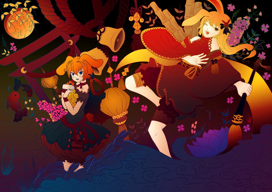
 Master-Futon — Year of the Rabbit
Published: 2011-02-17 08:02:59 +0000 UTC; Views: 1111; Favourites: 22; Downloads: 32
Redirect to original
Description
Went completely out of my comfort zone with this one.Line art by for the 's February contest.
Line art: [link]
photoshop
Colored only with gradients and layer masks
10 hrs spaced out over several days
Download for full-view
Related content


Comments: 30


Thanks, I really appreciate it.
👍: 0 ⏩: 1

Love the Gradients in this one. It shows that it can be used in this kind of way. There some things I like but then there things that are over way too much and it keeps turning my head the other way.
👍: 0 ⏩: 1
Thanks, since the subject was bordering on the abstract I decided to just relax and go with it. I joined the club so that I would force myself to try new techniques that I wasn't used to, so I'm relatively happy with how this ended.
👍: 0 ⏩: 0

The gradients work very well in this piece. I love colors you chose and the way you emphasized the rabbits in the water by partially outlining them. I especially liked the way you chose to color the paint brush. It's simple and elegant.
However, I did notice that you seem to have removed the leg of the girl on the left side, as well as part of the ruffles just above the leg.
👍: 0 ⏩: 2
Also, thanks for the compliments.
👍: 0 ⏩: 0
I think I see what you mean, but it's like that in the original lines.
👍: 0 ⏩: 1
Which part is like that in the original lines? The leg or the rabbits?
👍: 0 ⏩: 1
...? Do you mean the lines were left open so that is why the leg matches the background?
👍: 0 ⏩: 1
I've got it fixed, I'm currently waiting for the file to finish uploading, it's pretty large. Thanks for pointing it out.
👍: 0 ⏩: 1
No problem, I'm glad I could help
👍: 0 ⏩: 0

Wow its so far from what i am used to seeing from your work. Very Awesome!
👍: 0 ⏩: 1
To quote Sea Lab "It's like a koala bear crapped a rainbow in my brain."
👍: 0 ⏩: 1


proof that gradients can be good! love it man, good luck in the contest!
👍: 0 ⏩: 1

I like what you tried with all the gradients. Some things look great!
Some things look a bit too much, though.
Good luck in the contest
")
👍: 0 ⏩: 1
Thanks, if you don't mind me asking, what do you think looks overdone?
👍: 0 ⏩: 1
In my opinion, the areas that look good/done at the moment are: the bunnies/front water, the lotus flower, the ink brush, upper and left parts of the right girl's clothes, the uppermost ribbon/2bells/2stones(?).
Certain things, like the left girl's clothes blending from blue/green/something to red looks a bit... not too good. You might wanna split it up so that her "upper" robes blend from two shades of green/blue, and the lower-, or under-robes blend in shades of red/orange, since a blend directly from green/blue to red/orange will cause an unpleasant grayish tone in the middle.
Contrasting colors may fit next to each other, but fading from one to another seems a bit trickier.
Just contrast and color choice affects much, so for example the pink/purple flower with yellow borders (to the right) looks bad in my eyes. Also the "flower bush" in the upper right has a bit too high contrast: too much high-saturated high-lighted purples, pinks and greens in such a small area. Consider experimenting with your choices of color, saturation and value until you find something that is both visually pleasing and contrastingly interesting.
I would suggest working on the background more, as well. The upper part can be dark, since it has nothing of interest to see, but the way you've done the background in the middle and lower parts make it seem like you don't care for the objects/details in the mid-/background.
As for shading, I really like what you've begun inside the bells. However, for consistency, I would suggest you work more on that too: shading the outside of the bells, shading and highlighting the spherical lamps, shade the red gates & hanging ropes, etc.
Hope you don't take this negatively! I just got too inspired since you asked what I was thinking. I think your coloration has great potential, but as of now I think it has a bit too many graphical inconsistencies and stark contrasts.
👍: 0 ⏩: 1
Thanks, I appreciate honest critiques. I'll definitely keep what you said in mind when working with this style in the future.
👍: 0 ⏩: 1

This one turned out amazing!! I love the colors you used for this one. You should try going out of your comfort zone more often. (Wink)")

👍: 0 ⏩: 1
Thanks.  (Smile)")
👍: 0 ⏩: 1
No problem.")
👍: 0 ⏩: 0

love the color palette <3
really unusual to see in your gallery *ggg*
👍: 0 ⏩: 1
Thanks, I had to kick myself in the ass to get through it, I'm not really that big on elements of abstraction; but the whole reason why I joined the club was to force myself to learn different coloring techniques so that I can get better.
👍: 0 ⏩: 0