HOME | DD
 Mathew-Swift-VA — MLP CCG OC Cards: Snowdrop
Published: 2014-04-24 21:59:03 +0000 UTC; Views: 2159; Favourites: 27; Downloads: 0
Redirect to original
Description
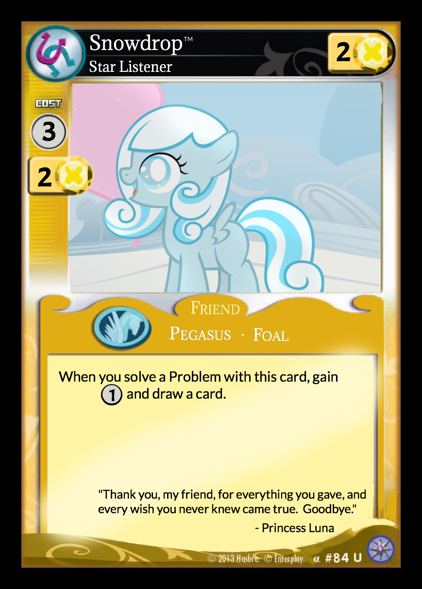
An MLP CCG Card of Silly Filly Studio's "Snowdrop." I just love that short, I had to make one for Snowdrop.MLP/CCG Card (C) Hasbro
Snowdrop and Picture (C) Silly Filly Studios
Related content


Comments: 6

Will you making more of these from popular OCs, like Fluffle Puff, Button's Mom?
👍: 0 ⏩: 1


I did this in an hour. i1375.photobucket.com/albums/a… (Much of that time was actually trying to find any evidence that Snowdrop is a trademark. She is not. In fact I didn't even find a copyright claim.)
And you know what? I was going to not even bother nitpicking and just give you the broad feedback of "give some actual effort next time" (which is still a perfectly fair critique), but instead I'm actually going to point out everything that I see you did wrong:
- Now most kids on deviantart would just make the excuse that they're using MS Paint and can't pull off the sort of thing you can in say Photoshop (which is actually a terrible excuse, as Pain is really powerful if you know how to use it.) but I see that you used a gradient to cover up the description, and only a higher level program can do that. Therefore you actually are using a decent program, and there is therefore no excuse for any of these.
- If you ARE actually using a program that can do gradients and pretty much nothing else, I would suggest getting yourself GIMP. It's free and can do most of the things Photoshop can do.
- There are blank bases already available. You are most likely not aware of this, as you seem to have had to paintbrush over a regular card. Yes they are lower quality, but if that comes at the expense of not having to do what you just did, that's not your concern.
- Use layers. This should be a no-brainer if you're doing the steps above, but if you are doing them all and this is your end result, that's just inexcusable.
- AND NOW FOR THE BIG ONE. The type formatting. My advice would be to look at a reference as you're doing it. There's a lot of smaller details, but fortunately I've found all the fonts which, as long as you play with it to get it to look like your reference, is like half the battle:
Title, subtitle and species are Quadrant Serial Light. You can get it most places you can download fonts. The species is small caps. You might need to give it just a bit of kerning to make it look right.
The description and flavor text are Myriad Pro Condensed. Should be on your computer already. Flavor text is italic. The credits at the bottom might also be, but if not they're at least close enough.
The numbers are Helvetica, but there is a possibility it's not on your computer, and you can't just get this one. A nice substitute I've been using for it though is Coolvetica, which is a knockoff of it you should be able to find.
...And look, there's a good half chance you'll just go through the motions of responding and ultimately ignore all that, and I realy don't care if you do. But hopefully, at least somewhere down the line, you'll be able to appreciate the fact that I just spent an hour correcting your terrible effort, and then another hour teaching you how to fix it.
👍: 0 ⏩: 2

I don't think numbers are helvetica (Or did you mean only the AT/power numbers? At least 6 and 9 in card # are different), other fonts seem legit though.
👍: 0 ⏩: 0

I don't think he used a Gradient tool - if you look around the edges of the square you can see the left overs from a spray can tool. I think he indeed used paint. But still, not such a bad job considering he might be using MS Paint.
But yeah, all the good points you made still stand. He could do a lot better working in GIMP or Paint.NET (my image editor of choice).
👍: 0 ⏩: 0
