HOME | DD
 MechanicalRaven — The Robot King : Prototype III
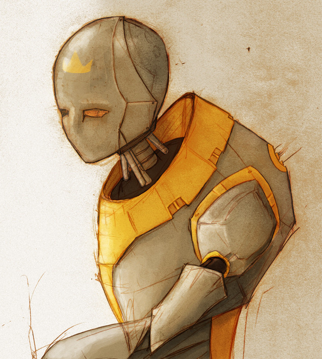
Published: 2005-02-16 03:25:34 +0000 UTC; Views: 6353; Favourites: 210; Downloads: 308
Redirect to original
Description
Update: 12-16-05:After more deliberation based on the comments and critiques I have recieve I changed to crown to hopefully look more... THERE... like a part of the piece...
I also tinted it sort of rust for the whole picture because I liked the feel of it better.
---------------------------------------- ---------------------------------------- ---------------
I had to fix several things. Small petty things. But they impacted the picture. So here it is again.
I have been developing my digialt painting skills for a more realistic effect and I think it shows.
Compare it to:
[link] (The Robot King)
[link] (The Robot King : Prototype II)
Do you think it would make a good triptych?
Any comments and critiques are greatly appreciated.
Related content


Comments: 36


")


I wish I could do renders like you!
Thanks for the look and the fav!
👍: 0 ⏩: 0

The crown looks like a label the maker put there. Like, these are Thompson Crown Robots or sum such sh*t. But he doesn't look like the poster robot for a 'come get your new upgraded, updated, all too cool' robot so much as he looks like he just fought in war and needs a beer because he's afraid to go back to the family that bought him. I think its the tinted rust color thats making me think this way. its so...methotical.
👍: 0 ⏩: 0

awesome! Love the sort of sketchy look and the style on it
👍: 0 ⏩: 0

I love this.The robot's expression in wonderful
 (Smile)")
👍: 0 ⏩: 0

i like this because he has a title that would envoke popularity and even joy yet this metallic creation looks so cold and alone
👍: 0 ⏩: 0

i like it
its very... smooth?
its both complex, but at the same time, its not complicated XD
also, is it me, or does that robot look like hes wearing a hazard suit, from half life two?
👍: 0 ⏩: 1

It's detailed, and you don't need to see that but you can look closer and enjoy those details, which is different from being complex. But complex things need detail to be complex. ' v '
👍: 0 ⏩: 0


Wow! Gorgeous in its simplicity! Such a complex and detailed image of a minimalistically designed robot. Very, very well done.
👍: 0 ⏩: 0

Nice, I like this one most (until now)
Put to favourites...
Hope to see some more! I like robots, I am building my own..but "she" does not look like an human being (yet)
👍: 0 ⏩: 0

this is a nice piece
what I like is the shape you made for the armor shell of its body.
I think more could have been done to the face.\\
but I like the shapes and the feel is cool !
👍: 0 ⏩: 0

send me a msg and talk with me. i have some ideas you might like if you have an open mind about listening. i like the work, and i want to see more.
👍: 0 ⏩: 0

Has anyone told you that your art looks like something that should be in I, ROBOT?
👍: 0 ⏩: 0


thats is very well made i love the concept art feel of it.
it would also make a very nice 3d model, i would model it if i had the time but i dont
Great job
")
👍: 0 ⏩: 0


I love the way this looks, it has so much mood in it. And that's funny cause, well, it's a robot. My favorite part is how you colored it- and I don't think that the sketchiness makes it look unfinished, it just adds more to the picture. All in all I love it. : D
👍: 0 ⏩: 0

oh, this is very nice! I think it' would look better with a shadow from the robot on to the wall behind him, creates more depth in the image. I like the style you got! Deserves a 
👍: 0 ⏩: 0

Wow, very "emotional" robot! Likes!
I'll check out the other prototypes

👍: 0 ⏩: 0

Very intriguing imagery here! Love the raw feel it has and the colors along with the subtle textures are wonderful. Alone it feels very unfinished but perhaps in the triptych you mentioned it would be more filling

👍: 0 ⏩: 0

Very cool, The suit reminds me of the one Gordan Freeman worse in Half-Life.

👍: 0 ⏩: 0

i love the sketchy feel to it, and the colors seem so drained and hard its wonderfull! very interesting design, i really like his elbow there
👍: 0 ⏩: 0

I really like the style and colours... the only thing is, is that it seems alittle flat. The characture is great aswell
👍: 0 ⏩: 0


Nice bot, he seems to be a young king. I like the sketch lines around. I like the color choice too.
👍: 0 ⏩: 0


I love this image, and I love the loose watercolor style to your colouring. It makes me think of isaac asimovs series of short stories about robots (have you seen I,robot.) it has real pathos somehow...
👍: 0 ⏩: 0

I disagree with zidaniel. I don't think it should be cleaned up at all...in fact, that's what adds to it for me. Egon Schiele, who you may or may not be familiar with, is notorious for that kind of sketch work...and he made millions. And he's also one of my favorite artists. He didn't have the same style as you, more of a gesture drawing of portraits, etc. But the principles hold true.
A triptych? Absolutely. You'd really be displaying the creation of this piece. That's all a matter of preference, however. You could take each and display them seperately, though it might be fun to play around with and see how they look side by side. This reminds me of a comic that I can't think of right now...
Style wise, I mean. If I think of it, I'll let you know. Ever read Aria? The style is similar, stressing similar here, not exactly the same.
Anyway, good work! I say kudos to Mechanical Raven!
my angst rings loud and clear
👍: 0 ⏩: 0

I really like this one.
Surreal, in a way, but in another way, I just like to say "surreal" so I sound smarter
👍: 0 ⏩: 0

I was drawn to the drama of the image. It really stands out in a crowd. The colors work. The crown may be a little weak, but it didn't really notice it until I looked again. The texture looks and feels good. It didn't feel digital to me when I first viewed it. Nicely done.
👍: 0 ⏩: 0

Just awesome~ the only thing that stuck out at me when I full-viewed it was the yellow crown. It just doesn't fit in with the rest of the piece because it looks like a paper cut-out. OTHERWISE, amazing!!!!! Wish I had those skills
👍: 0 ⏩: 0

I like this piece lots, I have some compliments and criticism so I hope your in the mood to read. The first thing that drew me to this piece was it looked sharp and smooth at the same time. The lines were clean and very good. Upclose I noticed a more sketchy look which is good for now but this piece would/will look great cleaned up. The things coming out of its back are a very nice touch. The eyes are splendid and very cool looking. However, the crown thing on its forehead is a big issue. It doesn't flow with the rest of the piece. it doesn't look painted on or molded in with metal, it kind of looks like you pasted a little yellow crown onto the image. It's really the only issue with this piece I see. But definatly keep up the good work. Now to look at your gallery.
👍: 0 ⏩: 0