HOME | DD
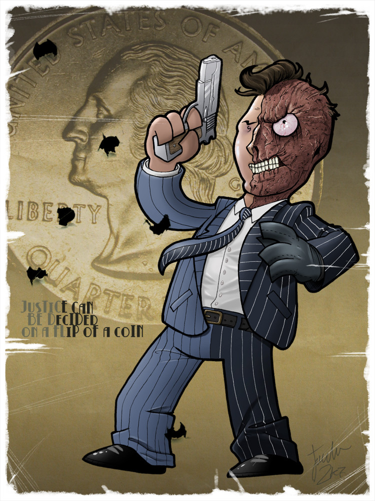
 melies — DENT.
Published: 2007-02-20 05:53:23 +0000 UTC; Views: 3327; Favourites: 48; Downloads: 14
Redirect to original
Description
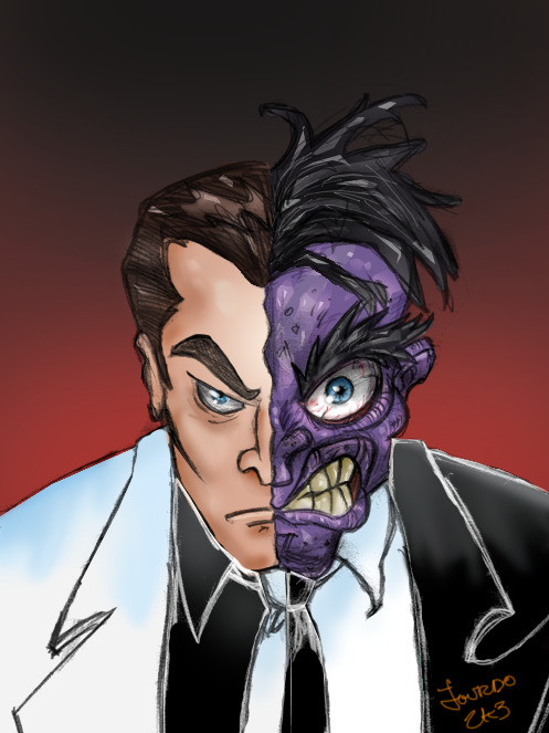
Just love Two-face.Related content


Comments: 39

Oh this is absolutely excellent! I really love your style, it's simple but made very powerful by tiny little details like the lovely colouring and the texturing in his scars.
👍: 0 ⏩: 1
 (Smile)")

")


hey great job love the style and also do you use illustrator? thanks
👍: 0 ⏩: 1

AHHH! Best. Two-face. Art. Ever.
Man, Two-Face that lil' and cute... so surreal and weird... but awesome.
👍: 0 ⏩: 1

This drawing is fantastic!! The colors and the details in the face alone are a work of art. Sweet stuff.
👍: 0 ⏩: 1

YAY! There needs to be more Two-Face love :clings to pic: Love the action and the style you used XD
👍: 0 ⏩: 1

just wait for The Dark Knight next year, with Harvey Dent and all, people are gonna remember two-face a bit more.
Thx a bunch for the fav!
👍: 0 ⏩: 1
I completely agree 
👍: 0 ⏩: 0

lol au début je pensais que c'était une déviation à propos de dents (tsé dans bouche)...
belle ligne (épaisse... mmmh)
👍: 0 ⏩: 0

I love the texture in dents face bro. Awsome job
👍: 0 ⏩: 0

y faut pas...y demande juss de l'amour au fond...
👍: 0 ⏩: 1

aaaaaaaaaaah NON non non non non et non!
👍: 0 ⏩: 0


Fantastic. I'm faving it. Love the feel of whimsy and danger.
👍: 0 ⏩: 1

fuck, yé glauque pour un cartoon
j'aime bien, tu t'inspires de mathieu pour la colo?
👍: 0 ⏩: 1
juss pour les gradient, y mavais montrer un ptit kekchose ke jtrouve rend ca plus rapide et beau. J'ai commencer ca sur mes Starwars, ke jai pas encore poster, pis ca marchait ben.
👍: 0 ⏩: 0

un gun argent  (Wink)")
JE TRIPPE sur son coté malifique... l'oeil!!... L'OEIL DU TIGRE MEC!!
pis son costume moi je l'aime dememe contrairement a alex

👍: 0 ⏩: 1
héhé, merci. Je taime pis tÉ BO
👍: 0 ⏩: 0

wow belle exécution, ya juste le complet , le contraste entre les 2 parties est peut-etre pas assez marqué.
👍: 0 ⏩: 1
bah, je laime demem moi
taime mieux le tw-face de batman forever?
👍: 0 ⏩: 1
ben pas necessairement, dans pas mal de comics et meme les dessins animés cest plus contraste et j'aime bien , mais bon tout dépend de l'oeuil qui le regarde (-: . yé funky dans b. forever hein? hehe
👍: 0 ⏩: 1
héhé, ouais, flashy fluo dun coté
pis ouais je sais, ya ben du monde ki le font noir dun coté, blanc de lautre, mais jtrouve ca le divise trop, cé un personnage tres complexe et nuancé, alors j'préfère des couleur sombre/claire, mais de meme nature. Jpréfère la vision Tim Sale de 2-face que celle disons de Bruce Timm...
mais té bo
👍: 0 ⏩: 0

Sa face est DEGEULASSE!! Un ecorche vivant! Bweeeeh
N'empeche que c'est assez hot. De mieux en mieux man. Yup.
👍: 0 ⏩: 0


I saw what you wrote on Hartman's piece about the "look" of an old art piece... was this the one you were talkin about? I've always found that scanning in old pieces of paper or crumbled up paper (usually white or a tan color but it really doesn't matter cause you can play with "Variations" to get a desired color) but play with that on a separate layer above or below your art, then play with different filters, You'll be surprised with what you'll come up with!
By the way... Two-Face does Rock.

👍: 0 ⏩: 1
thx! but what I meant exactly was about the torn edges of the paper, as if its been worn out by time...I find it difficult to replicate.
Thx a bunch dude!
👍: 0 ⏩: 1
Kinda the same thing, find some old magazine or comic book that has beat up edges and for the most part soild color and either scan it in or take a very hi-res pic of it so you get the "depth" of it and the play with some layers and filters (Overlay, multiply, etc...) until you come up with somthin you like see I kinda did it here... [link] this was just a piece of paper I crumbled up and scanned then threw a little shadow on it to kinda look like it was sitting on the ground...
-Baker
👍: 0 ⏩: 0