HOME | DD
 meltdowns — burn my dread
Published: 2009-07-22 00:18:36 +0000 UTC; Views: 4431; Favourites: 51; Downloads: 1796
Redirect to original
Description
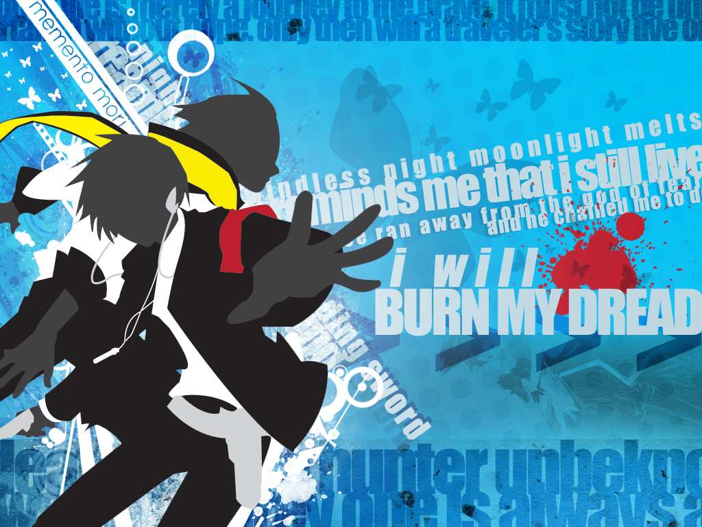
This started out as a design for a shirt, actually. Then I recycled it and made it into a wallpaper. I seem to like doing shirt designs/wallpapers lately.Blah blah. Anyway. I vectored Minato and Ryoji on Adobe Illustrator, using [link] as a guide. Didn't take too long, since I didn't want to spend too much time on making the details or anything like that.
The hard part was actually making the background area, because I...have not worked with wallpapers for a very long time. So I moved back into Photoshop and started playing around with a couple of things here and there. Eventually I got a start and somehow this...thing was the result.
Used lyrics from Burn My Dread, and that "Death is not a hunter unbeknownst to its prey..." bit.
To be honest, I'm not all that pleased with it. I feel it's really empty, despite the bunched up text and all that stuff. I don't know--I guess it's missing something, but I don't know what it is. But enough rambling. It's just a wallpaper that I did because I was bored.
Related content


Comments: 12

I was wondering, will you ever make different screen size versions of this? Like 1366 X 768 or something similar? I'm really REALLY digging this wallpaper and if i'd resize/stretch it in PS that would be a dishonor to this masterpiece.
👍: 0 ⏩: 1

I would, but I lost the original PSD file for this and I don't know where it could be....somewhere on my external hard drive? ; ; In any case, this piece is old, but I'm embarrassed yet flattered that you like it! Go ahead though, if you'd like, you can make alterations or stretch it to your liking~
👍: 0 ⏩: 0


Good stuff. =3 This is what you were working on? Sorry I disrtracted you. XD
I really love the solid-colored central figures (it's Minato and Ryouji, squee~ owo), and the lyrics, of course. I love lyrics on wallpapers~
Maybe it doesn't look right because the text doesn't variate much? To make emphasis, lines are supposed to be bolder, more transparent, larger or smaller, right? I know you were just messing around in PS, but it's a good thing to considder in another piece. If you're going to incorporate text, it has to be done correctly, you feel me? (I'm not talking down to you, promise!!! XDD)
I really like the blues... Nice NYX AVA in the bg, I see him~ 
I know you were just messing around, sorry. X3
👍: 0 ⏩: 1
Well, like I said, I was just messing around with stuff on Photoshop, so I really didn't mind chatting with people here and there anyway. If I were really, seriously working on something, I'd have signed off MSN, haha.
Yeah, that's one of the things I was actually considering... I tried a lot of things with the text, but none of them looked better than what's seen now. I tried lowering the opacity, changing colors, sizes, kerning, all that jazz, and nothing seemed to fit very well. I considered using a different font as well, but that only seemed to add to the clutter. In the end I just got kind of frustrated by the silly fonts, so I decided to just let it go for now.
Oh, nice to know you caught him! Again, I was tempted to make him stand out even more, but a higher opacity seemed to make him pop right out--to the point where it seemed like he would get more attention than anything else in the wallpaper, lmfao.
Thanks for all the suggestions, and taking the time to comment though!
👍: 0 ⏩: 1
True enough. Touche`! XD
Maybe you could try adding less text? Maybe you were trying to hard to incorporate it, and that's how you got stuck.
I can surprise myself by what I notice. XD I also understand about one character overtaking another in a single picture. It's a tough balance; I don't know how you graphic designer people do it. @_@ Even though it's kind of a common theme, maybe you could incorporate both NYX and Orpheus in the bg? Or maybe that crazy Justice one? What's it called...? Messiah! *w*
Lol, sometimes I just get in the mood to comment. XD Glad you appreciate rambling comments~ <3
👍: 0 ⏩: 0

Oh I feel stupid it's a shame my photoshop skills are fading without a working graphics computer. Well overall this is pretty good and you are definately improving.
👍: 0 ⏩: 1
It's a common mistake, so it's not a big deal. But, thanks - I haven't touched Photoshop much over the summer so this was just something to make sure I wouldn't get too rusty.
👍: 0 ⏩: 0
Wow I have no idea why you don't make your own shirts ")
👍: 0 ⏩: 1
It's not exactly a brush - the butterfly is located in the custom shape area in Photoshop.
👍: 0 ⏩: 0