HOME | DD
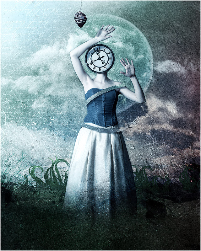
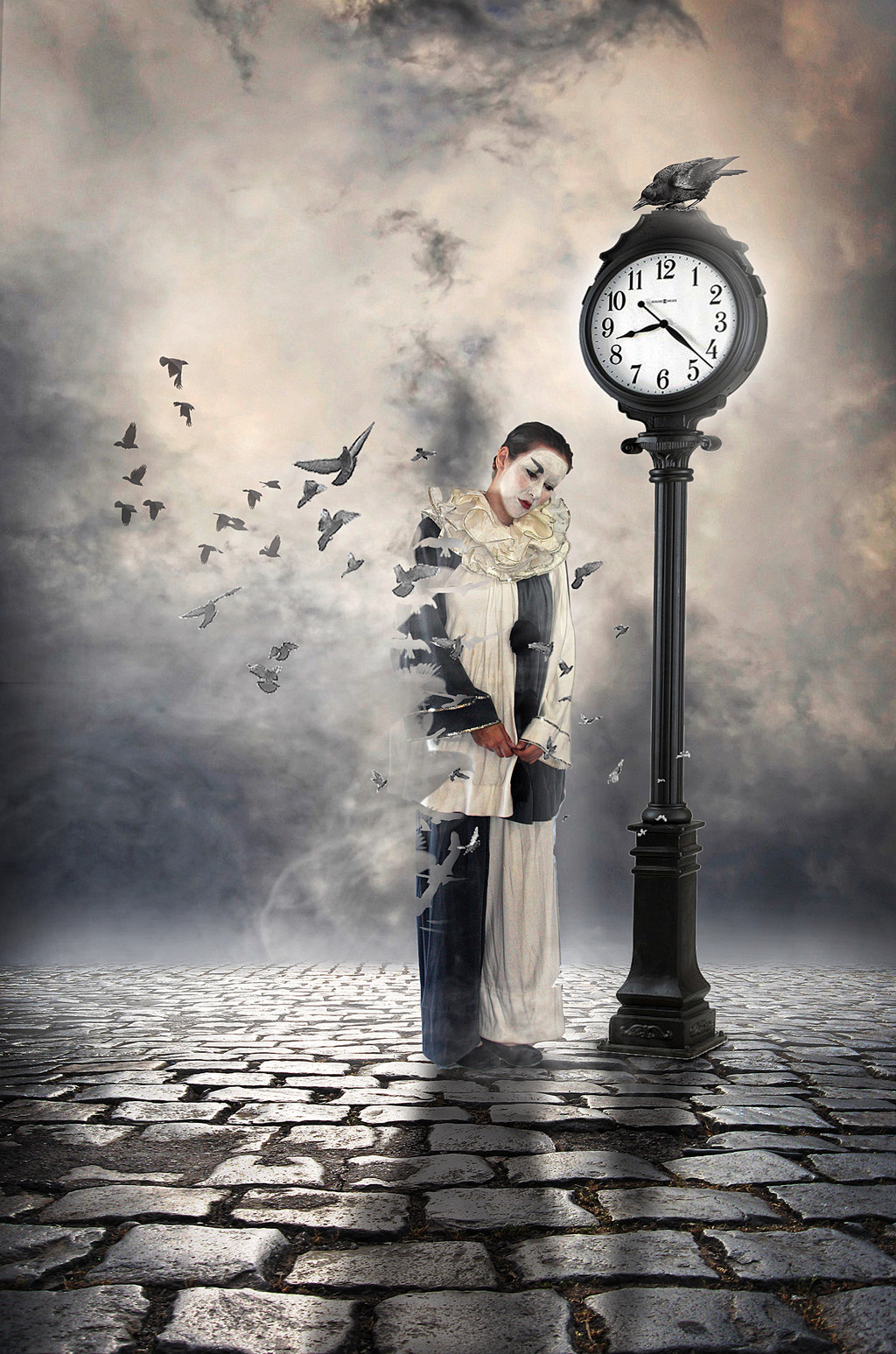
 metaltoby — it isnt a matter of time
by-nc-nd
metaltoby — it isnt a matter of time
by-nc-nd
Published: 2007-03-24 15:11:30 +0000 UTC; Views: 2955; Favourites: 92; Downloads: 0
Redirect to original
Description
stocks:hair brushes
other from sxc
Related content


Comments: 27

Fantastic!
Everything flows and
shows imagination :]
👍: 0 ⏩: 0


This wonderful piece has been featured in my journal here [link]  (Smile)")
👍: 0 ⏩: 0


Oddly reminds me of Savage Garden's song "Promises."
"Don't go making all those promises you know you cannot keep. There's a time to play the king and a time to be a theif. And if you're making all these promises you know you cannot keep. You know time will be the theif and your fallen king will end up alone."
To which, I find both this piece and that song very very cool.
")
👍: 0 ⏩: 0


very cool. i love this - i really like the style. nice work.

👍: 0 ⏩: 1

thank yu very much! glad you like it
👍: 0 ⏩: 0

i love the color scheme. it works so very well with the writing texture, and those minty hues are my faves.
her right hand looks a little two-dimentional. is this on purpose?
nonetheless, it might be my favorite piece of yours.
cheers!
👍: 0 ⏩: 1
right hand? uhm..no..it wasnt intentional..but i cant see this two-dimensional effect....
anyway..thanks for the comment

👍: 0 ⏩: 1
no worries. keep up the awesome sauce. it's orgasmic.

👍: 0 ⏩: 0

e questo..che commento e'?!?!? -_-
👍: 0 ⏩: 1

love the texture and background... i think the positioning of the clock is a little off, maybe putting it to the right some more would make it seem more balanced to me
👍: 0 ⏩: 1
uhm..i put it in this position trying to give the idea that it is a lightly inclined to the left and toward the bottom.
do you think that i dont reach this result?
👍: 0 ⏩: 1
i think that the neck position straight up like it is and the tilted clock are contrasting each other... i know you cant really do anything about the model's neck, but if it was slightly bent down and to the left as well, i think the piece would be perfect
👍: 0 ⏩: 0

i know i'll be brutal but this heart spoils a composition for me a lil bit. But fc I'm not an expert. I also think that you could add some more hands, which could strongen the effect  (Wink)")
👍: 0 ⏩: 1
eheh..you're never brutal..i appreciate well-grounded criticism
maybe you're right for something..but i dont want to edit this piece anymore
thank you anyway!
👍: 0 ⏩: 2
i know i know! and i appreciate it ^__^
kisses!
👍: 0 ⏩: 0
I see, blah i just wanted to say sth more than just : "wow", "lol", or "good"
👍: 0 ⏩: 0


Looks very cold, I like it, specially the textures you used, tho she looks very clean anyways, well done
👍: 0 ⏩: 1
thank you my dear friend
👍: 0 ⏩: 0